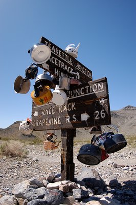
Tom, I love this sign. I think Hugo is really on to something, and I just wanted to further his thought. Perhaps if you pumped the blue sky up a bit, to make it feel a little heavier and more important.. it wouldn't feel so out of balance. A good circular polarizer should do the trick.. or five minutes in PS.
This sign sure is very photogenic, and the lighting on this one is fantastic! Very well balanced. Maybe it could use a tad more tension in it, as it is very "clean". (Ref: my natural choice)
Although I could argue the excessive sky above the sign, I think it need not be changed. By cropping it off, the composition would be completely centered again. Rambling on, the sky offers an outlet, or another option: the way UP! Quite farfetched, but well, you know how I think out loud, and.... It's hard to soar like an eagle...;o)