|
|
Critique By:
Paul Sanders (K:744)
1/27/2004 7:57:07 PM
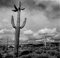
Cris,
Not sure how I could offer help. It's clear you know of depth of field and sharpness of focus. How do you figure out the correct exposure for a desert photo? I myself never can get the exposure right for these kinds of pics. The composition is very nice as well.
|
| Photo By: Cris Mitchell
(K:119)
|
|
|
Critique By:
Paul Sanders (K:744)
1/27/2004 5:22:51 PM
Todd,
The sun was hiding behind the clouds hence the lack of brightness in the pic but more importantly, the scan is slightly darker than the original print. Thanks.
|
| Photo By: Paul Sanders
(K:744)
|
|
|
Critique By:
Paul Sanders (K:744)
1/25/2004 5:36:44 PM
Very nice pic. While I'm not a huge color fan I do like this pic alot because it's more about mood and composition than the distraction of too many colors. It has a very understated appeal. Great job! I hope I didn't come across as a B&W snob. I think I'm just jealous of people who can do color well because I can't!
|
| Photo By: David Dias
(K:1347)
|
|
|
Critique By:
Paul Sanders (K:744)
1/25/2004 5:09:11 PM
Very nice! I love winter pictures. I tried to take pictures of the snow here and they were all a disaster (wrong exposure). Do you overexpose to compensate for the snow?
|
| Photo By: Eirik Holmøyvik
(K:58)
|
|
|
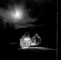
Critique By:
Paul Sanders (K:744)
1/24/2004 2:37:52 PM
Very nice pic. It has a very "retro" feel. The subject is not necessarily retro but the quality of the pic is retro and that is a high compliment. Most modern photos lack that certain something that old photos seem to have. Very nice job!
|
| Photo By: Werner Berghofer
(K:59)
|
|
|
Critique By:
Paul Sanders (K:744)
1/24/2004 2:30:04 PM
Great image and great expression. Good capture. I also love the sharpness and tones of the pic. Congrats.
|
| Photo By: Alessandro Barteletti
(K:3)
|
|
|
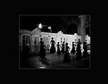
Critique By:
Paul Sanders (K:744)
1/24/2004 2:13:23 PM
Wow, I love the photo. Don't know what to say. I like the subject matter and the fact that you can see the snow falling. I also love the faceless people. Very cool. Must be a fun camera to use. Congrats.
|
| Photo By: Cole H
(K:2)
|
|
|
Critique By:
Paul Sanders (K:744)
10/30/2003 7:48:32 PM
Wow, I really like this. It's kind of dreamlike and the composition is very nice too.
|
| Photo By: Herr Karl
(K:70)
|
|
|
Critique By:
Paul Sanders (K:744)
10/14/2003 10:38:56 PM
Thanks everybody for the comments. I agree with everybody on the cropping. Looking at it now I think this pic would be much better if there were no tree on the right and there were no tree branches in the top half of the pic (especially the top right). It would be much better if there was more sky with no dead black space on the top half. Thanks again!
|
| Photo By: Paul Sanders
(K:744)
|
|
|
Critique By:
Paul Sanders (K:744)
10/13/2003 5:34:00 PM
Priyadarshi, this was taken at the annual Balloon Fiesta in Albuquerque, New Mexico.
|
| Photo By: Paul Sanders
(K:744)
|
|
|
Critique By:
Paul Sanders (K:744)
10/12/2003 9:53:34 PM
I'm a sucker for pictures of bikes and this is no exception. Nice composition.
|
| Photo By: rosemeire todao
(K:467)
|
|
|
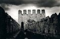
Critique By:
Paul Sanders (K:744)
10/12/2003 9:09:56 PM
Castles and gloominess...they both go together. Great photo. You managed to make it look like a Holga photo. Good job.
|
| Photo By: Aykan OZENER
(K:5996)
|
|
|
Critique By:
Paul Sanders (K:744)
10/12/2003 8:01:00 PM
Pretty neat pic. It's kinda abstract making me recall that photo of Salvador Dali and the water and the cat flying in the air. I hope you know what I'm talking about and hope I don't come across as nuts. I like creative photos like this. That's something I need to challenge myself with. I take the easy way out and take images that already exist (such as landscape and cityscape) instead of self creating interesting compositions or looking for abstractions like this.
|
| Photo By: Ayse Telci
(K:4168)
|
|
|
Critique By:
Paul Sanders (K:744)
10/12/2003 7:49:07 PM
If I could get in a darkroom I'd try to salvage this photo by increasing the contrast therefore bringing out some more detail. Even though it was not intentional the advantage of a darker photo is usually a more interesting sky. Thanks for the comments.
|
| Photo By: Paul Sanders
(K:744)
|
|
|
Critique By:
Paul Sanders (K:744)
10/12/2003 8:29:38 AM
Wow, a photo of someone holding a camera that I actually like! This is a neat photo. Interesting point of view. That face that she is holding the camera at a slight distance makes a huge difference and I like how the camera lense somehow looks like a cyclops eye. Nice tones also.
|
| Photo By: Ayse Telci
(K:4168)
|
|
|
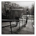
Critique By:
Paul Sanders (K:744)
10/12/2003 8:12:01 AM
Wow, great pic! It's got so much in it that I love, that morning feel which puts me in a wierd sentimental mood, contrasty trees, great lampposts, interesting person, and great sun lighting. I love it.
|
| Photo By: Franck Dormoy
(K:997)
|
|
|
Critique By:
Paul Sanders (K:744)
10/12/2003 7:56:41 AM
I like this photo the best I think. Figures it would be one without a real person in it! The fact she is not real makes you look at the photo harder, to figure out if she is real or not. Also, the background to me matches her very well. The background reminds me very much of traditional tatoo art and she of course resembles a tattoo pin up girl. Good job. Creative.
|
| Photo By: ppdix
(K:17069)
|
|
|
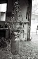
Critique By:
Paul Sanders (K:744)
10/11/2003 10:23:19 PM
I always like these type of images, not sure why. I'm not sure how I would improve this. I actually think if you moved to the right and got rid of the open door it might be better. Don't quote me on that, the point is I think a change in composition would improve this shot. Other than that it is a great shot. The lighting is good and I love the clarity and sharpness of the object, something I always strive for but rarely achieve. Somehow, I'm not very good at still lifes. Keep up the good work!
|
| Photo By: Liz Chaffin
(K:546)
|
|
|
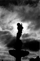
Critique By:
Paul Sanders (K:744)
10/2/2003 9:48:58 PM
Sorry Yannic, can't erase the black circle on the bottom left. Unfortunately, I don't have photoshop. About this shot, this pic was actually taken in the late daytime but somehow turned out like an evening or night shot.
|
| Photo By: Paul Sanders
(K:744)
|
|
|
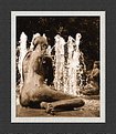
Critique By:
Paul Sanders (K:744)
10/2/2003 9:43:38 PM
Nice pic. I like the way the water looks on the statues and also the clarity of the fountain water. I think it helps that there is a dark background. I've tried fountain shots before and they always turn out hideous. Good job.
|
| Photo By: Yannic Meerbergen
(K:2990)
|
|
|
Critique By:
Paul Sanders (K:744)
10/2/2003 12:11:35 AM
Fabulous photo! It's got great contrast, great sky, and wonderful detail. Great job!
|
| Photo By: Carol Watson
(K:5185)
|
|
|
Critique By:
Paul Sanders (K:744)
10/1/2003 5:12:50 PM
Wow! I really like the perspective and the depth of field. I like it a lot.
|
| Photo By: Andreas Wolkerstorfer
(K:5090)
|
|
|
Critique By:
Paul Sanders (K:744)
9/27/2003 10:44:10 PM
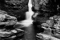
Rickett's Glen is in the Poconos in Pennsylvania. I did actually take some vertical shots of the same waterfall and for some reason I like this better. I think the rocks in the foreground draw your attention to the waterfall. I do wholeheartedly agree that the pic should have included more of the top. The inclusion of the beginning of the fall would have improved it a great deal. Thanks everybody!
|
| Photo By: Paul Sanders
(K:744)
|
|
|
Critique By:
Paul Sanders (K:744)
9/23/2003 10:54:26 PM
Wow, I love this photo. This is a great capture of emotion and excitement. It reminds me of some of the great Time Life photos of kids.
|
| Photo By: david malcolmson
(K:4145)
|
|
|
Critique By:
Paul Sanders (K:744)
9/21/2003 5:32:12 PM
I love this photo. Very cool. I love how the city looks like a miniature and the sky reminds me something out of an old B&W movie. In fact, for some reason the whole pic reminds me of Bergman. Did you intentionally underexpose?
|
| Photo By: Martin Bergqvist
(K:81)
|
|