|
|
 Susie OConnor
{K:34798} 8/17/2005
Susie OConnor
{K:34798} 8/17/2005
|
Thanks for the info Trish. I will play with it. I appreciate any opinions you care to offer on any of my photos. Seems I'm learning something new every day!
|
|
|
|
 Trish McCoy
{K:15897} 8/17/2005
Trish McCoy
{K:15897} 8/17/2005
|
beautiful. seems a bit to soft in my opinion but it's still a great capture. and I like both bw and color. just seems it needs to be a bit lighter and more contrast too.
|
|
|
|
|
Eric Peterson
{K:4419} 8/17/2005
|
Not a problem Susie. Glad you liked the shoulder treatment anyway. As for the other, everyone has their own vision and preferences and yours are cetainly no less valid than mine or anyone else's. Keep up the good work.
Eric
|
|
|
|
|
Susie OConnor
{K:34798} 8/17/2005
|
Thanks Eric! And thanks for taking the time to play with my image. I agree with the burning on the shoulders. It really does tone that down. That is a part of PS I'm just learning. :) I think the eyes got a little oversharpened however. Thanks again for your input. MUCH APPRECIATED!
|
|
|
|
|
Eric Peterson
{K:4419} 8/16/2005
|
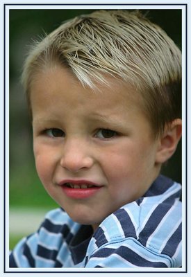
Nice portrait. I'll vote for the B&W as well. The only suggestion I'd make would be to dodge just a bit around the eyes to lighter them up and sharpen them just a tad to draw the viewer's eye. You also might consider burning in and blurring his shoulder a bit. Right now it's so bright white and sharp that it draws the eye away from his face and distracts from his expression. Attached below is an example of what I mean.
Eric
|

|
|
|
|
 Sam Graziano III
 {K:14064} 8/16/2005
|
I Like the B&W susie, I think the softness of the tones and the background work well together in the B&W format!
Congrats on both way tho.
Best regards
Sam
|
|
|
|
|
z z
{K:7231} 8/15/2005
|
Both of these are a strong portrait. I get this same look and attitude from every critter, child and spouse when I pull out my camera at home. =) Great shot!
|
|
|
|
|
Darlene Boucher
{K:15739} 8/15/2005
|
Both are wonderful Susie, but I think I like the black and white better, great moment captured!!!
|
|
|
|
|
Sarah Per Lee
{K:2477} 8/15/2005
|
Hmmmmmm, COLOR!! I knew this was yours on the "next in series" before I even saw your name. Your own personal touch/style whatever you wanna call it, is apparent! I believe the expression is well captured here Suz. I also believe that the color is not a distraction whatsoever from the expression. Cute subject!
|
|
|
|
 mike donovan
{K:3698} 8/15/2005
mike donovan
{K:3698} 8/15/2005
|
Colour! Great expression, excellent portrait!
B&W too formal for this look I reckon!
|
|
|
|
 Gabriel Fuentes
{K:6565} 8/15/2005
Gabriel Fuentes
{K:6565} 8/15/2005
|
Maybe it's a 'guy thing' but the lips look a little more red than I'd feel comfortable wearing ... maybe that's why he feels 'picked on.' Just kidding. Actually, the B&W does it for me, color on faces can be distracting and I prefer to focus on the expression. Just a personal choice ... B&W for 'people' pictures ... and yours is an example why: in B&W I'm not concious whether the shirt looks new or faded, whether the lips are too red, whether the skin tones are right .. I go right into enjoying this excellent photograph with perfect illumination .. well done Susie ...Love it!!! ..Gab
|
|
|
|
 Kathy Hillard
{K:25721} 8/15/2005
Kathy Hillard
{K:25721} 8/15/2005
|
I'm going to surprise you again...I like the color. He is just too all boy! Very cute picture!
Kathy
|
|
|
|
|
Roberto Okamura
{K:22851} 8/15/2005
|
Excellent portrait Susie!
I like both version, but I think the b&w version better!
Congrats!
Roberto.
|
|
|
|
|
Susie OConnor
{K:34798} 8/15/2005
|
Here's the B/W
|
|
|