|
|
|
Enas Moussa
{K:7470} 7/6/2004
|
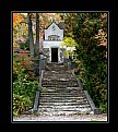
i usually prefare B&W but in this one i like it colord better.. i think it needs more contrast to be B&W .. so colors here r showing the details, the old age of the building and the green tree.. simply keep it this way .. plzzzzzzz
|
|
|
|
 Roger Williams
 {K:86139} 6/26/2004
|
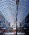
Well, a minority view, it seems, but I prefer the colour. The B&W lets you enjoy the structure without being distracted by the colour, but the colour seems to be such an interesting and valid part of this picture. I love the fresh green leaves, and the "texture" of the structure, which I can understand better in colour. When I have shots with deliberately splayed upward-looking verticals, like this, I usually try to get the one in the middle of the picture (or where the one in the middle WOULD be if there WERE one in the middle) to be parallel with the edges. This way, the picture doesn't apear to lean to the left or the right, which helps it look more natural... as if one really were "looking up." Just a thought--try it and see if you like the difference it makes.
|
|
|
|
|
arwa abdullah
{K:34415} 6/26/2004
|
That’s exactly why I turned it into black and white in the first place paul 
When taking the pic I tried to make the small light bulb a vocal point but it didn’t work maybe needed some more light around it
Thanx for your comment
|
|
|
|
|
Teresa Moore
{K:11063} 6/25/2004
|
I like both, but the color is my favorite. I guess I just haven't developed a love for b/w, yet,but I hope to.
|
|
|
|
|
Rawabi Al-Nuaimi
{K:15659} 6/25/2004
|
ummmm.. color..! i always prefer color..! :-D
|
|
|
|
 Ahmed J
{K:6014} 6/25/2004
|
This is nice and soft colored.. but i go for B&W with this old architure.
|
|
|
|
|
Amna Al Shamsi
{K:21795} 6/25/2004
|
This one is also nice, but i prefer the B&W
|
|
|
|
|
Alyazia Khaleefa
{K:1168} 6/25/2004
|
me to0o.. B&W..
guess because of the theme too.. the B&W works well when it comes to an old house i guess!
|
|
|
|
 Paul's Photos
{K:35235} 6/25/2004
|
I agree about the b&w version being better. I think it is because the colors actually distract from the architecture. When I look at the image in color my eyes wander around the image a lot.. looking at the color of the leaves on the tree or the various shades of brown of the building. However, with the b&w version, the image seems more balanced and the building stands out more. Of course this is just my subjective opinion :)
|
|
|
|
|
Enjoy
{K:16125} 6/25/2004
|
I prefer the b/w but only because I like b/w and like seeing them in it..
|
|
|
|
 Pedro Libório
{K:53861} 6/24/2004
|
also nice but in this case I prefer de B&W version...
regards and thanks for your words and visit
|
|
|
|
 Saeed Al Shamsi
 {K:47735} 6/24/2004
|
Although this is the original traditional colour and still very attractive, but, I go for B&W image, Saeed
|
|


