|
|
Critique By:
M.M. Meehan (K:3751)
9/22/2005 2:11:03 AM
This is a beautifull composition. I am so glad you did not crop the bottom half of it off. That foreground adds more interest and another dimension to the whole scene. Very moody with the fog rolling in.
I wonder what software you use for your RAW conversion to jpeg.
|
| Photo By: ade mcfade
(K:12388)
|
|
|
Critique By:
M.M. Meehan (K:3751)
9/3/2005 11:36:06 PM
Cute candid. I even like the light coming in from the top right and backlighting the child.
Love my Elan!!
|
| Photo By: Michael Grace-Martin
(K:10183)
|
|
|
Critique By:
M.M. Meehan (K:3751)
9/2/2005 8:39:59 PM
Interesting lines in this cityscape. The tree is a bit of a distraction. It seems to interfere with the straight lines of the architecture.
|
| Photo By: Len Webster
(K:25714)
|
|
|
Critique By:
M.M. Meehan (K:3751)
9/2/2005 8:37:35 PM
Gorgeous. You caught the light just at the right time.
I am not sure if its an optical illusion or if the horizon is tipped. Since the girl seems to be perpendicular, I guess the horizon just seems to slant.
|
| Photo By: cesira urzi
(K:1828)
|
|
|
Critique By:
M.M. Meehan (K:3751)
9/2/2005 8:29:31 PM
Interesting shapes and forms. What is the thing in the lower left corner?
Does your camera use the L series lens? just curious.
|
| Photo By: Farsheed Parto
(K:357)
|
|
|
Critique By:
M.M. Meehan (K:3751)
9/2/2005 8:26:04 PM
I keep coming back to this one. Very serene, lovely. I would put it in the abstract category. Delicate, soft and lovely.
|
| Photo By: David Bulli
(K:641)
|
|
|
Critique By:
M.M. Meehan (K:3751)
9/2/2005 8:21:57 PM
This is a well composed action shot. Great colors!
|
| Photo By: Erik Shea
(K:1600)
|
|
|
Critique By:
M.M. Meehan (K:3751)
9/2/2005 8:20:03 PM
excellent. A well deserved award
|
| Photo By: Le Tuan Anh
(K:84)
|
|
|
Critique By:
M.M. Meehan (K:3751)
8/20/2005 9:06:00 PM
Nice tribute to HCB. This is one of my favourites of yours. But right now it reminds me of someone else who seems to be hibernating at the moment (gone) too. Another street shooter who we all miss terribly for his wonderful crits and view of the streets of Chicago. Sigh.
This site really rocks. I have been away too long. Got back from a trip to the prairies a couple of weeks ago and have been trying to catch up on everything since then. My blog from on my web page has some of what I have been doing, but I must email you soon. need food....
|
| Photo By: Audrey Reid
(K:5872)
|
|
|
Critique By:
M.M. Meehan (K:3751)
8/20/2005 6:48:04 PM
This is perfect for an e postcard!! Its a great story telling photo, too. I love the composition that suits the text perfectly!!
Maybe we need a new project.  ) BEST postcard for Usefilm!! ) BEST postcard for Usefilm!!
|
| Photo By: Mohamed Banna
(K:34237)
|
|
|
Critique By:
M.M. Meehan (K:3751)
8/20/2005 6:43:02 PM
Hey, have you thought about putting this in the silhouettes/shadows latest project? It fits very well, I think, into that project!
Very nice silhouette against the slightly faded out background to give me a real feel of being by the ocean, watching the waves and listening to the sounds. I love the ocean, so this has special meaning for me. Thanks for sharing.
|
| Photo By: Blake Heiss
(K:2197)
|
|
|
Critique By:
M.M. Meehan (K:3751)
8/20/2005 6:39:33 PM
good minimalistic contrail photo. I guess we all have some of these in our portfolios. Its a nice place to land when I seem to be having trouble figuring things out today. ) Relaxing, peaceful, familiar and easy to view.
|
| Photo By: Angelo Villaschi
(K:49617)
|
|
|
Critique By:
M.M. Meehan (K:3751)
8/20/2005 6:32:26 PM
Fantastic lovely landscape. Worth all the time and trouble you took to get this one. I think I like your landscapes even better than your conceptional shots that are doing so very well in the International Salons. I bet if you entered this one it would be equally well received. ) Its one of my favourites in your portfolio. Yeah, the Hong Kong lady is right.. your use of color is great.
|
| Photo By: Steve Chong
(K:814)
|
|
|
Critique By:
M.M. Meehan (K:3751)
8/20/2005 6:00:08 PM
Oh cool. Nice documentary shot. Could be sharpened a bit, maybe.
Just excellent!
|
| Photo By: Joe dos Santos
(K:3682)
|
|
|
Critique By:
M.M. Meehan (K:3751)
8/20/2005 5:57:18 PM
This is going without comments? oh dear! It deserves a lot more attention.
Its a very good shot of the running stream with the added interest of the lady. Excellent lighting. Good diagonal lines in the composition.
|
| Photo By: Donald Hanson
(K:460)
|
|
|
Critique By:
M.M. Meehan (K:3751)
8/20/2005 3:59:19 AM
I like how the hill is in darkness and the trees are golden with the first light. A study in blue and gold balanced with diagonal lines for added interest.
Congratulations on your 2 HONOURABLE MENTIONS at the 2005 PSA International Exhibition!!
|
| Photo By: Steve Chong
(K:814)
|
|
|
Critique By:
M.M. Meehan (K:3751)
8/18/2005 10:01:03 PM
this is surely a moody landscape. I like the infrared treatment on it. It would be a very good scene to shoot, even without the infrared.
I wonder why the top is still all green. (obviously, I know nothing of how to get this infrared treatment). I think the top of the photo would look good with the white highlights, also.
|
| Photo By: cessy karina
(K:14205)
|
|
|
Critique By:
M.M. Meehan (K:3751)
8/18/2005 9:56:09 PM
Lovely serene scene. Good tonal range, and great capture of one of nature's rare moments.
|
Photo By: Mirek Netusil
(K:572)

|
|
|
Critique By:
M.M. Meehan (K:3751)
8/18/2005 9:50:26 PM
This looked like an interesting abstract, until I read the thread. Now I understand the title. But it still looks like a good abstract. Lovely blue colors
|
| Photo By: Michele Carlsen
(K:146013)
|
|
|
Critique By:
M.M. Meehan (K:3751)
8/18/2005 5:18:58 PM
Congratulations on your BIP. Great idea to convert to black and white.
This is soooooo cool. I even like the softness to it. Gives me the impression of Alice stepping through the mirror.
|
| Photo By: Lida Chaulet
(K:3430)
|
|
|
Critique By:
M.M. Meehan (K:3751)
8/18/2005 4:12:39 AM
cute composition. Great colors and light. There is sooooo much detail in the shell of the egg. I don't understand how the shell turned pinkish and the white of the egg did not. Unless, of course, the eggshell is painted that strawberry color.
The photo is just a bit large for my screen and I have to scroll it up and down to appreciate the balance you have achieved with the black space vs. the colors. In viewing the bottom right corner and the top left corner the blacks appear to be similiar shape and so lend an even weight to each corner. But there is a shaft of bluish light in the bottom that does not carry through to the top side. I wish it had, and shaded the top of the whole egg that lovely violet color, also.
|
| Photo By: Jeroen Wenting
(K:25317)
|
|
|
Critique By:
M.M. Meehan (K:3751)
8/18/2005 3:54:40 AM
This is quite a different perspective, for sure. ) I cannot figure out what it is. Sorry, but I just cannot make head or tail of it. Or is that it? Its an elephant tail?
|
| Photo By: Blake Heiss
(K:2197)
|
|
|
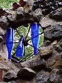
Critique By:
M.M. Meehan (K:3751)
8/18/2005 3:48:49 AM
This appears to be an interesting stone wall. At first glance the photo looks a bit busy and my eye jumps all over with no where to settle. But that may have been your intention. Using oppposite primary colors is a designers trick to get people to view a magazine layout longer because it takes longer to understand. This does not seem to work very well with thumbnails, as only so very little is visible. This certainly has had me looking at it for a while. Interesting find and composition.
|
| Photo By: Leanne Johnson
(K:80)
|
|
|
Critique By:
M.M. Meehan (K:3751)
8/18/2005 3:44:07 AM
Looks like an excellent place to find some good scenic shots.
I like the colors and composition. I wish the photo was larger, so I could see it better.
|
| Photo By: N.R. Miller
(K:946)
|
|
|
Critique By:
M.M. Meehan (K:3751)
8/17/2005 12:36:46 AM
Nice one Tracy. Good faded out background and good detail and color in the crocus. You did a very carefull job on the extra blurring.
|
| Photo By: Tracey Parkhurst
(K:0)
|
|
|
Critique By:
M.M. Meehan (K:3751)
8/16/2005 10:56:03 PM
A very well earned Featured Donor award. Congratulations.
Really nice perspectives on the dock. The tiny boat in the background emphasizes the deep depth of field. Lovely reflections in the foreground
|
| Photo By: Cesar Augusto Carvalho
(K:982)
|
|
|
Critique By:
M.M. Meehan (K:3751)
8/16/2005 9:47:43 PM
Congrats on the EC.
There is a lot of bright light on the canola field that does not appear to be coming from the cloudy sky. There is a lot of noise in the sky that does not exist on the rest of the landscape. I wonder why there are no cloud shadows over the land. I think the green and yellow colors have been highly saturated. It all just looks a bit unreal to me... rather like a kids coloring book.
|
| Photo By: Martin Paul
(K:140)
|
|
|
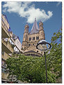
Critique By:
M.M. Meehan (K:3751)
8/15/2005 4:50:30 AM
Is this the spire of the Cathedral? The inclusion of the apartments on the left really detracts from the scene, sorry to say. Plus the light stand and the bush are hiding most of the view. Wonder why you shot it this way?
|
| Photo By: Don Loseke
(K:32503)
|
|
|
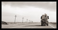
Critique By:
M.M. Meehan (K:3751)
8/13/2005 6:24:05 AM
Congrats on Staff Choice of your photo.
I wonder where this land of chaos is.. with its leaning telephone poles. Just another moving day, I guess.
I could wish for a little more interest in the sky, but you shoot what's there, I guess. I want more contrast added... with photoshop... horrors!
|
| Photo By: Andy Ly
(K:716)
|
|
|
Critique By:
M.M. Meehan (K:3751)
8/7/2005 5:44:00 PM
Thanks for all the recent comments, Roby.
I have not had time to see your portfolio recently, sorry. I have been away.
|
| Photo By: M.M. Meehan
(K:3751)
|
|