|
|
Laura E.
 {K:5598} 2/14/2006
|
Hi Shane,
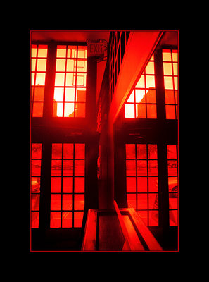
I don't know how I missed the second posting of this photo... sorry about that. Now the glare is removed and the details are revealed. Looks great!
Laura
|
|
|
|
|
Shane O'Neill
{K:3054} 2/13/2006
|
thanks for your thoughts Laura ..
take a look at http://www.usefilm.com/Image.asp?ID=1031358
this was posted about 6 weeks ago. I scanned the neg on an Imacon - the difference is unreal!
Rgds,
Shane
|
|
|
|
|
Laura E.
{K:5598} 2/12/2006
|
Hi Shane,
You have a really great portfolio.
I like this shot a lot, I think it's interesting and unique. Have you considered scanning the negative and then taking the highlights down just a shade or two in PS?
It's really a testament to your skill that you were able to get such a good shot from what are pretty challenging circumstances to shoot in.
Nice job!
Laura
|
|
|
|
|
David Soler
{K:713} 3/10/2005
|
Shane,
I think you should be proud of this shot. It has character, it's unique. I love the sun blazing through. Awesome!
david
|
|
|
|
 Manu
{K:13082} 1/20/2005
Manu
{K:13082} 1/20/2005
|
Mmm....like yourself not too sure. Maybe too red, maybe a little blown, maybe some cropping or deleting. But the strange thing is... it does have something about it.
I think I will leave it like that...these things happen sometimes.
Cheers
Manu
|
|
|
|
|
Samuel Robinson
{K:1851} 1/20/2005
|
Very nice composition and colours. Well done.
|
|
|
|
|
Todd Miller
{K:16464} 1/20/2005
|
i agree, i think that exit sign could be cropped to give the shot a bit more focus...great color, contrast, and i like the strong geometry. overall an excellent image.
cheers,
todd
|
|
|
|
|
James Silcock
{K:12501} 1/19/2005
|
I love the colour but I keep getting drawn to the exit sign? The lines on the inside of the building are very strong but the cars for me distract too much. But the colour is so strong I think it works.
|
|