|
|
 Nick Karagiaouroglou
 {K:127263} 2/16/2008
|
Yes, now that you say it, I think I should also place the steps in the about box, Andre! It's much more communication then. But I must also make it clear that the description of the steps is meant not for the posted image but for its alteration afterwards.
I see it exactly the way you do too, though. All this work is of course done with some kind of "end result" in mind, but the things we pick up enrich our "rucksack of skills and knowledge" and so we get better with time.
Of course the simplest thing would be the more wishable to do - just put a white background under the guitar. The thing is, I didn't shoot the image of the guitar itself. I just took it from a photo-CD and asked the people if I could use it for placing my images on the face of the guitar and they were as kind to allow me that. And after some years and my reloctation to Lucerne I don'tr even have the CD anymore - who knows where I lost it.
But perhaps I could also use my guitar for that. It will not be then any kind of tribute to Eddie Van Halen because mine doesn't have that shape of the stratocaster, but in the sense of photography it would be better, I guess, since I could make a guitar image just the right way for later manipulations. I must think of that.
Thanks again and enjoy the weekend!
Nick
|
|
|
|
 Andre Denis
{K:66407} 2/15/2008
|
Isn't it amazing how many steps we can go through to try and get an outcome that we are sometimes still not happy with? But, we learn and pick up so many things along the way. I used to tell myself to write notes of all the changes I made to an image in photoshop. But then, if I posted a highly altered image here at this site, I usually explained the steps in the about.
Did you try the simplest thing of all? Just using a solid colour background under the guitar before shooting.
Andre
|
|
|
|
 Nick Karagiaouroglou
 {K:127263} 2/12/2008
|
Hi Andre!
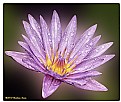
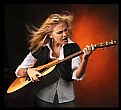
You gave me much work to do with your idea, but it is such a good practice. I was thinking about simply putting some other background. This would demand to somehow isolate the guitar and to manipulate the rest of the image, but keeping the transitions between guitar and the floor as natural as possible.
So I started thinking about how that thing could be selected in some reasonable manner. I used the magnetic lasso for the biggest part of it, and added also some fethered selection strokes here and there with the selection brush. But pasting that on some black or charcoal shoed me another problem. The edges of the guitar are too weak then. If I don't use a feathered selection for copying it looks too pixelated, and if a do use a feathered selection it is simply not an object on a background anymore.
Then I thought that working with layers might allow some more natural look, if one of them would have somehow enhanced edges of the guitar, and another one over it with less than 100% opacity would let it shine through. I pasted the feathered selection on the black backgound and then thought that the contours luminocity filter could do the job here, as it enhances the sharpness *and* also the luminocity of edges in a controllable way. Of course it didn't only affected the contours of the body of the guitar but also all othe edges, like for example between the different colors inside the body and the frets too. It looked more like a drawing, or a design of a guitar this way.
So I pasted the same feathered selection again, reduced the opacity of the new layer to 80%, and used darkening mode for the mix.
And this is the result, which still has many problems, like the shadows and the contours of the guitar, or also the fact that I forgot to de-select the part of the floor that we see through the opening for the bridge. But perhaps it shows one possibility of how to enhance it by adding another background *and* avoiding the unatural look of the guitar?
I'll keep on working on this problem. Thanks a lot again for caring about my securing my employment! ;-)
Nick
|

Trying to add a new background and keep the guitar looking like a real object - still in work |
|
|
|
 Nick Karagiaouroglou
 {K:127263} 2/12/2008
|
Thanks a lot for the nice comment, Vandi!
I'll also try to replace the floor with some other background and see what it looks like then.
Best wishes,
Nick
|
|
|
|
 Nick Karagiaouroglou
 {K:127263} 2/12/2008
|
Thanks a lot, Dave! And I agree too, and will work on that idea. But it will take some days, as I already said. Nonetheless I'll have to do that, since it promises to make the overall look much better. I'm really glad for the convergence of perceptions here!
Cheers,
Nick
|
|
|
|
 Nick Karagiaouroglou
 {K:127263} 2/12/2008
|
I also find it good there, Paul. It somehow reminds me of a sudden artificial harmonic in the middle of a riff!
Cheers and thanks a lot!
Nick
|
|
|
|
 Nick Karagiaouroglou
 {K:127263} 2/12/2008
|
Oh yes, it is similar to the previous one, Gustavo, as I also said in the about box. It is similar but with a bit more weight on the flash of blue, as an alteration of the main theme.
Many thanks for the comment, and all the best.
Nick
|
|
|
|
 Nick Karagiaouroglou
 {K:127263} 2/12/2008
|
Hi Andre!
And many thanks for the nice comment and the idea! Well, yes, I guess most people don't even imagine how much more work one has to invest for such an image than for some "accidental playing around with a smile that finds everything nice" ;-) Really, as I already said, the selection of the guitar body in the right way was a small project for itself. Or else it would rather look like cut/paste and it would lack any natural appearance.
Your idea about teh background I find great! Of course, in order to do that I have to select the floor very very carefully again, allow some fethering at the borders of selection, and I think above all maintaining the right amount of translucence in the shadows of the guitar, in order to mix the shadows with the right amount of the background color. Or how else could I still have a real object with natural shadows - any further idea here?
I will try to do that, certainly I'll do, but this will take some days, I guess, but as soon as I get it I'll attach it to a message. And the moral of the story is: It was a mistake to delete the file with the layers and the appropriate selection of the guitar body. I could start by inverting the selection, if I had kept it. Sigh!
Cheers and thanks again,
Nick
|
|
|
|
 Nick Karagiaouroglou
 {K:127263} 2/12/2008
|
Thanks a lot for the nice comment, Erland!
And there is nothing to be sorry about. I find your English just about good!
Cheers,
Nick
|
|
|
|
 Vandy Neculae
{K:7990} 2/11/2008
|
Lovely series of guitar, Nick. The colors and texture are great!
Vandi
|
|
|
|
 Dave Stacey
 {K:150877} 2/11/2008
|
Brilliant colours and abstract details in the guitar, Nick! I agree with Andree, that a plainer background might be a little less distracting.
Dave.
|
|
|
|
 Paul Lara
 {K:88111} 2/11/2008
|
I really like that splash of blue.
|
|
|
|
 Gustavo Scheverin
 {K:164501} 2/11/2008
|
La encuentro muy similar a la anterior.
Un abrazo!
|
|
|
|
 Andre Denis
{K:66407} 2/11/2008
|
Hi Nick,
Great job on all these guitar images. As I said before, you have put a lot of effort into this project. One suggestion for the images.. I'm thinking maybe a solid colour backdrop might work a bit better than the hardwood grain floor. A solid black or charcoal would probably make the colour in the guitar face stand out even nicer.
Andre
|
|
|
|
 Erland Pillegaard
{K:34147} 2/11/2008
|
Very good idea and picture
Sorry I not say so mush,my English is very bad
erland
|
|


