|
|
|
John Lamb
{K:9687} 12/4/2004
|
Hi Tim, it's Saturday lunch time here in NZ and I now have time to spend some time looking at friends images. It rather nice to follow the progression in your pictures and particularly like you experiments in sepia.
This one has a lot of appeal to me.
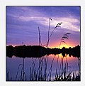
Removing or muting the colours renders the shapes and textures in a different perspective. I like the mood you have captured here. The watery sun through the clouds creates a soft light that both reveals shape and form in some parts and allows other parts to fade into the soft shadows.
I am there in the landscape, aware of the surrounding movement and murmer of nature but also mesmerised by the shifting sea and the dancing light. A moment when time stands still and a minute lasts a lifetime. Thanks for the moment.
Regards John
|
|
|
|
|
Michele Berti
{K:14921} 12/1/2004
|
beautiful Tim. the sepia tone really works on this composition. the color version is beautiful as well by the way. well done.
|
|
|
|
 Lukasz Kuczkowski
{K:14687} 12/1/2004
|
excellent, like the tones here - it makes this landscape look diffrent;
well done
regards
Lukasz
|
|
|
|
 Saeed Al Shamsi
 {K:47735} 12/1/2004
|
Great view point selection,the huge tree give the incarage the view to scan the marvelous back ground scente, the tone of excellent choice,splendid work,saeed
|
|
|
|
|
Tommaso Razzano
{K:8073} 12/1/2004
|
wonderful image ... Tim ... I love these tones...
ciao !
tommy.
|
|
|
|
|
Chris Spracklen
{K:32552} 12/1/2004
|
This one just has the edge for em too, Tim!
Nice work on both counts.
Best regards, Chris
|
|
|
|
 Paul's Photos
{K:35235} 12/1/2004
|
like the tones in this image.. nice landscape... good work
|
|
|
|
|
Rebecca Raybon
{K:26654} 12/1/2004
|
I agree. When the colors are gone, black and white or sepia is the only way to go. This one is moody in sepia. I love it.
|
|
|
|
 Dave Stacey
 {K:150877} 12/1/2004
|
I think they both have their merits, but I agree, I like this one the best. The best of two great images, that is!
Dave.
|
|
|
|
 Tim Schumm
{K:29196} 12/1/2004
|
yeah thats my thoughts too jennifer. It seems to be a way to deal with the lack of color durring the winter months and intrduces an overall warmth into the image without creating any extra distractions
|
|
|
|
|
jennifer armstrong
{K:6688} 12/1/2004
|
hey tim - i think i prefer this toned photo to the colour one you posted earlier. Without the pull of the green in the foreground, i find my eye really falls back & into the piece - to the beauty of the clouds on the horizon & the sun trying to sneak through. It also feels quieter & more peaceful to me - has a stronger mood & feeling than the colour version. Really beautifully done!
|
|


