|
|
|
Amancio Couto
{K:15720} 10/22/2003
|
EXCELLENT work!...congrats Brian!
|
|
|
|
|
sandy c. hopkins
{K:17107} 10/20/2003
|
brian this is great...
i agree about the border...
i like the tree border better
i think the blue takes a way from it...
now to the good stuff...
you have captured some great gnarled trees with tons of character..i really like this and the contrast against the black...
:)
sandy
|
|
|
|
 Christine Campbell
{K:2693} 10/20/2003
Christine Campbell
{K:2693} 10/20/2003
|
Hi Brian,
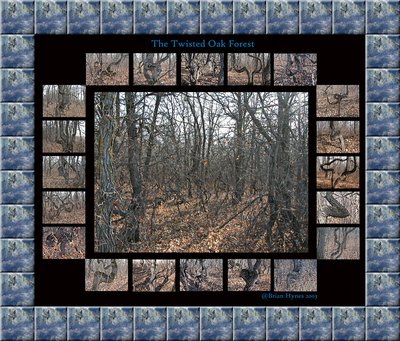
I like the photo of the forest and the smaller details of the trees. However, I would get rid of the border. It's too obviously Photoshopped, repetitive, and distracts from the rest of the image. As much as I love Photoshop, I hate to 'see' it, if that makes sense. Also, without the border you'll have more canvas for the center photo so it doesn't loose as much quality and the finer details will be more noticable. I'd like to see the larger photo take more of the emphasis. Maybe desaturating the outer images and even making them a bit smaller would work. As it is right now, it looks like something you'd put on a website with mouseovers.
Raymond, I like your idea for presentation also.
|
|
|
|
|
Brian Hynes
{K:522} 10/19/2003
|
Raymund - I think you may have something here.
Best Regards Brian
|
|
|
|
 Raymund Macaalay
{K:7218} 10/19/2003
Raymund Macaalay
{K:7218} 10/19/2003
|
This is what im thinking about, and place multiple images same as this, What do you think? Just a thought
|

|
|
|
|
|
Brian Hynes
{K:522} 10/19/2003
|
Thanks Raymund - I will post one of the better ones tomorrow for your comments.
Thank you very must for your offer to help.
Brian
|
|
|
|
|
Raymund Macaalay
{K:7218} 10/19/2003
|
If you could just post larger images and present it in a different way, It would be better if you present it like it is in negatives and layed out on a flat surface, make it rusty or grainy then black and white or sepia which will give it a more gloomy effect... If you could just post your images I'm glad to help you
|
|