|
|
 Shirley D. Cross-Taylor
 {K:174121} 8/30/2006
|
You're welcome, dear Jacob. Hope you figure out what you want...:)
|
|
|
|
 Jacob French
{K:6315} 8/29/2006
Jacob French
{K:6315} 8/29/2006
|
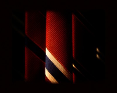
Yes, the original (which you can see in my portfolio if you desire) is filled with ties on either side, but I wanted a way to "isolate" that one in the center. I"m glad you like the idea, and you will certainly see more attempts at this as I try to make it right.
Thanks again!
J
|
|
|
|
 Athanasios Sotiriou
{K:613} 8/29/2006
Athanasios Sotiriou
{K:613} 8/29/2006
|
Its a nice idea..and the choice of colors is great..to me its like i can feel the texture of that tie :-) however, the left of the photo is just a blank space while the right is distarbing with those dots...as you say, you could try a close crop..or should have initially filled the frame with some light or other ties on both sides...
i would suggest experimenting with the idea (which i like a lot) again in the future..
|
|
|
|
|
Jacob French
{K:6315} 8/29/2006
|
I certainly value your opinion, Shirley. I'm not sure what it is about the original, but it seems to be lacking something to me. Perhaps a bit more exploration and a little while away from it will bring the revelation I'm looking for! :-D I always find that I think of things when I'm "not" thinking of things, you know?
J
|
|
|
|
|
Jacob French
{K:6315} 8/29/2006
|
Thanks for the feedback, Irenka. I agree with the name too, renamed it here for all our benefit! :-D
J
|
|
|
|
|
Shirley D. Cross-Taylor
{K:174121} 8/29/2006
|
This is okay, dear Jacob, but I prefer the original version.
|
|
|
|
 Irenka Daniluk
{K:8011} 8/29/2006
Irenka Daniluk
{K:8011} 8/29/2006
|
I like the dark feel about your photo, and the light focused just in the centre. I agree with Mary Sue though, not much choices here :) Or rather the choice has been made, and now comes to the light...
|
|
|
|
|
Jacob French
{K:6315} 8/29/2006
|
Yeah, I suppose after the rework it would be better served with a more appropriate name. I see what you mean with the floating spots on the right. My thoughts were if it were completely black there, I might as well have cropped it down to a smaller size, but I wanted to illusion of something there. It does seem a bit distracting now that you mention it though.
Thanks a lot for the feedback! :-D
J
|
|
|
|
|
Mary Sue Hayward
{K:17558} 8/29/2006
|
I like your idea here (the choice of ties, not the part about being bored!)
I think what bothers me is that, for me, the image doesn't fully illustrate the title "Choices". Isolating the light works well if you want to show just the center tie, but the ties to the left and especially to the right of the center tie are so dark that they may as well not be in the image. And those two bright spots in the right center area (maybe part of a stripe?) are distracting if they are left to just float.
I like the use of color...the reds are rich and dark without being dreadfully oversaturated.
|
|