|
|
Critique By:
LV (K:480)
8/24/2004 5:48:03 PM
Oops, it didn't add the image on my first try.
|
| Photo By: Marc Crumpton
(K:1)
|
|
|
Critique By:
LV (K:480)
8/24/2004 5:37:23 PM
Honestly, I think this picture is overexposed. The brightness of the light reflecting from the right arm and the leather seat is a bit harsh. I think the picture would look much better with a -1 EV compensation. I hope you don't mind me making a minor change to the picture in Photoshop. Here is the picture with the exposure toned down. What do you think?
|
| Photo By: Marc Crumpton
(K:1)
|
|
|
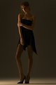
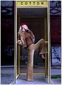
Critique By:
LV (K:480)
8/24/2004 5:11:12 PM
I am not too sure about your choice of background here. You might want to try using a larger aperature to put the background out of focus. I also find the pole a bit distracting. Otherwise, you've got good lighting on the model.
|
| Photo By: Gil Valencia
(K:21)
|
|
|
Critique By:
LV (K:480)
8/24/2004 5:02:21 PM
Nice landscape photo to start off with. And the addition of your talent in Photoshop really made this an exeptional creative piece.
|
| Photo By: rob bishop
(K:561)
|
|
|
Critique By:
LV (K:480)
8/24/2004 4:43:28 PM
Love the use of lighting here to highlight the model.
|
| Photo By: Aaron Griesdorn
(K:145)
|
|
|
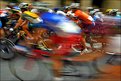
Critique By:
LV (K:480)
8/24/2004 1:45:53 AM
A wonderfully executed panning shot. Well done. Love the colours, and the way you were able to capture one of the riders in sharp focus... goes well with the title of the image.
|
| Photo By: cessy karina
(K:14205)
|
|
|
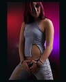
Critique By:
LV (K:480)
8/23/2004 10:26:57 PM
I think you've acheived the effect you are looking for Bryan. I like how the coloured lights works well with the model's hair and outfit.
|
| Photo By: Bryan Steffy
(K:4910)
|
|
|
Critique By:
LV (K:480)
8/23/2004 10:19:37 PM
Very nice.
|
| Photo By: Gabriele Bullita
(K:1235)
|
|
|
Critique By:
LV (K:480)
8/23/2004 10:17:59 PM
What was your shutter speed for this one? You might have it a bit too high therefore not enough light in this picture. The flash also doesn't seem to be enough on high sync mode.. or it might be the high shutter speed. I like the look of the other racing picture, although this one is not bad at all. It's good to see you experimenting with the settings. Keep it up.
|
| Photo By: Thomas Hoffman
(K:148)
|
|
|
Critique By:
LV (K:480)
8/23/2004 10:07:21 PM
The cropping, or lack of, is just about right. Cropping any higher would make it appear like the model is nude, and would convey a different meaning. The hint of clothing is skillfully captured. I think the position of the model looking over her shoulders, and the expression is great. Overall, this is quite a remarkable picture.
|
| Photo By: Angelika Vulcano
(K:832)
|
|
|
Critique By:
LV (K:480)
8/23/2004 9:56:33 PM
I've been following this series with great interest. There is a certain feel to this series that is both creative and original. All the pictures in the series have the elements of bright lighting, bold somewhat unnatural colours, and wide depth of field, combined to create a style that is uniquely yours. There is a rawness to your pictures...these are not the conventional glamour or fashion pictures that you normally see, since the wide DOF and composition puts the focus not just on the model, but on the model within her surrounding.
With regards to this photo, I think it is a another outstanding addition to the series. One small improvement you could make in photoshop would be to slightly adjust the colour hue. I feel it is too yellowish. You've used the same model in your "Country Fashion" picture, and I like the model's skin tone in that one much better. Maybe you can use PS to somehow match the other pictures hues to make the skin a bit more natural looking. I also feel that you could boost the saturation up a bit. I noticed the colour of the dress is a bit muted.
Keep taking more pictures in this series. Always look forward to seeing the next one!
|
| Photo By: benjamin babcock
(K:615)
|
|
|
Critique By:
LV (K:480)
8/20/2004 7:48:42 PM
Great stuff.
|
| Photo By: Maleonn
(K:3054)
|
|
|
Critique By:
LV (K:480)
8/19/2004 8:58:02 PM
Very creative. Excellent portrait.
|
| Photo By: sean armenta
(K:161)
|
|
|
Critique By:
LV (K:480)
8/19/2004 8:05:58 PM
I like how your lighting brings out the muscular definition of her body. Great B&W tones in the picture.
|
| Photo By: ppdix
(K:17069)
|
|
|
Critique By:
LV (K:480)
8/18/2004 3:50:11 PM
This is a fun shot, compared to the other one which is more sensual. I like the look of this one better.
|
| Photo By: Jason Bennett
(K:213)
|
|
|
Critique By:
LV (K:480)
8/18/2004 1:13:23 AM
Hmmm... I didn't even notice the horizon. 
|
| Photo By: Delete My Account Delete my Account
(K:1232)
|
|
|
Critique By:
LV (K:480)
8/17/2004 11:18:17 PM
Very nice picture. Monica's skin tone looks bronze-gold and shimmering. What type of lighting and setup did you use if I might ask? I like how the model looks very three dimensional, and stands out against the background. Exquisite!
|
| Photo By: Simon Pang
(K:-41)
|
|
|
Critique By:
LV (K:480)
8/17/2004 11:06:45 PM
You're one lucky photographer. 
|
| Photo By: Simon Pang
(K:-41)
|
|
|
Critique By:
LV (K:480)
8/17/2004 11:03:04 PM
Nice street shot. I like the smoothness of the lighting. In regards to the pole, I don't think it is distracting, but adds a visual anchor to the picture. Love the use of DOF here.
|
| Photo By: J Dillon
(K:1426)
|
|
|
Critique By:
LV (K:480)
8/17/2004 8:24:01 PM
I like your series of shots, especially ending with this one. What about putting all the images together into one large image? Also I might try black and white just to see a different look... A priceless moment you've captured here!
|
| Photo By: Dale Ann Cubbage
(K:9755)
|
|
|
Critique By:
LV (K:480)
8/17/2004 7:05:48 PM
I like the soft focus of this photo. Your composition is always interesting and first class. I enjoyed looking through your portfolio!
|
| Photo By: Tamara L
(K:1387)
|
|
|
Critique By:
LV (K:480)
8/17/2004 7:02:46 PM
Very interesting. How did you get this lighting? Did you do any post production work? I like the idea though.
|
| Photo By: Abdul Kadir Audah
(K:-21)
|
|
|
Critique By:
LV (K:480)
8/17/2004 4:16:39 PM
How about using a diffuser? It would probably give a softer lighting than a reflector. Try positioning a large white blanket between the sun and the model. The blanket should of course be large enough to cover the model from head to toe. You probably have to find a way to tie the blanket to something tall and place it close to the model. It is a cheap and effective solution, so give it a try.
Looking through your portfolio, I think you have a really neat series with these garden shots. Keep up the good work!
|
| Photo By: benjamin babcock
(K:615)
|
|
|
Critique By:
LV (K:480)
8/16/2004 11:18:04 PM
Wow, great picture! I like how the colours all seem to tie in nicely. Did you use a polarizer by any chance? Looks like it considering the deeply saturated blue sky. Fantastic capture.
|
| Photo By: benjamin babcock
(K:615)
|
|
|
Critique By:
LV (K:480)
8/16/2004 8:15:42 PM
Took some time for the picture to load... Anyways, I like the lighting of this picture. Some may say it is too dark, but I think it works. One thing that bothered me is the gray border. Why not use a different colour, since you already have a gray background?
|
| Photo By: Zsolt E. S.
(K:144)
|
|
|
Critique By:
LV (K:480)
8/16/2004 8:10:57 PM
I like it. Very nice colours. I would crop so the person's head at the bottom wasn't in the picture though.
|
| Photo By: Jorge Vasconcelos
(K:33746)
|
|
|
Critique By:
LV (K:480)
8/16/2004 8:09:00 PM
I like the black and white version. There seems to be some hot spots on the models cheeks which don't look so good in colour but seems to do okay in b&w. The B&W version shows more the essence of this photo. I found the blue blanket a bit distracting.
|
| Photo By: Jeff Fiore
(K:11277)
|
|
|
Critique By:
LV (K:480)
8/16/2004 7:20:41 PM
This is an amazing shot! Wonderful colours and detail. Your panning is very well done. Thanks for sharing pictures from Athens!
|
| Photo By: kosmas papagiannis
(K:2)
|
|
|
Critique By:
LV (K:480)
8/16/2004 5:32:24 PM
It looks off balanced, and to me the objects in the photo look like they will slide off at any moment...if you see what I mean. I have seen others take pictures using this angle, however it is not my favorite.
|
| Photo By: Q Zhang
(K:3946)
|
|
|
Critique By:
LV (K:480)
8/16/2004 5:12:21 PM
Very cool!
|
| Photo By: Pawel Staszak
(K:59)
|
|