|
|
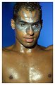
Critique By:
John Doe (K:170)
10/16/2002 3:20:30 PM
This is really cool. Great composition and I have to respectfully disagree with Terrence about the lighting. There is a shadow under the chin but I don't find it negative.
|
| Photo By: Suhaila SAHMARANI
(K:213)
|
|
|
Critique By:
John Doe (K:170)
10/15/2002 9:24:27 AM
I like this Jimmy. The colors caught my eye and I love the way the softness and light plays with the color.
|
| Photo By: Jimmy Estimada
(K:-7)
|
|
|
Critique By:
John Doe (K:170)
10/15/2002 9:15:42 AM
I like it. I would suggest you close your apeture down a bit to more dof. In this shot the ramp is in focus and the rider is not. Although, that could have been your attempt. Anyway, good shot, hope my feedback helps.
|
| Photo By: Sebastiaan Neerhout
(K:299)
|
|
|
Critique By:
John Doe (K:170)
10/15/2002 9:13:07 AM
Absolutely beautiful Andrew. Quintessential, perfect use of natural window light. Very nice DOF.
|
| Photo By: Andrew Lahanas
(K:7062)
|
|
|
Critique By:
John Doe (K:170)
10/15/2002 9:09:09 AM
Hi Reynaldo. I agree with Heather, you've got a nice shot here except the left side is too hot most notably on the ear.
|
| Photo By: Reynaldo Guimaraes
(K:2422)
|
|
|
Critique By:
John Doe (K:170)
10/15/2002 5:44:34 AM
The image is too small to really be able to critique. From what I can see it seems to have a green tint and vertical lines (not sure if that was your intention).
|
| Photo By: Jimmy Estimada
(K:-7)
|
|
|
Critique By:
John Doe (K:170)
10/15/2002 5:38:49 AM
Well done Adam. 
|
| Photo By: Adam E. J. Squier
(K:9803)
|
|
|
Critique By:
John Doe (K:170)
10/10/2002 12:09:09 PM
Great job Dimitris! Another interesting photo.
|
| Photo By: dimitris theocharis
(K:-276)
|
|
|
Critique By:
John Doe (K:170)
10/7/2002 2:37:24 PM
I really like this image, but for some reason the lips seem too much. Did you alter the lipstick in photoshop? Perhaps select the lips in photoshop and reduce the saturation. Great use of color.
|
| Photo By: Mark Warmus
(K:17)
|
|
|
Critique By:
John Doe (K:170)
10/3/2002 9:09:46 AM
Very cool William. Great job at digital manipulation.
|
| Photo By: William R Eastman III
(K:2141)
|
|
|
Critique By:
John Doe (K:170)
10/3/2002 9:08:46 AM
Absolutely amazing! This series has inspired me.
|
| Photo By: Przemyslaw Piwowar
(K:136)
|
|
|
Critique By:
John Doe (K:170)
10/3/2002 9:05:57 AM
Hi Philip, I'd like to comment on this one but it's just to dark. Can you lighten it up in photoshop?
|
| Photo By: Philip Schiffer
(K:0)
|
|
|
Critique By:
John Doe (K:170)
10/3/2002 9:04:52 AM
Hit the button too quick....wanted to add that you had a good eye for composition. You were at just the right angle in relation to the columns.
|
| Photo By: Jonelle Cetin
(K:116)
|
|
|
Critique By:
John Doe (K:170)
10/3/2002 9:03:43 AM
I'd like to see the subjects more in focus. Adjust the horizon in photoshop.
|
| Photo By: Jonelle Cetin
(K:116)
|
|
|
Critique By:
John Doe (K:170)
10/3/2002 8:52:20 AM
Fantastic work Jason. I could detail all the things I like about it would take up too much room. 
Very well done.
|
| Photo By: Jason Bennett
(K:213)
|
|
|
Critique By:
John Doe (K:170)
9/28/2002 6:12:16 PM
Very nice, perfect capture of emotion.
|
| Photo By: Andrew Lahanas
(K:7062)
|
|
|
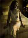
Critique By:
John Doe (K:170)
9/28/2002 6:10:44 PM
Nice full body fashion shot. I particularly like the pose and expression you captured.
|
| Photo By: Greg Suvino
(K:57)
|
|
|
Critique By:
John Doe (K:170)
9/28/2002 6:05:22 PM
Perfect for the desired result. Good job!
|
| Photo By: Larry J. Rhodes
(K:2441)
|
|
|
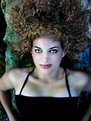
Critique By:
John Doe (K:170)
9/28/2002 6:04:26 PM
Very nice image especially considering the purpose. Only critique is that the face and chest are a bit hotter than everything else. Great promotional image!
|
| Photo By: Larry J. Rhodes
(K:2441)
|
|
|
Critique By:
John Doe (K:170)
9/28/2002 6:01:41 PM
Great moody image. IMHO might be a little better with the feet blackened out.
|
| Photo By: Larry J. Rhodes
(K:2441)
|
|
|
Critique By:
John Doe (K:170)
9/28/2002 5:59:46 PM
I like the composition and "pose" a lot. I think the light may be a bit hot. May be better a little softer.
|
| Photo By: Larry J. Rhodes
(K:2441)
|
|
|
Critique By:
John Doe (K:170)
9/25/2002 3:44:11 PM
Wow! Very dramatic. I love it.
|
| Photo By: Przemyslaw Piwowar
(K:136)
|
|
|
Critique By:
John Doe (K:170)
9/15/2002 9:37:14 AM
Agreed, I like everything about this photo.
|
| Photo By: Arthur John Grossman III
(K:1214)
|
|
|
Critique By:
John Doe (K:170)
9/15/2002 9:32:52 AM
Very well done Phillip. What was your lighting setup?
|
Photo By: Phillip Filtz
(K:1792)

|
|
|
Critique By:
John Doe (K:170)
9/12/2002 2:54:43 PM
Absolutely fantastic Steven!
|
| Photo By: Steven Vigar
(K:303)
|
|
|
Critique By:
John Doe (K:170)
9/12/2002 2:54:08 PM
Hi Monika, I've tried this same shoot several times and just haven't been able to capture the image in my head. I think maybe a different pose and a bit wider crop might be better. What do you think?
|
| Photo By: Monika Sakama
(K:0)
|
|
|
Critique By:
John Doe (K:170)
9/12/2002 2:49:28 PM
I'm impressed that you were able to get such good lighting with hardly no shadows with only one light, great job! I don't care for the angle of the model.
|
| Photo By: Greg Suvino
(K:57)
|
|
|
Critique By:
John Doe (K:170)
9/12/2002 2:47:38 PM
Hi Nathan,
Couple suggestions: his head should have been turned in such a way to minimize the shadow from his nose, the background is a bit busy (a different angle may have been better), and his eyes are too squinty from the sun.
I'd also like to suggest (I'm not trying to be a jerk, just trying to help) that you type up your comments in some program with a spell check then check the spelling then copy/paste it in. Please don't take this personally, I'm just trying to help. I do it too.
I have really enjoyed the direction your photos have taken. Keep shooting!
|
| Photo By: nathan combs
(K:2242)
|
|
|
Critique By:
John Doe (K:170)
9/11/2002 2:35:02 PM
Great shot, very interesting. I personally think it would be better without the blurr though. I find the blurr to be hard on the eyes and distracting.
|
| Photo By: Karen L. Chambers
(K:277)
|
|
|
Critique By:
John Doe (K:170)
9/11/2002 2:24:52 PM
Great job Nathan. The expression is protrayed perfectly.
|
| Photo By: nathan combs
(K:2242)
|
|


![Photograph By Nelson Moore [Kes] -](http://thumbs.imageopolis.com/images/6/0/0/5/6005/1537290-tn.jpg "Photograph By Nelson Moore [Kes] -")