|
|
Critique By:
Thomas Voigtmann (K:516)
4/7/2005 8:06:53 AM
Wowwwwww, how beautifully seen and composed, Amr! Wonderful blue colour as well, that really makes the image special. Best, Thomas.
|
| Photo By: amr alim
(K:2767)
|
|
|
Critique By:
Thomas Voigtmann (K:516)
4/5/2005 11:28:55 AM
Impressive, Gökhan, good effect with the sun and the flare. Thanks for your comment.
|
| Photo By: Gökhan KARAMAN
(K:8878)
|
|
|
Critique By:
Thomas Voigtmann (K:516)
4/1/2005 11:07:26 AM
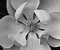
Amr, I like this composition a lot, and also the graininess of the image. Looks like a play between order and disorder...
|
| Photo By: amr alim
(K:2767)
|
|
|
Critique By:
Thomas Voigtmann (K:516)
3/24/2005 8:20:39 PM
Wow, that is a very very good cat portrait. To me she doesn't look at all like resting - staring attentively into the distance and ready to act any moment now!
|
| Photo By: Alison Stroebel
(K:4069)
|
|
|
Critique By:
Thomas Voigtmann (K:516)
3/24/2005 8:04:37 PM
Now that's a sunset. I really like the way you got those light rays radiating out of the center. Great image & thanks for your comment.
|
| Photo By: Eugenio Mussini
(K:191)
|
|
|
Critique By:
Thomas Voigtmann (K:516)
3/24/2005 7:55:32 PM
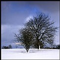
Amr, great that you like it  It's actually taken from the bottom of the tree, pointing upwards. The point being that these trees are unusual, since they are not "straight" but look more like giant corkscrews It's actually taken from the bottom of the tree, pointing upwards. The point being that these trees are unusual, since they are not "straight" but look more like giant corkscrews 
|
| Photo By: Thomas Voigtmann
(K:516)
|
|
|
Critique By:
Thomas Voigtmann (K:516)
3/24/2005 7:49:34 PM
That's a very good exposure, and the light is just great. You've obviously waited for the right moment.
|
| Photo By: Joe Liftik
(K:155)
|
|
|
Critique By:
Thomas Voigtmann (K:516)
3/24/2005 7:35:00 PM
Amr, I think it is amazing how you manage to get something unique out of these street shots that would turn out to be completely boring if I did them . Well done, bravo. The partial desaturation works particularly well here.
|
| Photo By: amr alim
(K:2767)
|
|
|
Critique By:
Thomas Voigtmann (K:516)
3/22/2005 11:03:43 AM
Now, that's an unusual image of the Golden Gate Bridge. Very nice and moody. I would maybe try to crop it a bit, getting rid of the too black foreground.
|
Photo By: Rob Graziano
(K:6678)

|
|
|
Critique By:
Thomas Voigtmann (K:516)
3/22/2005 11:01:47 AM
Nice contrast, between the shiny cars and the faded billboard.
|
| Photo By: Tom Miskiewicz
(K:119)
|
|
|
Critique By:
Thomas Voigtmann (K:516)
3/22/2005 11:00:37 AM
Haha, what a cat! You captured it in the perfect moment, great image.
|
| Photo By: barbara
(K:95)
|
|
|
Critique By:
Thomas Voigtmann (K:516)
3/22/2005 10:49:39 AM
Very interesting message, Amr. Life in decline. Have you tried cropping to cut off a bit of the white sky?
|
| Photo By: amr alim
(K:2767)
|
|
|
Critique By:
Thomas Voigtmann (K:516)
3/20/2005 5:35:32 PM
Parvin, are you scanning from the slide or from a print? I assume a proper slide/negative scanner should be able to do better.
|
| Photo By: parvin dabas
(K:2652)
|
|
|
Critique By:
Thomas Voigtmann (K:516)
3/20/2005 5:25:45 PM
Thanks Cliff! Yep, it's a meerkat, they are really cute and take turns "posing" 
|
| Photo By: Thomas Voigtmann
(K:516)
|
|
|
Critique By:
Thomas Voigtmann (K:516)
3/19/2005 5:17:54 PM
Very good composition and exposure! I guess I get what you mean, but the people are a bit too far away to convey that feeling. Nevertheless, wonderful shot. Thanks for sharing and thanks for your comment.
|
| Photo By: amr alim
(K:2767)
|
|
|
Critique By:
Thomas Voigtmann (K:516)
3/19/2005 5:00:20 PM
Hehe, a black-and-white tiger  Perfectly captured, I wouldn't even crop at all, it is good to have the trees adding their diagonals. Perfectly captured, I wouldn't even crop at all, it is good to have the trees adding their diagonals.
|
| Photo By: Dick van Breda
(K:4655)
|
|
|
Critique By:
Thomas Voigtmann (K:516)
3/19/2005 4:24:41 PM
Wow, the slow-sync flash really does it in this case. (Poor animals, though 
|
| Photo By: Mistral Vortex
(K:627)
|
|
|
Critique By:
Thomas Voigtmann (K:516)
3/19/2005 4:23:06 PM
Jeroen, are you implying that flash would have helped in this situation? If I was close enough to a bear to use my flash, I'd be terrified :-) Even so, it's a great shot, and I like the blurred water from the long exposure.
|
Photo By: Jeroen Wenting
(K:25317)

|
|
|
Critique By:
Thomas Voigtmann (K:516)
3/19/2005 4:16:02 PM
An absolutely delicate flower show, wow! The blue tips on the out-of-focus leaves make for an interesting effect.
|
| Photo By: Cliff Rosbotham
(K:2908)
|
|
|
Critique By:
Thomas Voigtmann (K:516)
3/19/2005 4:09:25 PM
Interesting effect; it's a shame the picture looks somewhat hazy. I assume the scan doesn't do the slide any justice!?
|
| Photo By: parvin dabas
(K:2652)
|
|
|
Critique By:
Thomas Voigtmann (K:516)
3/19/2005 4:00:07 PM
Very dramatic, and a nice angle - well done!
|
| Photo By: Antony Duvall
(K:41)
|
|
|
Critique By:
Thomas Voigtmann (K:516)
3/19/2005 3:48:55 PM
Khaled, thank you for your comments on my little series of images from this bridge (more to come eventually).
|
| Photo By: Thomas Voigtmann
(K:516)
|
|
|
Critique By:
Thomas Voigtmann (K:516)
3/19/2005 3:42:06 PM
Khaled, another impressive b/w from you! I did at first think it was a little dark, as others have said, but on the other hand I really like the strong contrast especially with his white beard and skarf. I guess you could only have brought some light into his eyes by changing the angle - but the angle you have chosen is just great.
|
| Photo By: Khaled Mursi Hammoud
(K:54005)
|
|
|
Critique By:
Thomas Voigtmann (K:516)
3/19/2005 3:36:27 PM
Romy, what a nice idea, and what a great result! The lonely cowboy  For some reason I even think that the little twig on the right hand side adds to the image. For some reason I even think that the little twig on the right hand side adds to the image.
|
| Photo By: Romy Fabian Garmaz
(K:17105)
|
|
|
Critique By:
Thomas Voigtmann (K:516)
3/18/2005 6:22:59 PM
What a great idea, making her pose between the clock (very symbolic...) and the painting of the young girl she must have been once. Great shot.
|
| Photo By: Tom Miskiewicz
(K:119)
|
|
|
Critique By:
Thomas Voigtmann (K:516)
3/18/2005 2:02:58 PM
Isn't it funny (and a shame) that those lions always seem to be in the shadow when you finally get there  Nice shot, interesting cropping. Nice shot, interesting cropping.
|
Photo By: Petal Wijnen
(K:50989)

|
|
|
Critique By:
Thomas Voigtmann (K:516)
3/17/2005 6:31:07 PM
Hi Alison, I'm still trying to figure out whether I should be pleased or not that my namesake is a turtle :-) It's a great composition! Did you try shooting it from the other side, though? Great to see that your focussing seems to work better now. Although I think the focus point might actually be slightly before the little chap - or am I wrong? Try to put the eyes into focus with highest priority in this kind of setup.
|
| Photo By: Alison Stroebel
(K:4069)
|
|
|
Critique By:
Thomas Voigtmann (K:516)
3/17/2005 4:40:54 PM
A great first, welcome! The lightning is absolutely great, and I like the way it renders the streetlamp very vividly, while reducing the trees to mere two-dimensional shadows.
|
| Photo By: OKsana
(K:31)
|
|
|
Critique By:
Thomas Voigtmann (K:516)
3/17/2005 4:25:29 PM
Hehe, a great variant of that famous photo taken in one of the towers of the Sagrada Familia in Barcelona :-) Yours seems to be an even better spot because of the see-through metallic spiral. Well captured.
|
| Photo By: Khaled Mursi Hammoud
(K:54005)
|
|
|
Critique By:
Thomas Voigtmann (K:516)
3/17/2005 4:21:14 PM
Great pose!
|
| Photo By: Tom Ziegler
(K:585)
|
|
