|
|
Critique By:
Matt Pals (K:1722)
9/20/2006 6:47:26 PM
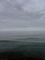
I have taken pictures at this exact spot, with nearly the same frame, with the tide maybe a little higher up and the sun a little further down... crazy.
matt
|
| Photo By: Jason Vaartstra
(K:181)
|
|
|
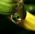
Critique By:
Matt Pals (K:1722)
5/13/2006 6:53:41 PM
good shot, nice sentiment. i your use of a shallow depth of field here.
matt
|
| Photo By: Miles Rouch
(K:410)
|
|
|
Critique By:
Matt Pals (K:1722)
4/14/2006 1:25:06 AM
Simple and lovely. the lighting is great.
matt
|
| Photo By: Sergio Cárdenas
(K:25028)
|
|
|
Critique By:
Matt Pals (K:1722)
3/26/2006 2:35:22 AM
What a fantastic image Carlos! The colors, and DOF are perfect. smart shot,
matt
|
Photo By: Carlos maidana
(K:203)

|
|
|
Critique By:
Matt Pals (K:1722)
3/15/2006 3:20:03 AM
So i guess i should say something.
I think this one blows my ol' original cliff falls away... My second version in sepia however, is a different enough shot to remain free of your upstaging antics 
I think the foreground ferns do wonders for the shot, giving it fantastic depth that was lacking in my original. Also, the wider angle was a give move, allowing you to included the second falls. Finally,the tones and range of colours here are fanastic.
Enough said, I ought not tell you about anymore of my spots.
good job jay,
matt
|
| Photo By: Jason Vaartstra
(K:181)
|
|
|
Critique By:
Matt Pals (K:1722)
3/15/2006 3:10:51 AM
The DOF really is great. As a whole, the image is very tidy and uniform... meanwhile the patterns and shodows throughout give it a clean complexity. also, thanks for your kind words.
matt
|
| Photo By: Claire Murray
(K:1479)
|
|
|
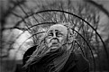
Critique By:
Matt Pals (K:1722)
3/14/2006 12:49:28 AM
The face is a litte blurry and hard to percieve. However, the background is great. i really like the depth of field and light distribution throughout it.
good stuff,
matt
|
| Photo By: David M Roberts
(K:914)
|
|
|
Critique By:
Matt Pals (K:1722)
3/6/2006 7:32:38 PM
This is a great shot with outstanding texture. I'm quite impressed with your portfolio. You manage to capture your subjects within a clean, and minimal context.
keep up the good work,
matt
|
| Photo By: Christopher Peace
(K:1340)
|
|
|
Critique By:
Matt Pals (K:1722)
3/6/2006 7:06:30 PM
what an absolutely surreal location...
nice portrayal.
matt
|
| Photo By: Nichol Rose
(K:1020)
|
|
|
Critique By:
Matt Pals (K:1722)
3/5/2006 10:47:21 PM
Cool. i like where you cropped the image. Nice grain and tones = overall tight composition.
matt
|
| Photo By: Marcin Terlecki
(K:83)
|
|
|
Critique By:
Matt Pals (K:1722)
3/5/2006 10:45:12 PM
A beautiful capture... good use of light. I find the lit details in the bottom right corner a little distracting. Perhaps burning that out would focus all attention where it out to.
good stuff.
matt
|
| Photo By: Cenk Tuna
(K:1015)
|
|
|
Critique By:
Matt Pals (K:1722)
3/5/2006 10:42:07 PM
Kinda boring. There is nothing that really catches my eye here. Something like a pier extending out into the frame or even a boat would give this image some subject.
matt
|
| Photo By: Cenk Tuna
(K:1015)
|
|
|
Critique By:
Matt Pals (K:1722)
3/5/2006 10:36:25 PM
An excellent composition. I like the texture of the image as well. Good call including the blanket at the bottom.
matt
|
| Photo By: SORRENTE Patrick
(K:3307)
|
|
|
Critique By:
Matt Pals (K:1722)
3/5/2006 7:33:12 PM
Absolutely fantastic. The DOF is perfect... Selective coloring works well here: bringing simplicity to the image.
well done
matt
|
| Photo By: Edin Dzeko
(K:543)
|
|
|
Critique By:
Matt Pals (K:1722)
3/4/2006 9:54:29 PM
Beautiful and delicate. The colors are very complimenting.
well done,
matt
|
| Photo By: Giuseppe Guadagno
(K:34002)
|
|
|
Critique By:
Matt Pals (K:1722)
2/26/2006 3:46:11 AM
Hey Anth, Dont be discouraged by the lack of critiques - they dont validate the photographs.
I think this is a great piece - A clean, well balanced image. It'd make a good album cover for say: Animal Collective.
matt
|
| Photo By: Anthony Hawkes
(K:15)
|
|
|
Critique By:
Matt Pals (K:1722)
2/26/2006 3:40:41 AM
Oh man, this is fantastic. The picture is suberply composed, and her expression is priceless. Conagrats on a splendid capture,
cheers
-matt
|
| Photo By: Pat Fruen
(K:12076)
|
|
|
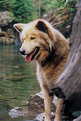
Critique By:
Matt Pals (K:1722)
2/21/2006 11:20:10 PM
"What an odd picture. The lighting is gorgeous. Has the image been stretched at all?" I was wondering about these things, and then i see the rat... out of left field. hehe, good stuff. This is a good conversation piece.
matt
|
| Photo By: brian underdown
(K:-960)
|
|
|
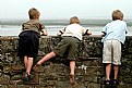
Critique By:
Matt Pals (K:1722)
2/21/2006 7:50:16 PM
This is a great a shot. Karina's idea of b&w is also a good one. My recommendation would be to crop out a bit of the left side, to balance the boys equally in the frame. And upon second look, the b&w version work fantastically with the differing shades of their shirts. light darker, darkest. Good stuff,
matt
|
| Photo By: Paolo Bergamelli
(K:687)
|
|
|
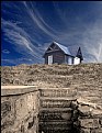
Critique By:
Matt Pals (K:1722)
2/18/2006 10:25:43 PM
Wow. A remarkable image, I like the border, it works well with the high contrast image. The foregeround really pulls you down the field to the horizon. I relly like this, thanks for sharing.
matt
|
| Photo By: brian underdown
(K:-960)
|
|
|
Critique By:
Matt Pals (K:1722)
2/18/2006 10:14:18 PM
Looks like this one got hit by the Usefilm automatic sharpening option too. nevertheless, a sweet capture. Good stuff,
matt
|
| Photo By: Meagan Beattie
(K:9)
|
|
|
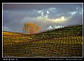
Critique By:
Matt Pals (K:1722)
2/18/2006 10:11:50 PM
I find any patterned orchards or fields difficult to capture on film... Sure, i can snap a shot down an aisle, but recreating the dizzying effect of the maze as you drive by is an entirely different accomplishment. Well, you've done that here. The complexity of the grid is gorgeous in this late-day light.
Thanks for sharing,
matt
|
| Photo By: Jim Goldstein
(K:21230)
|
|
|
Critique By:
Matt Pals (K:1722)
2/18/2006 10:03:11 PM
Nice portrait Meagan. Good choice of foreground and background. I see what you mean about some lost quality. Did you use the sharpening option when uploading it? i find that often reduces picture quality. Also, i hope you dont mind... but i played around with it in Photoshop a bit... what do you think?
|
| Photo By: Meagan Beattie
(K:9)
|
|
|
Critique By:
Matt Pals (K:1722)
2/18/2006 9:49:17 PM
This is a cool shot. How'd you do it?
matt
|
| Photo By: Anthony Hawkes
(K:15)
|
|
|
Critique By:
Matt Pals (K:1722)
2/18/2006 9:32:41 PM
Very minimalist. I like it, you ve captured the subtleties of the water very well.
thanks for your kind words,
matt
|
| Photo By: Dariusz Poborski
(K:604)
|
|
|
Critique By:
Matt Pals (K:1722)
2/18/2006 7:42:10 PM
Beautiful texture and color. I'd like to see this zoomed out a bit for a little more perspective. What kind of flora am i looking at?
matt
|
| Photo By: Rich Swanner
(K:-3732)
|
|
|
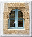
Critique By:
Matt Pals (K:1722)
2/18/2006 7:34:43 PM
Nice shot. I like the depth of the image. There is the brick, then the pane, then the curtains beyond that. Also, you have captured great detail and texture.
thanks for your kind words,
matt
|
| Photo By: Diego Bullita
(K:17017)
|
|
|
Critique By:
Matt Pals (K:1722)
2/18/2006 7:29:07 PM
I like the surrounding blur. It gives the image a nice sense of action.
matt
|
| Photo By: JakeLM
(K:3365)
|
|
|
Critique By:
Matt Pals (K:1722)
2/11/2006 6:39:44 AM
Fanastic contrasts here... I would sugest reposting this image but without sharpening the image. It has resulted in a rather grainy image.
matt
|
| Photo By: Mark Julian
(K:36866)
|
|
|
Critique By:
Matt Pals (K:1722)
1/18/2006 9:04:12 PM
This sky is made that much more majestic with this great angle - below ground level. You have capture the shot within stunning depths.
matt
|
| Photo By: KEVIN TEMPLE
(K:8657)
|
|