|
|
Critique By:
Matt Pals (K:1722)
6/12/2007 4:04:36 AM
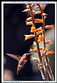
This was an impressive shot even while I figured you had a zoom lens... Quite the capture with your macro.
Well done!
|
| Photo By: Dale T
(K:77)
|
|
|
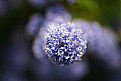
Critique By:
Matt Pals (K:1722)
6/1/2007 5:06:56 AM
this is gorgeous, and deserves a few more comments.
|
| Photo By: James Lee
(K:4790)
|
|
|
Critique By:
Matt Pals (K:1722)
5/26/2007 6:53:18 AM
I thought about cropping out the road and the grass, but it looked like I was chopping off the bottom of the barns. In hindsight, i think it would work if i cut out the road and left the grass...
thanks for the comments,
|
| Photo By: Matt Pals
(K:1722)
|
|
|
Critique By:
Matt Pals (K:1722)
5/22/2007 8:09:54 PM
Stunning image. The detail and dof is perfect.
this shot is strangely similar to my most recent post:
http://www.usefilm.com/Image.asp?ID=1306782
|
| Photo By: Janet Lee
(K:357)
|
|
|
Critique By:
Matt Pals (K:1722)
5/22/2007 8:06:23 PM
Fantastically composed. It has a lovely similarity to stained glass.
Well done,
matt
|
| Photo By: samer
(K:118)
|
|
|
Critique By:
Matt Pals (K:1722)
5/11/2007 6:04:05 PM
lovely work
|
| Photo By: Abdul Kadir Audah
(K:-21)
|
|
|
Critique By:
Matt Pals (K:1722)
4/17/2007 10:47:36 PM
Its a gorgeous location, and I really like the tones. Your model seems a little out of place in this environment though. ...like she'd be a better fit in a concert recital rather than a decrepit alley.
|
| Photo By: Dardan Zhegrova
(K:-87)
|
|
|
Critique By:
Matt Pals (K:1722)
4/17/2007 10:43:13 PM
Stunning image. I like this project, and this is the strongest of the 4 so far.
well done,
matt
|
Photo By: Peter De Rycke
(K:41212)

|
|
|
Critique By:
Matt Pals (K:1722)
4/17/2007 10:40:40 PM
Haha, ummm... I dont exactly how to interpret this but its a well composed picture.
looks like a thick soup.
matt
|
| Photo By: michael hadley
(K:373)
|
|
|
Critique By:
Matt Pals (K:1722)
4/17/2007 10:39:07 PM
Obviously incredible. Expect some fanfare for this one...
matt
|
| Photo By: Marek Szymanski
(K:1001)
|
|
|
Critique By:
Matt Pals (K:1722)
4/16/2007 7:01:02 PM
Nice Effect. Such attempts often have poor results but this is very well done.
matt
|
| Photo By: zet ka
(K:1411)
|
|
|
Critique By:
Matt Pals (K:1722)
4/16/2007 6:51:37 PM
Mike said it well. This is all around a brilliantly composed shot, nearing perfection.
This deserves more attention.
matt
|
| Photo By: Chris Brown
(K:1000)
|
|
|
Critique By:
Matt Pals (K:1722)
4/14/2007 7:46:44 PM
Gorgeous composition. Your photos consistently capture the dramatics of landscapes. Keep up the good work.
matt
|
| Photo By: Alberto Romano
(K:2407)
|
|
|
Critique By:
Matt Pals (K:1722)
4/14/2007 7:43:19 PM
Nice and simple. Great colors and textures. Well done.
I notice some quality loss on the stem though, where the pixels are showing.
matt
|
| Photo By: Francisca Ramirez
(K:336)
|
|
|
Critique By:
Matt Pals (K:1722)
4/14/2007 7:34:02 PM
A gorgeous location indeed. Some more thought could have gone into framing and composition though. I wouldnt have those sticks in the foreground, and a wider, or maybe horizontal perspective could give more context.
matt.
|
| Photo By: Don Loseke
(K:32503)
|
|
|
Critique By:
Matt Pals (K:1722)
4/14/2007 7:28:59 PM
Nice colors and arrangement. The detail is great as well.
matt
|
| Photo By: Richard Carrozza
(K:1201)
|
|
|
Critique By:
Matt Pals (K:1722)
4/14/2007 7:18:13 PM
Gorgeous colors and lighting. The subtle background compliments well.
matt
|
| Photo By: James Morse
(K:296)
|
|
|
Critique By:
Matt Pals (K:1722)
4/14/2007 7:14:09 PM
odd.... I wish the pumpkin fellow were in a more natural position; he seems awkward.
matt
|
| Photo By: James Morse
(K:296)
|
|
|
Critique By:
Matt Pals (K:1722)
4/14/2007 7:10:17 PM
Nice colors, and sense of movement. This could be great if her face were more clear.
good job,
matt
|
| Photo By: Rob Burgoyne
(K:-1207)
|
|
|
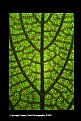
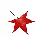
Critique By:
Matt Pals (K:1722)
1/10/2007 11:08:41 PM
Beautifully illuminated. If you burned out the stem you could make it appear as though the leaf is in free fall... if your into that sort of deception. :)
matt
|
| Photo By: ali shokri
(K:1611)
|
|
|
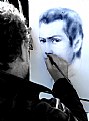
Critique By:
Matt Pals (K:1722)
1/9/2007 11:10:00 PM
Beautiful picture. I like the contrast of color and b&w between the canvas and reality. good idea.
matt
|
| Photo By: Barry Fox
(K:464)
|
|
|
Critique By:
Matt Pals (K:1722)
1/9/2007 11:08:04 PM
Lovely tones... I like the grainy effect as well, i t works well.
matt
|
| Photo By: Larissa Nazarova
(K:12118)
|
|
|
Critique By:
Matt Pals (K:1722)
12/2/2006 9:04:42 PM
Gorgeous tones... i a mhaving a hard time orienting myself, figuring out what is goin on here.
matt
|
| Photo By: T. o
(K:-60)
|
|
|
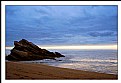
Critique By:
Matt Pals (K:1722)
9/24/2006 8:32:11 PM
Nice silhouette, those are some crazy colors... how true are they? Also, i would try cropping out the land at the top.. maybe a long, panoramic crop?
matt
|
| Photo By: Larry Fosse
(K:66493)
|
|
|
Critique By:
Matt Pals (K:1722)
9/24/2006 8:25:05 PM
This is a great shot, and it is unfortunate that I am the first to say so. The crop works really well, the colors are nice... it could be a little sharper though.
Any SLR owner can take a 3 second exposure of moving water, or bump up saturation for an image and get a half dozen comments. Your portfolio may not get a ton of comments, but it is impressive. Your perspective, and what you choose to frame is unique.
I like,
matt
|
| Photo By: Miles Rouch
(K:410)
|
|
|
Critique By:
Matt Pals (K:1722)
9/20/2006 6:47:26 PM
I have taken pictures at this exact spot, with nearly the same frame, with the tide maybe a little higher up and the sun a little further down... crazy.
matt
|
| Photo By: Jason Vaartstra
(K:181)
|
|
|
Critique By:
Matt Pals (K:1722)
5/13/2006 6:53:41 PM
good shot, nice sentiment. i your use of a shallow depth of field here.
matt
|
| Photo By: Miles Rouch
(K:410)
|
|
|
Critique By:
Matt Pals (K:1722)
4/14/2006 1:25:06 AM
Simple and lovely. the lighting is great.
matt
|
| Photo By: Sergio Cárdenas
(K:25028)
|
|
|
Critique By:
Matt Pals (K:1722)
3/26/2006 2:35:22 AM
What a fantastic image Carlos! The colors, and DOF are perfect. smart shot,
matt
|
| Photo By: Carlos maidana
(K:203)
|
|
|
Critique By:
Matt Pals (K:1722)
3/15/2006 3:20:03 AM
So i guess i should say something.
I think this one blows my ol' original cliff falls away... My second version in sepia however, is a different enough shot to remain free of your upstaging antics 
I think the foreground ferns do wonders for the shot, giving it fantastic depth that was lacking in my original. Also, the wider angle was a give move, allowing you to included the second falls. Finally,the tones and range of colours here are fanastic.
Enough said, I ought not tell you about anymore of my spots.
good job jay,
matt
|
| Photo By: Jason Vaartstra
(K:181)
|
|

")