|
|
Critique By:
Harry Jasper (K:2913)
2/14/2004 11:36:40 AM
Very nice picture, unbelievable that this little creature can kill you.
|
| Photo By: Brian Hynes
(K:522)
|
|
|
Critique By:
Ryan Blades (K:623)
12/2/2003 7:59:26 PM
MMMMMmmmmm... something so ugly, to something so delicious  heh heh
Nice shot!
Ryan~
|
| Photo By: Brian Hynes
(K:522)
|
|
|
Critique By:
sandy c. hopkins (K:17107)
11/15/2003 6:59:14 PM
hi brian can't believe i forgot to rate this!
hope all is well..
 ) )
|
| Photo By: Brian Hynes
(K:522)
|
|
|
Critique By:
sandy c. hopkins (K:17107)
11/10/2003 9:56:28 AM
they are all the same??
you did great here brian~~
hope all is well..
|
| Photo By: Brian Hynes
(K:522)
|
|
|
Critique By:
Ordilei Caldeira (K:2545)
11/9/2003 9:19:26 PM
Beautyful.
|
| Photo By: Brian Hynes
(K:522)
|
|
|
Critique By:
JL E (K:9693)
11/6/2003 12:59:59 PM
Excellent photo!
Cheers,
Jose
|
| Photo By: Brian Hynes
(K:522)
|
|
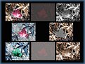
|
Critique By:
Raymund Macaalay (K:7218)
11/4/2003 2:17:00 AM
As I walk through your portfolio I see that most of your images are fantasy like in perspective and starting to deliver great images in this respect, Like this one, i feel like fairies will just come out while staring at this one. Great Job Brian
|
| Photo By: Brian Hynes
(K:522)
|
|
|
Critique By:
Brian Hynes (K:522)
10/30/2003 4:32:06 PM
Thanks Raymund - They are all the same...
|
| Photo By: Brian Hynes
(K:522)
|
|
|
Critique By:
Keith Banham (K:1306)
10/30/2003 2:34:35 PM
Classic shot Brian. Love it.
regards,
Keith
|
| Photo By: Brian Hynes
(K:522)
|
|
|
Critique By:
Keith Banham (K:1306)
10/29/2003 10:21:09 PM
Hi Brian,
Great shot. Works well apart from the pale sky. Have you thought about using a tabacco tinted filter? Nice work.
Keith
|
| Photo By: Brian Hynes
(K:522)
|
|
|
Critique By:
Raymund Macaalay (K:7218)
10/29/2003 7:51:10 PM
Excellent presentation Brian, Great Job, are all of these same images?
|
| Photo By: Brian Hynes
(K:522)
|
|
|
Critique By:
sandy c. hopkins (K:17107)
10/28/2003 2:17:07 PM
very nice brian!!
the colors are really beautiful and i like your composition..hope all is well...you really are gettin good at this!!
nice work.
sandy
|
| Photo By: Brian Hynes
(K:522)
|
|
|
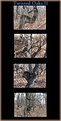
Critique By:
Janis Shaw (K:4)
10/27/2003 10:01:40 AM
Very nice - certainly creative
Janis
|
| Photo By: Brian Hynes
(K:522)
|
|
|
Critique By:
Harald Felgentreu (K:2096)
10/25/2003 10:02:59 PM
Hi
Brain
nice work
regards Harald
|
| Photo By: Brian Hynes
(K:522)
|
|
|
Critique By:
Idézio Junior (K:1046)
10/23/2003 7:57:46 PM
Very clever and beautiful composition.
|
| Photo By: Brian Hynes
(K:522)
|
|
|
Critique By:
Amancio Couto (K:15720)
10/22/2003 11:40:29 PM
EXCELLENT work!...congrats Brian!
|
| Photo By: Brian Hynes
(K:522)
|
|
|
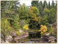
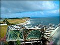
Critique By:
Spencer E. (K:4032)
10/21/2003 9:00:43 PM
Excellent macro... One question, WHY ARE YOU HOLDING IT!?!?!?!? : )
|
| Photo By: Brian Hynes
(K:522)
|
|
|
Critique By:
Raymund Macaalay (K:7218)
10/21/2003 8:00:18 PM
Hey Brian, this is one perfect macro shot! Look at the details on the skin and nails, The joints on the Ticks legs, they were perfectly capture, Nice Work
|
| Photo By: Brian Hynes
(K:522)
|
|
|
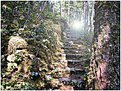
Critique By:
sandy c. hopkins (K:17107)
10/20/2003 8:54:33 PM
very nice brian....
they almost seem in angiush from having to stand for a hundred years...
good job...
|
| Photo By: Brian Hynes
(K:522)
|
|
|
Critique By:
Raymund Macaalay (K:7218)
10/20/2003 8:27:07 PM
Now it looks better and creepy
Looks like its a blair witch project
|
| Photo By: Brian Hynes
(K:522)
|
|
|
Critique By:
Crizl Rae (K:232)
10/20/2003 8:08:17 PM
This would have been better if its black and white, But still a great job!!!
|
| Photo By: Brian Hynes
(K:522)
|
|
|
Critique By:
Pat Fruen (K:12076)
10/20/2003 7:08:01 PM
Very interesting concept. Could you maybe increase the contrast a bit? Nice work.
|
| Photo By: Brian Hynes
(K:522)
|
|
|
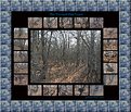
Critique By:
sandy c. hopkins (K:17107)
10/20/2003 1:24:58 PM
brian this is great...
i agree about the border...
i like the tree border better
i think the blue takes a way from it...
now to the good stuff...
you have captured some great gnarled trees with tons of character..i really like this and the contrast against the black...
sandy
|
| Photo By: Brian Hynes
(K:522)
|
|
|
Critique By:
Christine Campbell (K:2693)
10/20/2003 12:52:57 PM
Hi Brian,
I like the photo of the forest and the smaller details of the trees. However, I would get rid of the border. It's too obviously Photoshopped, repetitive, and distracts from the rest of the image. As much as I love Photoshop, I hate to 'see' it, if that makes sense. Also, without the border you'll have more canvas for the center photo so it doesn't loose as much quality and the finer details will be more noticable. I'd like to see the larger photo take more of the emphasis. Maybe desaturating the outer images and even making them a bit smaller would work. As it is right now, it looks like something you'd put on a website with mouseovers.
Raymond, I like your idea for presentation also.
|
| Photo By: Brian Hynes
(K:522)
|
|
|
Critique By:
Brian Hynes (K:522)
10/19/2003 9:41:01 PM
Raymund - I think you may have something here.
Best Regards Brian
|
| Photo By: Brian Hynes
(K:522)
|
|
|
Critique By:
Raymund Macaalay (K:7218)
10/19/2003 9:09:07 PM
This is what im thinking about, and place multiple images same as this, What do you think? Just a thought
|
| Photo By: Brian Hynes
(K:522)
|
|
|
Critique By:
Brian Hynes (K:522)
10/19/2003 9:08:06 PM
Thanks Raymund - I will post one of the better ones tomorrow for your comments.
Thank you very must for your offer to help.
Brian
|
| Photo By: Brian Hynes
(K:522)
|
|
|
Critique By:
Raymund Macaalay (K:7218)
10/19/2003 9:00:17 PM
If you could just post larger images and present it in a different way, It would be better if you present it like it is in negatives and layed out on a flat surface, make it rusty or grainy then black and white or sepia which will give it a more gloomy effect... If you could just post your images I'm glad to help you
|
| Photo By: Brian Hynes
(K:522)
|
|
|
Critique By:
Idézio Junior (K:1046)
10/19/2003 6:00:01 PM
I like this composition, creative. Thanks for your comment.
|
| Photo By: Brian Hynes
(K:522)
|
|
|
Critique By:
Vicki Bentley (K:5080)
10/18/2003 9:26:33 PM
Like the composition. I think it could be sharper, and your horizon needs to be leveled. Very good effort, however. Regards.
|
| Photo By: Brian Hynes
(K:522)
|
|