|
|
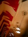
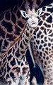
Critique By:
Ken Draper (K:700)
11/19/2004 5:24:30 AM
Now here is a creative capture! I really like this and wouldnt have thought of it myself. shame on me and congrats to you! Kenny
|
| Photo By: kathleen fonseca
(K:11992)
|
|
|
Critique By:
Ken Draper (K:700)
11/19/2004 5:23:22 AM
well composed technically in thirds and like many of my own oils and after effect added shots, doesnt display all the details as clearly as it would full size. I can tell by even this smaller image that its well done. Nice work. Kenny
|
| Photo By: Royce Emley
(K:84)
|
|
|
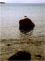
Critique By:
Ken Draper (K:700)
11/19/2004 5:19:50 AM
Im surprised theres no comments here Kathleen. this looks suitable for commerical ads work, clear, creatively composed and a quietly powerful image. Nice job. Kenny
|
| Photo By: kathleen fonseca
(K:11992)
|
|
|
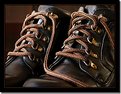
Critique By:
Ken Draper (K:700)
11/19/2004 5:17:10 AM
wow, great clear sharp grabbing the eye image. Whod have thought a pair of boots and laces could be so dynamic. Great composition and clarity here, congrats! Kenny
|
| Photo By: Nitish Kanabar
(K:2618)
|
|
|
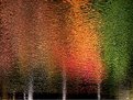
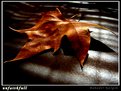
Critique By:
Ken Draper (K:700)
11/17/2004 5:10:26 AM
First glance had me wondering what neat effect you used and then to find its a natural reflection I liked it even more. Great capture and presentation. Kenny
|
Photo By: Warren Simons
(K:741)

|
|
|
Critique By:
Ken Draper (K:700)
12/8/2003 5:52:07 PM
What a delighfully creative capture, great eye and wonderful lighting and tones make this special..I wish I had thought of it! great shot, Kenny
|
| Photo By: Bahadir k
(K:8825)
|
|
|
Critique By:
Ken Draper (K:700)
11/28/2003 9:46:33 PM
This is a quiet yet powerful composition and not grainy in the low light. Id love to see this one full size. Nice Job, Kenny
|
| Photo By: Roland Le Gall
(K:7018)
|
|
|
Critique By:
Ken Draper (K:700)
11/26/2003 7:19:35 AM
this version also didnt load properly, perhaps a tad too big yet , becuase a thin red border is missing and my logo is blurred. oftne happens in downloads. sorry. Im also attaching a copy of the pre makeover shot. Can you see why She felt so great about her makeover? Her whole personality changed with the excitement of it, more outgoing. positive and cheerful and when I walked in the the makeover shot , I walked right past her without recognizing her. Kenny
|
| Photo By: Ken Draper
(K:700)
|
|
|
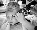
Critique By:
Ken Draper (K:700)
11/25/2003 5:32:57 PM
thanks to all for the nice comments. FYI this is my only grandchild and I had been hoping to get him in such a setting but hadnt been to the barber shop with him til now. I recalled my own grandfather cutting my hair and how I tried not to move so the recreation in BW was an attempt to recapture that old image from my childhood.
Ive been experimenting with the BW conversions and found that by increasing color in original, before converting to BW, then adding a touch of pencil or charcoal in separate layer and selectively erasing to areas I want it, it increases detail. I also blew it up and used the burn tool on eyelashes and brows since his hair is so light after blowing it up used 15 to 30 percent darken RGB on areas like dark spots in hair hair and shadow under nose. The Hands of the barber were appeared more in focus because I used the darken RFB tool on creases of hands, thumbnail edges and shading on left back of hand to give appearance of sharper focus. all at low opacity. Ive just been experiementing but it does seem to give more depth to the standard conversions. As a tip, Ive found also that by adding a light layer of oil to animals, horses coats, dog fur etc, then converting to bw, it gives a special depth to the overall image and appearance of better contrast also. Ive had little luck with destaturating and had to make do with these methods. I will figure out more as I go hopefully. Its unbelievable how many options there are for processing photos and im still a beginner but love it. If you have any of your own tricks for enhancing color to BW photos, Id love to hear them. Kenny
ps to Sandy, was that last comment for me or a Dave?
|
| Photo By: Ken Draper
(K:700)
|
|
|
Critique By:
Ken Draper (K:700)
11/24/2003 10:33:05 PM
This is one of your best renditions yet Sandy! This is a unique composition and subject , well let and very interesting. Great job! I am learning new compostions from your work, Kenny
|
| Photo By: sandy c. hopkins
(K:17107)
|
|
|
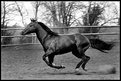
Critique By:
Ken Draper (K:700)
11/23/2003 11:17:26 PM
you did a nice job of capturing the motion here at that shutter speed pete. The horse is in focus and background just slightly blurred so you did a great pan job on this one. One thing Ive done in most of mine, that have similar backgrounds of fences etc, is to level them even if the arenas arent level (which i find most arent lol). It allows full focus on the subject without distraction of eneven background. this one is just about 1. or 1.5 off level and is a one click fix and recrop. I just started shooting horses myself (not not that kind of shooting) the last few months and find them to be powerful images, such muscle, mass and grace all rolled into one. I draw great peace from working with them and the images are among my most viewed pix in all my webshots galleries.
|
| Photo By: Pete Woronowski
(K:53)
|
|
|
Critique By:
Ken Draper (K:700)
11/23/2003 11:10:49 PM
this is a special subject and I wish it was sharper. It seems the background is sharper than the subject. It appears the same as some ive done on auto landscape mode when focusing on the subject instead of the forground to bring subject into the DOF focus. Still an interesting pic but I dont think it did your expressive model justice. Id like to see more pix of this subject. Something special in that face. regards Kenny
|
| Photo By: sandy c. hopkins
(K:17107)
|
|
|
Critique By:
Ken Draper (K:700)
11/23/2003 11:07:12 PM
HI Sandy , this is a strong image and evokes much more feeling in the BW than the original color. I like the grain and crop and intense feel to it youve provided in crop and processing. You have a keen eye for the picture within a picture and the feelings attached to each that are enhanced by your composition. Regards Kenny
|
| Photo By: sandy c. hopkins
(K:17107)
|
|
|
Critique By:
Ken Draper (K:700)
11/23/2003 6:30:53 PM
another sharp image here and i have no idea what is wrong with it as it certainly held up comrpesson wise on my monitor. By the way, how many cameras do you own? lol This seemed more like a D60 clarity at first and im in the market for a new camera or two so might have to check some of yours out. The images are of highest quality. regards Kenny
|
| Photo By: Sylvia Jones
(K:652)
|
|
|
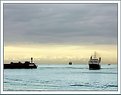
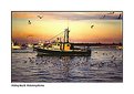
Critique By:
Ken Draper (K:700)
11/23/2003 6:27:42 PM
wow some great pics in your portfolio for sure and this one grabs the eye right off. I can see the dilema in cropping but think you did it just right. allowing for the larger flock of birds to show and yet not over crop the front where you would have had an even smaller section of the background boat and would have been distracting and appeared indistinct. as it is the crop looks natural on the little boat and all the birds are framed well. Colors wonderful and Im amazed there werent more comments here so I added mine to this nice pic. regards, Kenny
|
| Photo By: Sylvia Jones
(K:652)
|
|
|
Critique By:
Ken Draper (K:700)
11/17/2003 10:21:33 AM
thanks Ricardo, in regards to soft, its a problem I have converting poster sized hi res images down to the limitations of this site for submission. so much data in such a tiny space. usually it appears ok down to 98x10 but in this small format they appear soft, especially landscapes. you can tell the compression effect by looking at my logo and seeing how much it blurs when reduced. I usually shoot in tiff format and to even get the logs to show clearly after reduction have to add many at the end of the process. I have found that the same photos also look wonderful as oil or water color conversions and do a lot of that for friends and for my personal taste, but those would appear even softer here and lost way too much detail. If you know how to make them appear sharper in here let me know. its kinda like getting 10 lbs of crud in a 1 lb sack if you know what I mean lol kenny
|
| Photo By: Ken Draper
(K:700)
|
|
|
Critique By:
Ken Draper (K:700)
11/17/2003 10:11:14 AM
thanks Ricardo, you hit it right on the head. So much beauty in the world to enjoy and share outside the dark side i dealt with everyday. It made me appreciate life and gives me a special peace finding and capturing, even enhancing scenes. regards kenny
|
| Photo By: Ken Draper
(K:700)
|
|
|
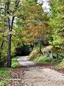
Critique By:
Ken Draper (K:700)
11/17/2003 8:52:59 AM
you really captured the flow perfectly here Paul and seem to be getting your wish to produce quality photos. I noticed, like me, you seldom use a tripod in your other pix and thoughh the compositions are nice , they are usually off focus from the long exposure, low light camera shake. I have my own method for avoid that but in really low light, you might just grab a tripod. This one appeared a bit dark on my monitor and I thought it might show more detail if contrast was adjusted and some saturation increased n leaves and rocks so I used screen capture to play with it. I created a copy, adjusted contrast lighter, increased saturation 15 percent on leaves, rocks and then layered back together at about 80 percent to allow all the details to be viewed. Im not sure how it displays on userfilm or its just my monitor thats dark but it seems to show all the beautiful details of the scene here. just an idea and of course your own taste in the scene must prevail. nice job, Kenny
|
| Photo By: Paul's Photos
(K:35235)
|
|
|
Critique By:
Ken Draper (K:700)
11/16/2003 9:34:19 AM
this is powerful and touching photo, a moment well captured for all time. Nice crop and the lighting and overall tones blend well in this work. How nice to have an image that is not only well composted but a valued life moment captured for all time. Kenny
|
| Photo By: Hugo Pierre
(K:15692)
|
|
|
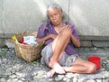
Critique By:
Ken Draper (K:700)
11/16/2003 8:39:35 AM
excellent capture here ! Some of my best shots were random people just as I found them, more of documentary style. This one has great emotional impact. great job, kenny Kenny
|
| Photo By: Dr@gon's Baby
(K:1011)
|
|
|
Critique By:
Ken Draper (K:700)
11/15/2003 10:32:02 PM
wonderful lighting, sharp contrast and focus. Any tech tips you could offer here to explain how you created it? thanks Kenny
|
| Photo By: Nick Pashchenko
(K:88)
|
|
|
Critique By:
Ken Draper (K:700)
11/15/2003 10:22:18 PM
beautiful image and the drops of water from the swans bill are perfect touch. Id have cropped just a touch from top at the hot spot, no much just a tweek, so it doesnt draw the eye away from the subject. I used my screen capture to compare and think it does soften the image. beautiful shot either way, Kenny
|
| Photo By: Donna Johnson
(K:9906)
|
|
|
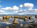
Critique By:
Ken Draper (K:700)
11/15/2003 10:15:17 PM
Wow , wonderful clarity and tru color here, looks like a commercial pic and very dramatic contrasts . Id love to get this quality in my pix. as far as the sky, its fine here. just ads more depth color and contrast vs a tighter crop. Frame this one! Kenny
|
| Photo By: Donna Johnson
(K:9906)
|
|
|
Critique By:
Ken Draper (K:700)
11/15/2003 10:11:10 PM
great pic Gabry! has a lot of personality in this strays face. I love shots like this. Your portolio shows you have a natural eye for composition. NIce work. Kenny
|
| Photo By: Gabriella Carta
(K:22879)
|
|
|
Critique By:
Ken Draper (K:700)
11/15/2003 8:57:12 PM
Nice capture here Julie. Id love to get such a composition opportunity. I like the way Julie's own pattern is framed by the background patterns. I did scroll to reframe after noticing the top of julies legs seem a bit blurry compared to the rest of the image. IMO if you cropped at the v of the chest, above the legs. the entire pic would seem in sharp focus or at least appearnce of balanced DOF. Nice job, thanks for sharing. Ken
|
| Photo By: Anna Boudreau
(K:16)
|
|
|
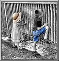
Critique By:
Ken Draper (K:700)
11/15/2003 5:50:00 PM
Bob, Thanks foryour comment yet im confused as to what you are referring to about verticle lines not being vertical. Unless you are referring the the area of fence to the left of Katie. Due to proximity and perspective looking down on the small children. I only worried about DOF on them for sharpest focus, and on the foreground section of fencing, where I also made sure the pickets were vertical. Due to angle it was a natural distortion of the far pickets at that range. I was more concerned with getting good profiles of them with faces and hands on fence or would have just shot it straight on from behind and had the vertical fence pickets level all the way. I dont think the photo would have had near as much charm and impact that way though. Remember also this is a poster sized image, cropped down a bit too. I was going to level completely but wanted the top rail to enlarge naturally as it goes away from lens also for more natural perspective also. I am interested in how this could have been done differenty so please feel free to explain. I was just happy they fell into that pose naturally and that I snapped the pic quickly enough to capture them that way. I will attach the cropped original color version for comparison also. thanks Ken
|
| Photo By: Ken Draper
(K:700)
|
|
|
Critique By:
Ken Draper (K:700)
11/12/2003 9:16:59 PM
I like the overall tone of this photo and you did a good job presenting the natural attractiveness of this model thru lighting, angle and pose. The photo would have done that no matter what size she was. On the other hand I found the tight crop cutting off the fingers of the left hand was distracting. It pulled away from teh natural focus from the models face down to her cleavage, which flowed in a nice line. Good overall job though and no Id never call this model fat. I think that was in poort taste and perhaps just a poor choice of words due to language. I hope so. I would like to do more boudior photos and know that not all my models are not the petite barbie types, yet it have their own sensual and sexual natures and personalites that is my job to bring out and capture. It can be a challenge and yet rewarding to see them with a positive self image after reviewing the their photos. Keep up the good work, Ken
|
| Photo By: ppdix
(K:17069)
|
|
|
Critique By:
Ken Draper (K:700)
11/12/2003 12:55:12 PM
thanks Francis, this pic was actually poster sized and there were more window sectons to the left that had a bright glare in them from the overcast sky outside. I made two layers of the photo at different contrasts. layered them back together, then cropped more of the window out to get the least amount of glare and lower the amount of window glare area. It came out nicely. Kenny
|
| Photo By: Ken Draper
(K:700)
|
|
|
Critique By:
Ken Draper (K:700)
11/12/2003 1:28:46 AM
thanks for your comments, and no I didnt pose Clovis that way. He does it naturally. He also likes to climb up on a box and hang his head over the top. I may submit another photo of that. He had such a sweet personality I could have easily smuggled him home on the plane with me...
|
| Photo By: Ken Draper
(K:700)
|
|
|
Critique By:
Ken Draper (K:700)
11/11/2003 11:54:07 PM
thanks for taking the time to view my pic Gerardo . In response to your question, this is a 30x36 300 dpi original photo reduced to 640 pixel image and doesnt show near as well here reduced. I only shoot in my largest resolution, so I encounter that often when submitting photos that have to be reduced and compressed so much. Ken
|
| Photo By: Ken Draper
(K:700)
|
|