|
|
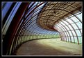
Critique By:
Nick Russill (K:929)
10/5/2004 3:13:51 PM
very nice shot. It is reminiscent of one I took this weekend - I did not see yours before - honest!
|
| Photo By: Steven B. Poitinger
(K:1757)
|
|
|
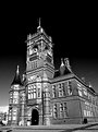
Critique By:
Nick Russill (K:929)
10/5/2004 3:11:26 PM
I like this shot a lot. The choice of B/W works very well. Well spotted!
Nick
|
| Photo By: SORRENTE Patrick
(K:3307)
|
|
|
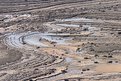
Critique By:
Nick Russill (K:929)
10/5/2004 3:09:26 PM
Hi Arjan
Great dramatic shot, but it could be improved a bit if you:
1. do not clip the river on the RHS
2. the horizon looks a little crooked
3. the sky is as dramatic as the canyon, but it is overexposed and there is not enough of it.
You used a great lens (I have one!), so maybe you could have made a panorama of several portrait shots and stitched them together?
Great effort anyway - congratulations.. Nick
|
| Photo By: Arjan van Leeuwen
(K:153)
|
|
|
Critique By:
Nick Russill (K:929)
10/4/2004 6:33:09 AM
Ingrid, I love this shot - great composition and exposure. You can almost feel the puppy's mix of enthusiasm and battle with the snow!
|
Photo By: Ingrid Mathews
(K:7277)

|
|
|
Critique By:
Nick Russill (K:929)
10/2/2004 8:33:13 PM
Great digital shot Milton - I like the two profiles of the mountains, the mist / smoke and the subtle colours. 10/10
Nick
|
| Photo By: Milton Louizidis
(K:1406)
|
|
|
Critique By:
Nick Russill (K:929)
10/2/2004 7:55:10 PM
Nice composition and crop Larry. How did you get the faded colour effect?
Cheers
Nick
|
| Photo By: larry white
(K:368)
|
|
|
Critique By:
Nick Russill (K:929)
9/26/2004 6:51:48 PM
Nice one Stephen. Fantastic colours, light focus and exposure! Can't really fault it!
All the best
Nick
|
| Photo By: Stephen Smith
(K:861)
|
|
|
Critique By:
Nick Russill (K:929)
9/14/2004 3:12:38 PM
Great shot - just goes to show that once your eye is in, you can spot a good photo opportunity anywhere!
The focus is spot on too and the blurring of the window captures the motion of the train.
|
| Photo By: lavendu ...
(K:4882)
|
|
|
Critique By:
Nick Russill (K:929)
9/14/2004 3:10:12 PM
Fantastic composition and depth of field! One of those shots that would look good printed BIG
|
| Photo By: Raquel Osorio
(K:947)
|
|
|
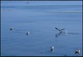
Critique By:
Nick Russill (K:929)
9/14/2004 3:08:02 PM
Nice one Raquel. Like the three gulls doing, as you say, watching the big bird take off!
|
| Photo By: Raquel Osorio
(K:947)
|
|
|
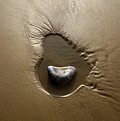
Critique By:
Nick Russill (K:929)
8/9/2004 1:27:16 PM
Nice one Ryan. I like the focus and composition and choice of BW. The missing reference for scale is good as it makes you think about what this object could be!
|
| Photo By: Ryan McMillen
(K:1218)
|
|
|
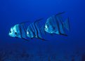
Critique By:
Nick Russill (K:929)
8/9/2004 1:25:39 PM
Great composition and lighting Dave. Would make a nice poster if someone was in to fishy type things. I never thought fish could have different facial expressions!
|
| Photo By: Dave Scranney
(K:101)
|
|
|
Critique By:
Nick Russill (K:929)
7/1/2004 2:14:50 PM
Hey Dave, this pic tells 1000 words!
Who is the guy in the background? Is it Kenny D or is it ...
Cheers
Nick
|
| Photo By: Dave Scranney
(K:101)
|
|
|
Critique By:
Nick Russill (K:929)
6/10/2004 11:44:58 AM
Dave, nice BW shot and mesmerising lines. Hope you watched your a**e when you took it (or were you driving along 
Cheers
Nick
|
| Photo By: Dave Scranney
(K:101)
|
|
|
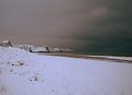
Critique By:
Nick Russill (K:929)
5/15/2004 5:54:11 PM
Nice one Dave. I know a great website called snow-forecast.com that might want to use this one! Would that be ok?
|
| Photo By: Dave Scranney
(K:101)
|
|
|
Critique By:
Nick Russill (K:929)
5/7/2004 4:48:59 PM
Good points, but now we see the benefits of a dSLR as opposed to a tiny Fuji Finepix which is what this was snapped with...
|
| Photo By: Nick Russill
(K:929)
|
|
|
Critique By:
Nick Russill (K:929)
5/7/2004 8:47:04 AM
I rotated it 90 degress CW and it made a great valentines card!
All the best
Nick
|
| Photo By: Nick Russill
(K:929)
|
|
|
Critique By:
Nick Russill (K:929)
5/7/2004 8:44:46 AM
Thanks for your comments Dirck. The shot is actually in colour but I love B&W tones which is what drew me to taking this shot. I was lucky because it had just snowed so the air was perfectly clear and the sky cloudless - hence the beautiful sharpness of the picture.
|
| Photo By: Nick Russill
(K:929)
|
|
|
Critique By:
Nick Russill (K:929)
5/7/2004 8:23:23 AM
Fantastic shot and tones. Almost as good as my one http://www.usefilm.com/image/286367.html
Now the heat is on - better to get on down to 'Gennith to get some better surf shots myself...
|
| Photo By: Dave Scranney
(K:101)
|
|
|
Critique By:
Nick Russill (K:929)
5/7/2004 8:20:19 AM
Great shot Dave - love the lighting and composition but your horizon is a little wonky too mate!
It would be great if you could enlist the modeling assistance of a small kid and chucked them in in place of the surfer making the wave look like an overheader!!
Cheers
Nick
|
| Photo By: Dave Scranney
(K:101)
|
|
|
Critique By:
Nick Russill (K:929)
5/7/2004 8:16:47 AM
Hey Dave,
Damn those kids. A sure winner! Perfect exposure and like the other guy said, keeping the subject still for that time was lucky but highlighting the motion in the water jet. I like the light reflected in the water running down the hill.
Keep it up!
Nick
|
| Photo By: Dave Scranney
(K:101)
|
|
|
Critique By:
Nick Russill (K:929)
4/28/2004 5:59:31 PM
Vivid colours and perfect focus / depth of field. needs to be a HUGE print on a white wall with the sun shining on it!
|
| Photo By: Kristina Kohut
(K:49990)
|
|
|
Critique By:
Nick Russill (K:929)
4/28/2004 5:57:31 PM
Very striking image and perfect symmetry that would otherwise take something away from the shot. I like the white zig zag on the wall caused by the stairs
|
| Photo By: Hugo Pierre
(K:15692)
|
|
|
Critique By:
Nick Russill (K:929)
4/28/2004 1:14:43 PM
I maybe over-tweeked the curves in PS. Another version in mono with just red channel looks great.
|
| Photo By: Nick Russill
(K:929)
|
|
|
Critique By:
Nick Russill (K:929)
10/27/2003 6:28:31 AM
Of course I intended this! I used a Sigma 15-35mm lens at ISO100.
I have lived in this town for 13 years and had planned this shot ages ago, but just had to wait for the right light and for there to be no people to get in the way (almost : ))
|
| Photo By: Nick Russill
(K:929)
|
|
|
Critique By:
Nick Russill (K:929)
8/20/2003 5:47:01 AM
where is it? It would be nice to know!
Nick
|
| Photo By: Maurilio Ultramari
(K:8200)
|
|
|
Critique By:
Nick Russill (K:929)
8/18/2003 1:28:14 PM
good timing! The little yacht in the water adds the essential ingredient!
|
| Photo By: Karen Nichols
(K:613)
|
|
|
Critique By:
Nick Russill (K:929)
8/18/2003 1:25:59 PM
A striking shot - and nice and sharp. Only one small niggle - the vertical lines are not quite vertical. Maybe I'm just being picky!
Best
Nick
|
| Photo By: Barry Walthall
(K:5312)
|
|
|
Critique By:
Nick Russill (K:929)
8/18/2003 1:23:31 PM
well, the foreground lacks interesting detail. The focal point of the photo seems a little out of focus.
Maybe you could use the many walls to provide a lead in to the mainsubject by shooting the photo somewhere else.
|
| Photo By: John Finn
(K:1101)
|
|
|
Critique By:
Nick Russill (K:929)
8/18/2003 12:35:17 PM
eerie skin tones..
|
| Photo By: Koray Birand
(K:101)
|
|