|
|
Critique By:
Betsy Hern (K:12872)
10/2/2003 11:45:07 AM
Autumn is just starting here in Wisconsin. Wait, I think that's Winter, we had a freeze last night. You must remember the wonderful Wisconsin weather. I'm taking a trip to Eau Claire to see the color next weekend, hope we have some as nice as this. Wonderful choice of elements with different, but similar colors and textures you've chosen here to shoot here, like the rocks best. Go Packers!
|
| Photo By: Gregory Fiedler
(K:15439)
|
|
|
Critique By:
Betsy Hern (K:12872)
10/1/2003 9:19:14 PM
I guess this means that summer is over. These colors go so well together, the peach and soft greens, touches of yellow and white -- wonderful palette. This is a very tactile photo too, the textures can be felt just by looking. Nice job.
|
| Photo By: Barb Langer
(K:438)
|
|
|
Critique By:
Betsy Hern (K:12872)
9/30/2003 10:51:20 AM
A big problem with blue jeans, which were mass produced for gold miners in 1853, were the pockets, which easily tore away from the jeans (maybe all that gold in their pockets was the problem). Someone had the idea of using metal rivets to hold the pockets to the jeans so that they wouldn't tear. He sold the idea to Levi Strauss who had the idea patented. Just thought the rivet thing went along with the steel thing here...
Oh, by the way, I really like this.
|
| Photo By: Gregory Fiedler
(K:15439)
|
|
|
Critique By:
Betsy Hern (K:12872)
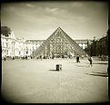
9/23/2003 7:04:17 PM
The secret to a good holga shot is to seek out the unusual. If I didn't know this was the Louvre I might envision this as some futurescape where everyone worshipped at the base of the mysterious glass pyramid that appeared one day in the center of the city. Where did it come from? It certainly doesn't look like it belongs with the architecture there. If you look closely it appears that everyone is entering the glass edifice, but is anyone coming out? Great holga shot!
|
| Photo By: Andreas Wolkerstorfer
(K:5090)
|
|
|
Critique By:
Betsy Hern (K:12872)
9/19/2003 8:14:28 PM
This is what we would all hope the highlands looked like, very picturesque, green, magic. What an opportune moment, approaching storms are the best for dramatic lighting. Lovely blues and greens, nice cropping, perfect project category... what more to say.
|
| Photo By: John E Robertson
(K:1752)
|
|
|
Critique By:
Betsy Hern (K:12872)
9/16/2003 6:55:52 PM
I like the drama in this shot. It looks like a storm is approaching and I love storms. I also love the detail in the siding on the church and in the small bit of land that anchors the scene. The lighting on the crosses is dramatic and increases the feel of the approaching storm. I would love to see this larger, are you, or have you printed this and if so how big is it? Into my Favorites it goes!
|
| Photo By: Karen Nichols
(K:613)
|
|
|
Critique By:
Betsy Hern (K:12872)
9/16/2003 6:33:43 PM
Welcome, great start! Perfect for the Shadows Project. How did you get this shot, were you above? Nice use of b/w and the composition is wonderful, I'm so pleased that the entire shadow is in the pic and is not cropped. Textures, tones good but the WOW of the photo is in the simple but effective subject -- not the bike rider but the shadow.
|
| Photo By: Rochim Hadisantosa
(K:113)
|
|
|
Critique By:
Betsy Hern (K:12872)
9/14/2003 9:04:36 PM
Love these, thanks for the link, very interesting...
|
| Photo By: Christian Harkness
(K:120)
|
|
|
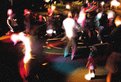
Critique By:
Betsy Hern (K:12872)
9/13/2003 9:04:03 AM
I kind of like the neon look to this. It might have been cool to get the little girl (I agree that she is the most interesting part of this photo) in crisp focus, then layer her onto the composition in the same place so it looked like she is the only one in the present, in reality, dreaming up this scene. I like the diffused glow but would have opted for cutting the grain. Night shots are fun, never know how they will turn out, and the hardest part is to try and control the bright lights which equate to the burned out areas. There might be some kind of filter that would cut down that problem, I'll have to do some research because now I'm intrigued with this whole idea. Thanks for the jump start. When in doubt, post those "iffy" shots -- there so many here willing to give their thoughts, which I always find helpful.
|
| Photo By: Gregory Fiedler
(K:15439)
|
|
|
Critique By:
Betsy Hern (K:12872)
9/11/2003 8:43:18 PM
Appropriate today, and stunning.
|
| Photo By: andrew vonbank
(K:2811)
|
|
|
Critique By:
Betsy Hern (K:12872)
9/10/2003 5:39:06 PM
Yeah Terry, take the tape off, this is almost too good to be a holga shot. Also try shooting into the sun, tilting the horizon and changing the distance thingee. Leave the camera out in the sun before you shoot and you will get light leaks. It also doesn't hurt to drop the camera now and then. I imagine you were a bit disappointed when this came out so good, and it is good -- I love kid shots and it looks like you have a bunch of rascals for models. But I do see some distortion in the corners so there is hope and, with time, you will get a truly bad, holga shot. Keep on shooting. (Hey, I wish some of my hon-holga shots came out this good.)
|
| Photo By: Terry McCully
(K:9221)
|
|
|
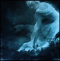
Critique By:
Betsy Hern (K:12872)
9/10/2003 6:42:55 AM
I like that she is looking up and into the eyes of the observer, it imparts to your wonderful image a kind of voyeurism -- the viewer is looking into the dreams of someone else and the dream has just noticed that they are there peering in. I love mysterious images and she gives me the feeling of a ghost or at least a memory, a wonderful but haunting memory. A Favorite for me, too. And, without getting into that whole digital vs traditional debate, I love that the mood of this was accomplished in printing. As has been said, I think sepia would work too, however the blue gives a distance, a coldness to this that is good for the mystery. Sepia might be too warm, too expected. OK, I've changed my mind, blue it is
|
| Photo By: Cheryl Jacobs
(K:122)
|
|
|
Critique By:
Betsy Hern (K:12872)
9/9/2003 9:10:28 PM
Is this the same slide printer?
http://cgi.ebay.com/ws/eBayISAPI.dll?ViewItem&item=25560319 94&category=11816
It doesn't say it's a slide printer, but a power control center. It appears to have a polaroid back but it's hard to tell from the pic. I'd be interested in it if it's what you used. If you have time to take a look at it, you can email me at betsyhern@yahoo.com. Thanks!
|
| Photo By: Melisa Taylor
(K:89)
|
|
|
Critique By:
Betsy Hern (K:12872)
9/9/2003 12:49:08 PM
Great job, Melisa. I know that these are a lot of work and kind of messy but so much fun. You've married a good subject to a good medium here. Did you use a DayLab or a Vivitar slide printer?
|
| Photo By: Melisa Taylor
(K:89)
|
|
|
Critique By:
Betsy Hern (K:12872)
9/8/2003 8:53:20 PM
You'd better keep an eye on this boy, he looks dangerous. Like Sue said, he has all his gear, but where's his camera?
|
| Photo By: Norbert Holschbach
(K:610)
|
|
|
Critique By:
Betsy Hern (K:12872)
9/8/2003 8:43:35 PM
Coolamundo, Andrew. It's fern night here on usefilm, I just commented on another great fern foto from Leslie Cohelan. I love the color green, love the patterns that ferns naturally produce. You have a good eye.
|
| Photo By: andrew vonbank
(K:2811)
|
|
|
Critique By:
Betsy Hern (K:12872)
9/8/2003 10:00:03 AM
He, or she is even cute upside down. Or is he/she already upside down? I'm so confused. I like the simple composition.
|
| Photo By: heather martino
(K:3648)
|
|
|
Critique By:
Betsy Hern (K:12872)
9/5/2003 8:14:58 PM
Part city, part country, all wonderful. Very nice composition. Those city lights framed by the foliage really sparkle. Chicago offers so many photo ops, great place to shoot. Hope you can make it to the next Chicago area get-together.
|
| Photo By: Mark Peterson
(K:3452)
|
|
|
Critique By:
Betsy Hern (K:12872)
9/3/2003 10:07:23 PM
Love the tilt, good idea. Anything goes with this camera. I am sure that now you will be hooked and will not be able to put it down. I will have to try this film in mine since you've gotten such wonderful results.
|
| Photo By: Peter Burda
(K:4807)
|
|
|
Critique By:
Betsy Hern (K:12872)
9/2/2003 7:52:11 AM
Very interesting. I think this would make a good accompaniement to a story about a family that keeps going back to the same beach for years on their vacation until they are very old. This would be their memory of younger days. I love photos that tell a story and make you think. This one does that and evokes many different emotions, and transcends all nationalities. Great use of b/w, understated but powerful.
|
| Photo By: Terry McCully
(K:9221)
|
|
|
Critique By:
Betsy Hern (K:12872)
9/2/2003 6:45:23 AM
It's all about color here. This could be a shot of anything and be wonderful because those colors really sing. Great palette for fabric, painting, clothing. Somewhat like fireworks, sunset, water refelctions. Just great color, especially the green at just the right point. The green leads your eye up and into the exploding center of the flower. Love it!
|
| Photo By: Jostein Moene
(K:264)
|
|
|
Critique By:
Betsy Hern (K:12872)
9/2/2003 6:38:02 AM
Cool. Cars, because of their smooth clean lines make some of the most graphic shots. Reflections in cars are great, too. I could see this as a whole series, different cars, different colors. Love the swoosh through the composition. Simple and so effective.
|
Photo By: Harlan Heald
(K:15732)

|
|
|
Critique By:
Betsy Hern (K:12872)
8/31/2003 8:44:29 PM
Love the texture in this, it looks like it was shot through some sort of fabric, or the effect was added in post processing. Either way, it adds visual interest. That umbrella is amazing, love the colors (or lack of color depending on your point of view). Wonderfully composed, cropped nicely. So very different from the usual, very creative.
|
| Photo By: Debra Griffin-Ibrahim
(K:7119)
|
|
|
Critique By:
Betsy Hern (K:12872)
8/31/2003 8:00:22 PM
Very nice treatment of this oh so hard to photograph flower. I have these growing all over my yard and have tried to capture them without completely burning out the whites. No luck. You may have solved the mystery with your filter treatment here. I especially like the greens, they anchor the white and add a nice vibrant touch to all the black and white.
|
| Photo By: John Charlton
(K:5595)
|
|
|
Critique By:
Betsy Hern (K:12872)
8/29/2003 9:03:52 PM
I bet this would be cool in color with a bright colored piece of glass, cellophane or gel over the pen light. Very creative and fun.
|
| Photo By: Nicole Inskip
(K:404)
|
|
|
Critique By:
Betsy Hern (K:12872)
8/29/2003 6:43:11 AM
Andrew, Andrew, Andrew, my dear friend, I could never be mad at you. You only say what you think, bravo, I wish more here would do the same. You are one whose opinion I value, so don't change. I love it when I, or anyone else for that matter, gets a bunch of comments leaning one way then someone speaks up to point out an alternative way of looking at the image. Makes me reassess and I get more from those comments than the pats on the back. I desperately want to comment that way on some images here, but usually chicken out... I just got some new close-up lenses for my Yashica and am taking in a roll of b/w in today, wish me luck. I think I screwed things up though because this crazy camera has a viewing lens and a taking lens and once I got things focused with the close-up lens on the viewing, then moved it to the taking I didn't compensate for the difference in distance -- they call this parallax error. Anyway, the photos should come out interesting. Maybe I'll pass them off as coming out just the way I intended, whatcha think? Peace, love and rock 'n roll!
|
| Photo By: andrew vonbank
(K:2811)
|
|
|
Critique By:
Betsy Hern (K:12872)
8/27/2003 6:42:43 AM
Exquisite!
|
| Photo By: Malin Kristinadottir
(K:956)
|
|
|
Critique By:
Betsy Hern (K:12872)
8/27/2003 6:40:41 AM
This one is way cool, too. What a wonderful bunch of images you have. I think this would be really great on my kitchen wall. It is very artistic, and funny (I love humorous photos, I have a man standing on his head eating spaghetti on my kitchen wall now). This would work in color, but the b/w is fantastic!
|
| Photo By: Malin Kristinadottir
(K:956)
|
|
|
Critique By:
Betsy Hern (K:12872)
8/27/2003 6:36:55 AM
Love this, and your treatment of the framing gives an old-world feel to the pair, glad you posted it this way. I think that we should have a garlic project much like the egg project so we could see how everyone would shoot garlic, we all have it in our homes (I like mine on pizza, and in mashed potatoes). I would love to see this bigger and think it would make a wonderful poster for a kitchen or an Italian restaurant, really big on the wall. You have a very nice bunch of images in your portfolio, b/w is so much fun. I think you could shoot color well, too. Do you develop your own prints?
|
| Photo By: Malin Kristinadottir
(K:956)
|
|
|
Critique By:
Betsy Hern (K:12872)
8/26/2003 1:20:54 PM
This is one that should be centered, contrary to that annoying Photo rule (I love to break rules). I think it is better in one tone, like you have it here. Very nice perspective, my eye follows all the way to the end. You got a lot of detail, too.
|
| Photo By: Gregory Fiedler
(K:15439)
|
|

![Photograph By Nelson Moore [Kes] -](http://thumbs.imageopolis.com/images/6/0/0/5/6005/1537290-tn.jpg "Photograph By Nelson Moore [Kes] -")