|
|
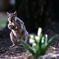
Critique By:
Jenny Brown (K:2859)
6/16/2004 8:06:16 PM
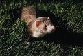
I love the direction of light; would like it a bit warmer as it's kind of purple (see below). The rim lighting is lovely though and really helps make him look excited. This is an excellent capture.
|
| Photo By: Taras R. Hnatyshyn
(K:4055)
|
|
|
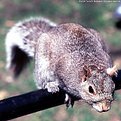
Critique By:
Jenny Brown (K:2859)
6/16/2004 7:50:08 PM
Here's a color-balanced version, makes the little guy look far more lively. I added a hint of yellow to highlights, midtones, and shadows, to neutralize the purple tint. You caught quite a lively moment and I thought he should be honored with lifelike colors. 
I'm guessing this could be accomplished on camera with a uv filter or a warming filter or something, but I'm still struggling with it myself so I have no solid answer yet.
|
| Photo By: Taras R. Hnatyshyn
(K:4055)
|
|
|
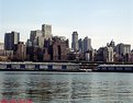
Critique By:
Jenny Brown (K:2859)
6/16/2004 6:41:27 PM
My initial thought was, "what's the subject?" as there's no dramatic focus point to the image. I tried cropping to a panoramic format (attached) and that made it more clear what could be improved - the light. This is shot in drab, hazy blue light, which eliminates all drama. Come back with dawn light, or right after a storm, or with sunset in the background, or anything at all to give it some color and life. Even a polarizer would help as it may darken the sky and provide some color.
Additionally, it's unclear what you're really aiming at; the buildings? the storage sheds? Something needs to be the primary subject. The storage sheds intrude into the balance of the image, without adding excitement or focus. If they were cropped out of the bottom, you'd lose the water, but you'd also lose the distraction; and if the buildings were more lively from better light, it may work fine without the water. Or, shoot a vertical right between the storage sheds, including far fewer buildings, but again in better light.
|
| Photo By: Taras R. Hnatyshyn
(K:4055)
|
|
|
Critique By:
Jenny Brown (K:2859)
6/15/2004 9:42:19 PM
This is a stunning image when viewed in combination with your other photos. You have so much perspective on the hard side of life, that this image really stands intensely alongside.
I don't know if it your style or not, but I could easily imagine your images in a collection, with each person's story alongside. You write as well as you photograph, and the stories are touching. Is it possible for you to share effective ways for people to get involved and help? The images and stories have the power to touch people's hearts, but without a direction to move in, they don't know how to assist.
|
| Photo By: Hugh Hill
(K:1618)
|
|
|
Critique By:
Jenny Brown (K:2859)
6/15/2004 5:58:13 PM
This one is really cool; the sweeping fluffies work well together. I love the perspective. I wish I could see more face, but I'm not sure how that could be accomplished. The color and contrast are excellent though.
|
| Photo By: Antero Araujo
(K:3)
|
|
|
Critique By:
Jenny Brown (K:2859)
6/15/2004 5:55:47 PM
The really bright areas are too overexposed, they completely lost detail and compete with her face. You nearly need a revesal of the lighting here; keep her dress in shadow and put more light on her face and hair. Or, use the sun to backlight the veil and dress with a rim of light, while keeping detail in the entire dress from the shadow side. Her face is lovely, and her pose is fairly nice except her hands look awkward; this may relax a bit more with her looking away from the light, as well. It looks like a beautiful location for these pictures; the light is a bit rough though. Hopefully you'll have a chance to try again; this could work really well.
|
| Photo By: Antero Araujo
(K:3)
|
|
|
Critique By:
Jenny Brown (K:2859)
6/14/2004 7:45:45 PM
Now that I hunt around (and it's pointed out by the title, which I overlooked earlier), I can see water droplets hitting the water; but it really doesn't look like it's raining other than that. I don't know how to help that - maybe a slower shutter or some low powered flash to make the raindrops visible? Otherwise I'm left wondering why she's holding an umbrella and standing on a rock, when the weather looks clear!
I think if the rain itself was visible this could be a really good image.
|
| Photo By: Andrei Sliva
(K:99)
|
|
|
Critique By:
Jenny Brown (K:2859)
6/14/2004 7:27:58 PM
Good gentle light. The window bars and background are a little distracting; there's not enough there to provide "environment" but a little too much to be "subtle." The centered composition is sort of awkward; maybe a square instead or something taller or offset?
The light is very nice though.
|
Photo By: Paddy Quinn
(K:66)

|
|
|
Critique By:
Jenny Brown (K:2859)
6/14/2004 5:29:13 PM
There's a lot of mood to this photo but I'm uncertain what the subject is. The person seems to divide the frame in 4 instead of providing focus or balance. Is it a portrait? Is it a landscape? She's just big enough that it seems like it's not a landscape, but she's too small for it to be a portrait. I'm uncertain what my eye is supposed to be focusing on or looking for.
|
| Photo By: Andrei Sliva
(K:99)
|
|
|
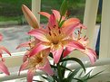
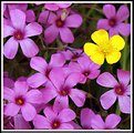
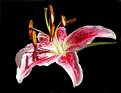
Critique By:
Jenny Brown (K:2859)
6/14/2004 5:24:13 PM
Very well done. The yellow one looks slightly unsharp, or perhaps it's lost in the brightness; otherwise, very good though. Pretty!
|
| Photo By: Kevin Dean
(K:438)
|
|
|
Critique By:
Jenny Brown (K:2859)
6/14/2004 4:56:07 PM
Photoshop work needs to be smoother. Try the tool to feather your selection or soften its edge before you cut or paint/erase. Or, if you're really just emphasizing the shirt colors, crop the photo down to just that; it could make an interesting abstract.
|
| Photo By: Dr. Rafael Springmann
(K:89517)
|
|
|
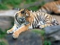
Critique By:
Jenny Brown (K:2859)
6/6/2004 12:21:12 AM
The artificially blurred surroundings make it cartoon-like. And since we can still see that there are rocks and another tiger, we can even guess that the original image probably looked nice without blurring. If you want a natural softening of the background, use an aperture like f/2.0 or however small your camera goes; that will put things away from the tiger out of focus in a way that looks much more realistic.
This image would probably look good without any blurring; try uploading it so we can see!
|
| Photo By: Mike Dea
(K:27)
|
|
|
Critique By:
Jenny Brown (K:2859)
6/5/2004 2:47:38 AM
Stunning... it overwhelms my senses. The highlights and sparkles really draw me in.
|
| Photo By: Edgar Monzón
(K:827)
|
|
|
Critique By:
Jenny Brown (K:2859)
6/3/2004 6:15:28 PM
This one makes me think, "Why did you make me stand on the ice?" One that young looks slightly out of place, as I thought they preferred to be warm creatures... Likewise the flowers are a bit out of place as daffodils only bloom once the ground starts to get warm. The color combination is cute and somewhat fun/silly but sufficiently artificial that it seems more like a cartoon than a reality. Maybe it could be pulled off with white sand or something?
|
| Photo By: Ingrid Mathews
(K:7277)
|
|
|
Critique By:
Jenny Brown (K:2859)
1/9/2004 4:29:35 PM
Good emotion, good timing. The black in the hair, with no detail, is a bit distracting to me. More range of grays would make that less extreme, and a little gentler.
|
| Photo By: Rachel Leah
(K:26110)
|
|
|
Critique By:
Jenny Brown (K:2859)
1/9/2004 4:20:39 PM
Yep, same girl. Above was around 18 months old; she's now 3 1/2 years with a sister.
Thanks for the comments!
|
| Photo By: Jenny Brown
(K:2859)
|
|
|
Critique By:
Jenny Brown (K:2859)
12/28/2003 10:04:30 PM
The "backdrop" is actually the couch she's sitting on; there was little I could do to adjust the scene as a little one holding a baby needs lots of pillows and propping, and the couch was the only feasible option. (I didn't set up the shot, this was a grab the moment.)
I suspect color itself is distracting here, though, so I'm trying a conversion to black and white in photoshop and will post the results. (So far I like the b&w better than the original.)
|
| Photo By: Jenny Brown
(K:2859)
|
|
|
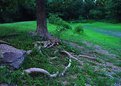
Critique By:
Jenny Brown (K:2859)
11/11/2003 11:24:53 PM
Here's something you could have done differently in the original setting. Walk up to those rocks along the edge of the water. Lay down on the ground, parallel to the little river, facing towards the steam. Use something like a 35mm - 50mm lens, so you get a bit of background surrounding, but mostly rocks, steamy water, and a hint of surrounding setting.
Take some pictures with the river running forward/upwards in your picture. Take some more with it running diagonally (all of these, while laying on the rocks).
Then, staying low to the ground, take some facing across the river, with the plants and rocks background.
The point of this is to fill more of the picture with your main subject (water/steam), and less of it with pretty but irrelevant background. The other point is to help you think about unique viewpoints and angles, so you get more different ideas of how to explore a scene.
|
| Photo By: Roger Williams
(K:86139)
|
|
|
Critique By:
Jenny Brown (K:2859)
10/27/2003 8:39:15 PM
I re-tinted it in photoshop, to fix the blue cast a bit... I like it better with appropriate color but it lost mood somehow. I think the blue was giving it a bit of the 'evening' feel, and without it, it seems more like daylight.
|
| Photo By: Jenny Brown
(K:2859)
|
|
|
Critique By:
Jenny Brown (K:2859)
10/26/2003 11:08:22 PM
Your eyes see into the shadows far more than any film can. So what you see as mild shadows the film sees as very dark shadows. Fill flash can be helpful but this is kind of a big area to light that way. Far better would be to come on a slightly hazy or slightly cloudy day, or just after a rainstorm, when the light is very gentle and there are almost no shadows anywhere.
|
| Photo By: Mike Ombrello
(K:4878)
|
|
|
Critique By:
Jenny Brown (K:2859)
10/26/2003 11:04:13 PM
There are several things you might do to help the lighting.
1) Come back on a cloudy day or wait for a cloud to cover the sun - this will reduce the contrast and glare and make it much easier to see things right. This is your best option when circumstances allow.
2) Use some fill flash - this means make sure your camera uses flash even in the middle of the bright day. You may have to specifically tell it to stay on. This will add some light to the shadow areas, reduce the contrast, and make it more balanced with the sun.
Your problem isn't really too much light from the sun, the problem is too much contrast. The darks are really dark and the brights are really bright, and that's too far apart for your film/paper/digital image/whatever. You can't control the sun itself, but you can put extra light in the dark areas so they aren't quite as dark, and then the whole picture will be more balanced and less glaring.
Additionally, if you had any choice in the girl's clothes, try something deep blue or light white or tan or gray or some neutral color; pink and orange are an unfortunate combination. Not sure if this was set up ahead of time or not though.
|
| Photo By: Marianne Gordon
(K:507)
|
|
|
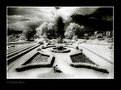
Critique By:
Jenny Brown (K:2859)
5/4/2003 10:39:06 AM
The approach you took is interesting, some angular lines to the garden, but it feels too centered and symmetric. I'm not entirely clear which area is the focus/subject, and what is extraneous. The unclear areas to each side are a little distracting. Perhaps a less wide angle lens would simplify the composition a bit. The garden seems to have potential but try more variety of angles and subjects.
|
| Photo By: Aguinaldo Vera-Cruz
(K:326)
|
|
|
Critique By:
Jenny Brown (K:2859)
4/22/2003 7:03:52 PM
Wonderfully light and expressive!
|
| Photo By: John Charlton
(K:5595)
|
|
|
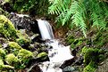
Critique By:
Jenny Brown (K:2859)
4/18/2003 12:07:16 PM
Try photographing this early one foggy morning or with some overcast clouds. It'll reduce the contrast and let you keep detail in both the dark rocks and the bright water, without it washing out. It will also warm the greens and give it a bit richer colors.
You've got a good idea here, just need to come back to it again when the lighting is better.
|
| Photo By: Max5 -
(K:88)
|
|
|
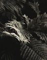
Critique By:
Jenny Brown (K:2859)
4/10/2003 12:20:55 PM
I'm drawn to the highlight area but it's among the hardest to see due to angle. If the area drawing my attention was one of the smoother leaf areas I think I'd like it better. Interesting concept but may need a bit more tweaking to make right.
|
| Photo By: Michael Cockrell
(K:89)
|
|
|
Critique By:
Jenny Brown (K:2859)
3/18/2003 3:05:14 PM
The technical side is excellent, but it feels awkward; if she's actively doing something she'd be looking at it, or only slightly glancing back at us. Her face is also rather blank and expressionless, making it not really feel like anything in particular. I also lost her hands in the foliage a bit for a while.
|
| Photo By: david solomon
(K:22)
|
|
|
Critique By:
Jenny Brown (K:2859)
3/2/2003 6:15:14 PM
The shadows are a little too strong but the colors and texture are beautifully rich.
|
| Photo By: Reidar Olsen
(K:144)
|
|
|
Critique By:
Jenny Brown (K:2859)
2/23/2003 7:30:50 AM
For scanning prints, try the 'Levels' adjustment in photoshop. It lets you lighten or darken the midtones as well as the shadows and highlights, and you can often get a result much closer to your original print, like the one I'm attaching.
Another thing you can do to improve pictures like this taken in direct sun is to use your on-camera flash -- it will fill light into the shadows and make the whole picture a bit better. It seems counterintuitive to use flash when you have bright sunlight but it really can make a difference. (It helps if your camera lets you set the flash to a lower power, too, so it's not overwhelming.)
|
| Photo By: Matt Lou
(K:334)
|
|
|
Critique By:
Jenny Brown (K:2859)
2/17/2003 12:08:02 PM
More contrast could help this a bit; a darker green behind it, somewhat more 'glowing' lighting. It may take some experimentation to make that work tho.
|
| Photo By: Karen Johnson
(K:2951)
|
|
|
Critique By:
Jenny Brown (K:2859)
1/15/2003 12:07:39 PM
This feels too rich in color saturation. You've set the contrast as if the image had faded over time. When that occurs, any sepia toning fades with it, to a lighter color and much less saturation. In this case you have one aspect enhancing its look of age and the other working against it.
Here's a guess at an enhancement; it could go even farther though. Alternatively if you want to keep the rich color, try leaving more darkness in his shirt and more contrast in the overall image.
|
| Photo By: Michael Cockrell
(K:89)
|
|