|
|
Critique By:
Megan Johnson (K:1422)
10/20/2007 11:00:50 AM
Larry,
Thanks for dropping by and having a look.
Megan.
|
| Photo By: Megan Johnson
(K:1422)
|
|
|
Critique By:
Megan Johnson (K:1422)
10/20/2007 11:00:07 AM
Dani,
Thanks for coming and having a look, I took these with very low light using a tripod so I had to use a slow shutter speed, and in this particular shot Robert was holding his guitar upside down (obviously) so there is a very good chance that the guitar has moved, but I was happy because his face is still in focus.
Megan.
|
| Photo By: Megan Johnson
(K:1422)
|
|
|
Critique By:
Megan Johnson (K:1422)
10/20/2007 10:54:42 AM
Paul,
Thank you for your kind comment, and yes despite the title he really is very nice ... he's more cheeky than nasty.
Megan.
|
| Photo By: Megan Johnson
(K:1422)
|
|
|
Critique By:
Megan Johnson (K:1422)
9/21/2007 11:06:12 AM
Visar,
Thank you for looking through my porfolio and for your kind comment.
Megan.
|
| Photo By: Megan Johnson
(K:1422)
|
|
|
Critique By:
Megan Johnson (K:1422)
9/21/2007 11:04:13 AM
Pawel,
Thank you for your kind comment.
Megan.
|
| Photo By: Megan Johnson
(K:1422)
|
|
|
Critique By:
Megan Johnson (K:1422)
9/21/2007 11:03:44 AM
Hussam,
Thank you for your kind comment.
Megan.
|
| Photo By: Megan Johnson
(K:1422)
|
|
|
Critique By:
Megan Johnson (K:1422)
9/16/2007 2:30:30 AM
Afsanhh,
Thank you for your kind comment.
Megan.
|
| Photo By: Megan Johnson
(K:1422)
|
|
|
Critique By:
Megan Johnson (K:1422)
9/16/2007 2:29:50 AM
Avi,
Thank you for your honest comment.
Megan.
|
| Photo By: Megan Johnson
(K:1422)
|
|
|
Critique By:
Megan Johnson (K:1422)
9/15/2007 1:08:05 PM
Celia,
This reminds me of the feilds of canola growing around where I live at the moment. Gret composition and colour.
Megan.
|
| Photo By: Célia Santos
(K:218)
|
|
|
Critique By:
Megan Johnson (K:1422)
9/15/2007 1:03:37 PM
Mohamed,
Comositionally this is excellent. Great tones and light. Well done.
Megan.
|
| Photo By: Mohamed Hussien
(K:8371)
|
|
|
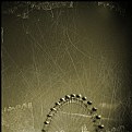
Critique By:
Megan Johnson (K:1422)
9/15/2007 1:00:59 PM
Mark,
This is such a simple image that works really well because of the scratching and sticky tape. What program did u use to get these effects and what did you do to it? I like the tone of the photo, in fact it reminds me of really old photos of the eiffel tower. It's also such an indiviual take on the London Eye. Great shot.
Megan.
|
| Photo By: Mark Hamilton
(K:8387)
|
|
|
Critique By:
Megan Johnson (K:1422)
9/15/2007 12:54:04 PM
Txules,
Great shot. The framing and composition is excelent and I love the colour and tones.
Megan.
|
Photo By: txules .
(K:62768)

|
|
|
Critique By:
Megan Johnson (K:1422)
9/15/2007 12:37:01 PM
Mark,
Oh I wish. lol. No I have never been to England, though I would love to. My sister just got back from a six week holiday in Europe where she spent a week in England, and I am SOOOOOOOO jealous. My friend Bek and I always complain because over here we don't have things like castles to just happen on and take photos. lol.
Megan.
|
| Photo By: Mark Wakefield
(K:481)
|
|
|
Critique By:
Megan Johnson (K:1422)
9/15/2007 12:22:11 PM
Mark,
I was so impressed by the two earlier photos I've come to look at your portfolio. And I just love this, was it taken at the same place as the other two? I really like the angle here, not only looking up at the building but also the fact that you have the side of the building in to gives the shot a real dimensional feeling. The sky looks excellent in this shot too. Really nice work.
Megan.
|
| Photo By: Mark Wakefield
(K:481)
|
|
|
Critique By:
Megan Johnson (K:1422)
9/15/2007 12:11:16 PM
Taqui,
It's a shame that the snail is so blurry because the composition of this photo is fantastic.
Megan.
|
| Photo By: Taqui Abdin
(K:32)
|
|
|
Critique By:
Megan Johnson (K:1422)
9/15/2007 12:06:28 PM
Barbara,
Great composition and colour.
Megan.
|
| Photo By: Barbara Socor
(K:13559)
|
|
|
Critique By:
Megan Johnson (K:1422)
9/15/2007 12:02:36 PM
Subrata,
What a fun, impromptu moment. This kid looks like he's having a ball just dancing around like nobody is watching. I like the bucket very much but it is a shame it covers his foot. Great DoF and nice tones through out the photo. Good job.
Megan.
|
| Photo By: Subrata Roy Chowdhury
(K:308)
|
|
|
Critique By:
Megan Johnson (K:1422)
9/15/2007 11:58:48 AM
Les,
Really well composed image. The planes are relativly sharp considering how far away they are. The out of focus foreground works really well for this photo. Greta job.
Megan.
|
| Photo By: Les Perry
(K:319)
|
|
|
Critique By:
Megan Johnson (K:1422)
9/15/2007 11:55:45 AM
Varin,
Great capture. Great DoF, nice tones and lighting.
Megan.
|
| Photo By: VarinVaree ...
(K:647)
|
|
|
Critique By:
Megan Johnson (K:1422)
9/15/2007 11:52:46 AM
Mark,
I just commented on the coloured photo that is very simmilar to this one. I think I preffer these shots in colour. The colour shot was much moodier than this I think. The only thing thats better about this shot is the way the clouds on both sides look like they are rushing back behind the castle. However I do like that you can see the lower land. You get the feeling whoever used to live here really was able to survey all of thier domain. Great series of shots.
Megan.
|
| Photo By: Mark Wakefield
(K:481)
|
|
|
Critique By:
Megan Johnson (K:1422)
9/15/2007 11:45:37 AM
Frank,
In the thumbnail it looks like you had him in focus with the background a blur of movement. Eventhough the subject is a bit blurry I think the photo is still really great. It's a great action shot. I like the composition and angle of the photo.
Megan.
|
| Photo By: Frank Desfours
(K:257)
|
|
|
Critique By:
Megan Johnson (K:1422)
9/15/2007 11:40:02 AM
Afsaneh,
This is a really interesting photo, such simple subject matter but really striking. You have captured great detail in the fabric background and the DoF is great. The shot is really well composed and the red thread provides great contrast for the photo. Great job.
Megan.
|
| Photo By: Afsaneh Sarvghaddi
(K:2780)
|
|
|
Critique By:
Megan Johnson (K:1422)
9/15/2007 11:35:34 AM
Tomek,
What a lovely photo. This girl looks like she's been having heaps of fun splashing around in the water, although you have captured a much more sombre image. Great DoF and I agree with Cory the reflection is very sharp, however I would have been tempted to crop the photo just below her feet as the reflection is cut off at her knees and doesn't show her full reflection. Really nice photo.
Megan.
|
| Photo By: Tomek Swietoniowski
(K:193)
|
|
|
Critique By:
Megan Johnson (K:1422)
9/15/2007 11:29:06 AM
Bhabesh,
I saw this as a black and white the other day but I think the coloured version has much more impact. In the black and white the front pillar of the bridge was almost silhouette where the back one had more detail. Having it in colour gets rid of that problem. The white fog rolling over the background looks fantastic. And the beautiful white flowers that I loved so much, are really yellow and they look just as pretty. In fact the yellow, green and brown hues in the foreground look wonderful. Great shot.
Megan.
|
| Photo By: Bhabesh Chakrabarti
(K:11394)
|
|
|
Critique By:
Megan Johnson (K:1422)
9/15/2007 11:19:01 AM
Giovanni,
I love walls of graffiti as backdrops to take photos of people. I like the composition, although a little more room at his feet would have worked well. The wall has really good texture and tones, and it has come up really nicely in black and white. I'd love to see what this looked like as a colour photo. You have caught your model with a great expression on his face, he looks so angery and determind whislt taking aim and throwing his ball? or rock? I can't see exactly what it is. Great shot.
Megan.
|
| Photo By: giovanni guido marchi
(K:27040)
|
|
|
Critique By:
Megan Johnson (K:1422)
9/15/2007 11:08:58 AM
Kadir,
This was really eye catching in the thumbnail, the colours and the composition are great. It's a shame that the planes are out of focus. It looks like you have given this quite a hard crop too, on my screen the sky is all spotty and pixely. A nice concept though.
Megan.
|
| Photo By: Kadir Erten &kadoo
(K:2757)
|
|
|
Critique By:
Megan Johnson (K:1422)
9/15/2007 11:03:42 AM
Pawel,
I really like the DoF in this shot, and the light. It's a really nice close up, however I would have liked it better if there was just a fraction more space at the top of the photo.
Megan.
|
| Photo By: Pawel Kwasnicki
(K:9651)
|
|
|
Critique By:
Megan Johnson (K:1422)
9/15/2007 11:00:45 AM
Larry,
I love photos of graffited walls. The bars are great, they make it look like this bad boy is in jail. Great capture.
Megan.
|
| Photo By: Larry Fosse
(K:66493)
|
|
|
Critique By:
Megan Johnson (K:1422)
9/15/2007 10:58:20 AM
El Kara,
This kid looks like a vampire with those glassy, reflective eyes and those pointy teeth. lol. The light, DoF, and colour of this photo are great, but I don't like the eyes. There are two perfect reflections of you in his eyes and I don't think it looks very natural. Is that something you did in photoshop or did the photo really come out looking like that?
Megan.
|
| Photo By: el kara
(K:99)
|
|
|
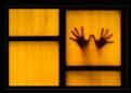
Critique By:
Megan Johnson (K:1422)
9/15/2007 10:51:23 AM
Dave,
This clown does look sad :( The bright colours look wonderful. Its a shame the woman in the background isn't more out of focus, in fact it's a shame she's there at all. Otherwise gret portrait.
Megan.
|
| Photo By: Dave Brown
(K:1390)
|
|