|
|
Critique By:
Barry Tipping (K:959)
10/12/2002 4:21:37 PM
A nice relaxed portrait. You're eyes hint at a mischevious side! Here it is with a solid background...
|
| Photo By: Emily Enderes
(K:192)
|
|
|
Critique By:
Barry Tipping (K:959)
10/11/2002 4:34:26 PM
Cool...surreal...
|
| Photo By: Aurore Lynch
(K:1687)
|
|
|
Critique By:
Barry Tipping (K:959)
10/10/2002 1:17:12 PM
Manuel,
Nice concept. That light in the corner kind of distracts from the "pain" message...cropping?
|
| Photo By: manuel valgode lopes vall
(K:0)
|
|
|
Critique By:
Barry Tipping (K:959)
10/6/2002 5:58:53 PM
Well at least they're wearing protection...
|
| Photo By: Jon Rank
(K:683)
|
|
|
Critique By:
Barry Tipping (K:959)
10/3/2002 5:35:32 PM
This is very striking...
I disagree with Arthur, this angle diminishes her nose and focuses attention on her eyes, mouth, and bone structure...superb work!
|
| Photo By: Rene Asmussen
(K:138)
|
|
|
Critique By:
Barry Tipping (K:959)
10/3/2002 5:32:00 PM
I like the composition of this...its even got "Polushkin-tone"... 
|
| Photo By: Jason Bennett
(K:213)
|
|
|
Critique By:
Barry Tipping (K:959)
9/22/2002 5:24:21 AM
Nathan, you are really exploring a lot of neat figure studies. Keep it up!
|
| Photo By: nathan combs
(K:2242)
|
|
|
Critique By:
Barry Tipping (K:959)
9/22/2002 5:17:09 AM
Great self-portrait Samantha... I'm perplexed as to how you can have a shadow on the right side of your nose...
|
| Photo By: samantha marie
(K:378)
|
|
|
Critique By:
Barry Tipping (K:959)
9/20/2002 4:00:32 AM
Great shot!
|
| Photo By: Preston Heller
(K:15)
|
|
|
Critique By:
Barry Tipping (K:959)
9/15/2002 3:36:45 PM
Just when I was about to go to sleep...
Nice pic!
|
| Photo By: Terrence Kent
(K:7023)
|
|
|
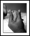
Critique By:
Barry Tipping (K:959)
9/14/2002 2:11:37 PM
Neat pic Nathan...Are we looking at the top of a shoulder, down the arm with a slight bulge of bicep?
|
| Photo By: nathan combs
(K:2242)
|
|
|
Critique By:
Barry Tipping (K:959)
9/8/2002 5:55:55 AM
Another brilliant and disturbing piece Andrew. I think the theme of decay is fascinating with the fruit and the flower. Where people now associate a certain tone with Sepia, in the future the tone represented by your work should simply be referred to as "Polushkin"...
|
| Photo By: Andrew Polushkin
(K:311)
|
|
|
Critique By:
Barry Tipping (K:959)
9/8/2002 5:52:12 AM
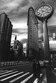
For such a complex scene, I would have preferred seeing the top left corner fully. But it has lots of possibilities and the exposure and tone are great. Nice work!
|
| Photo By: Angela Kleis
(K:2)
|
|
|
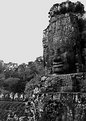
Critique By:
Barry Tipping (K:959)
9/8/2002 5:48:13 AM
Great tonal range and composition! Is this Ankor Wat? I almost made it there a few years ago... (*sigh*)
|
| Photo By: Dario Diament
(K:83)
|
|
|
Critique By:
Barry Tipping (K:959)
9/6/2002 6:32:33 PM
Nathan,
This is very elegant. In the attachment, I've softened it and pushed the contrast even further. You have a good eye...
|
| Photo By: nathan combs
(K:2242)
|
|
|
Critique By:
Barry Tipping (K:959)
9/6/2002 11:38:18 AM
I like the concept! If you change the background, you have some more options...Nice work!
|
| Photo By: Elangovan S
(K:10675)
|
|
|
Critique By:
Barry Tipping (K:959)
9/6/2002 8:04:08 AM
Amie,
You are off to a good start. One of the first things you'll have to practice is increasing your awareness of the background and if it compliments (or detracts from) the subject. In this case, your rather pretty subject has some distracting stuff emerging from her ear. Backgrounds can have detail, but it should support the subject. Exposure-wise, a little more light from a fill-flash or a reflector would make the subject pop off the background more. Keep shooting!
|
| Photo By: Amie Lynn Cochran
(K:34)
|
|
|
Critique By:
Barry Tipping (K:959)
9/6/2002 7:20:15 AM
A beauty. You might crop the lower left corner. Nice work!
|
| Photo By: Sarah Needham
(K:2482)
|
|
|
Critique By:
Barry Tipping (K:959)
9/6/2002 7:18:28 AM
Rob,
If you hadn't sliced off the shoulders and her head, this would have been a beauty... That's why I don't do weddings...no second chances... ;(
|
| Photo By: Rob James
(K:210)
|
|
|
Critique By:
Barry Tipping (K:959)
9/3/2002 2:57:43 PM
No offense, but I'd rubber-stamp your brother out of the image and then hang it on the wall!
|
| Photo By: Aaron Doss
(K:121)
|
|
|
Critique By:
Barry Tipping (K:959)
9/3/2002 2:55:08 PM
This is a great portrait Autumn. I think the blurred necklage balances the bottom half of the image; avoiding too much whitespace. In the attachment, I rotated 1 degree CCW and cropped the image. Nice work!
|
| Photo By: Autumn Ruhe
(K:993)
|
|
|
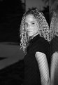
Critique By:
Barry Tipping (K:959)
9/3/2002 2:42:39 PM
A pleasant portrait. Head tilt is probably 1 degree harder than I would like (subtending her right eye a little). Nice exposure. She must be an angel to tolerate tattoo'd chicks like LibertyBell...did you crop her halo out?
p.s. Yes we read your "About" comments...
|
| Photo By: Arthur John Grossman III
(K:1214)
|
|
|
Critique By:
Barry Tipping (K:959)
9/3/2002 4:14:32 AM
Rachel,
I like the composition and the exposure. Suzanne is indeed very beautiful...the only thing I would do to improve this shot is have Suzanne apply a liberal coat of powder to give her skin an even tone. Keep shooting (her)!
|
| Photo By: Rachel Radcliffe
(K:17)
|
|
|
Critique By:
Barry Tipping (K:959)
9/1/2002 4:55:28 AM
Nathan,
Nice composition and tonality! Is the color doctored in PS or in-camera?
|
| Photo By: nathan combs
(K:2242)
|
|
|
Critique By:
Barry Tipping (K:959)
9/1/2002 4:14:35 AM
Hi Rachel,
This is a nice portrait. I like the reflections on her arm that are more subtle on her face. Her shirt blends with the ground, but it looks like this was shot at twilight or nighttime, so you did very well with the exposure anyway.
Please ask Suzanne to refer to picture 13651 because I would like to buy a print. Thanks!
|
| Photo By: Rachel Radcliffe
(K:17)
|
|
|
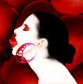
Critique By:
Barry Tipping (K:959)
9/1/2002 4:08:53 AM
Dimitris, I never "got" your scanner art, but I think this is great. I like the high-key of her skin contrasting with the shadows on the rose petals. The earring almost looks like a Photoshop graphic. Very nice!
|
| Photo By: dimitris theocharis
(K:-276)
|
|
|
Critique By:
Barry Tipping (K:959)
8/30/2002 4:10:53 AM
Arthur,
Exposure is great, but that index finger over the nose kills it. The crease in the background (coming out of her forehead) isn't helping either...
|
| Photo By: Arthur John Grossman III
(K:1214)
|
|
|
Critique By:
Barry Tipping (K:959)
8/25/2002 5:05:06 AM
Disturbing and brilliant as usual!
|
| Photo By: Andrew Polushkin
(K:311)
|
|
|
Critique By:
Barry Tipping (K:959)
8/24/2002 6:28:56 PM
Great portrait Rob. I might rubber-stamp that catchlight coming off her bracelet. Very pretty...
|
| Photo By: Rob James
(K:210)
|
|
|
Critique By:
Barry Tipping (K:959)
8/24/2002 1:28:04 PM
Anna, I like the composition. I would have liked the image more if the model (or the light) was rotated just a little so that the shadow of her shoulder wasn't falling across her chest. In fact, if the light on the right was actually 45 degrees behind her, if would have added definition to the top of her shoulder which is blending with background. Let's see more of this series!
|
| Photo By: Anna Miarecka
(K:0)
|
|