|
|
 Peter De Rycke
 {K:41212} 5/29/2005
|
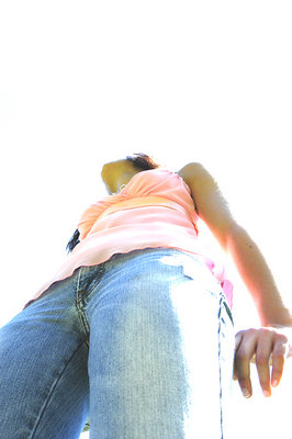
Nice point of view !
Peter
|
|
|
|
 Paolo Corradini
{K:59552} 5/29/2005
Paolo Corradini
{K:59552} 5/29/2005
|
excellent shot like the perspective and tone!
|
|
|
|
 christine dong
{K:129} 5/29/2005
christine dong
{K:129} 5/29/2005
|
mm thanks boys?
|
|
|
|
|
Tyler Robbins
{K:904} 5/29/2005
|
Nah, so there's straght edge... that's fine, it's a compositional decision that was made and it is part of the image, it is an inplied border, and although I said no border in my original comment, so what if there is an end to the image, we know what should be down there, and what makes the image is more of what is there (as far as the angle and the light) and not what isn't there, there was obviously a reason to exclude and crop said parts.
|
|
|
|
|
*** ***
{K:2147} 5/29/2005
|
I agree, Tyler -- still, she might want to do something about that wrist. The straight line cutoff IS distracting. Maybe a little photoshopping to get rid of that darn straight edge.
|
|
|
|
|
Tyler Robbins
{K:904} 5/29/2005
|
No way, no border!!!! when this happens it is a happy accident, screw borders, this kind of shot shoutl be printed on a nice big sheet of watercolor paper with a deckled edge, sometimes photos benefit from floating in a sea of white with no box to bind them.
|
|
|
|
|
Sara M
{K:12411} 5/29/2005
|
I like it.. the composition is nice, and the faded colors work very well here..
|
|
|
|
|
*** ***
{K:2147} 5/29/2005
|
Great angle! Love the blown out highlights which work well with the angle. The flesh tones are a little odd, though. Good image.
|
|
|
|
 Matt Pals
{K:1722} 5/29/2005
Matt Pals
{K:1722} 5/29/2005
|
Great composition, and angle. I really like this, but i'd suggest a border. The white on white is nice until the hands and legs get cut off.
|
|