|
|
 James Cook
{K:38068} 7/19/2006
|
I like the image as you have posted it. Of course, I am curious about the original.
Thank you for the information. Keep up the good work.
|
|
|
|
 Nuno Cardoso
{K:50} 7/19/2006
|
Hello James,
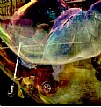
The subject was in front of a black background, something like a huge black plastic.
The background was at about 20 meters away from the subject, thats why the contrast is so great.
About the crop, i wanted to give a diagonal line with the hand of the subject (from the bottom right to top left). It wasn´t possible, in this conditions to capture the other hand. The picture would take another meaning and i didn´t wanted that.
Thanks for your comment. Hope to receive more from you.
NCard
|
|
|
|
 James Cook
{K:38068} 7/19/2006
|
Your positioning of the subject gives the impression that he is turning away from something (in the darkness?). I don't like Nour's crop because you lose the hands.
What were the lighting conditions that produced such a contrast between your subject and the background?
|
|
|
|
 Nuno Cardoso
{K:50} 5/4/2005
|
Hi there!
Nour El Refai
Thanks for your comment, but sometimes rules are meant to be broken :)
In this case I think it works very well. The image is more opened and can breed much more than your sugestion. Thanks for your post! :)
NCard
|
|
|
|
 Paolo Corradini
 {K:59552} 5/4/2005
|
amazing shot! great impact!
|
|
|
|
|
Guido Fulgenzi
{K:6076} 5/4/2005
|
impressive portrait,congrats.!
|
|
|
|
|
Sergio Gomez
{K:722} 5/4/2005
|
Incredible portrait with very strong colors. IMHO better with a litle more subject sharp.
|
|
|
|
 Nour El Refai
{K:12481} 5/4/2005
|
amazing portrait, so intense and the title too
i wish the face should be a little to the left according to the rule of thirds,i'll try to crop it but still something stange, i don't know
|

|
|
|
|
|
ellie photos
{K:1583} 5/4/2005
|
Great capture
|
|


