|
|
|
Mike Craven
{K:179} 9/11/2004
|
I can't see the number 7 board on this shot so I will have to give you the 7 myself!!
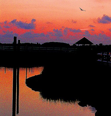
There is that ol' bird again, gives a nice little bit of movement to a very tranquil picture.
Thanks again.
Mike
|
|
|
|
 John Loreaux
{K:86210} 9/5/2004
John Loreaux
{K:86210} 9/5/2004
|
Thanks John, I,ll give it a shot!
My best.........JOHN
|
|
|
|
|
John Hatziemmanouil
{K:40580} 9/5/2004
|
Well interesting John as artwork however I am not sure about the strong difference between the pixels (red - yellow - blue) Perchaps this could work as a paint if you try to smert it! (like the shot I upload)
Smert tool of Corel Photo Paint is a tool that simple use a shape and paint using the real colors of the image.
|

|
|
|
|
|
Linn Currie
{K:24426} 9/5/2004
|
Dear John
Remember that as long as YOU like it, and as long as YOU have fun playing with PS, that is all that matters. Not everybody is going to like our efforts and that is why we rely on feedback/critique so "test the waters".
This particular PS edited image does not do justice to what I can only imagine how beautiful the original must be. I know your work by now and one thing you don't need is to use PS to enhance it in any way, as it is generally of a high standard.
Linn
|
|
|
|
|
Regina Rianelli
{K:24147} 9/4/2004
|
WOOOOOEEE......... John!
superb creation..... the seagull, perhaps?
fabulous tones.... definitly a Favorite to me!
Thank YOU for visiting "work in Motion" !!!
kind regards,
Regina
|
|
|
|
|
John Loreaux
{K:86210} 9/4/2004
|
Thanks for Your honesty Linn!
Sometimes I hesitate to try things because I,m afraid someone won,t like it, but I guess You have to do it anyway.I was trying to create more of a painting than a photo and I suppose it did turn out like that but not everyone likes this sort of treatment..
I,ll upload the original at a later date.
Thanks again Linn!
My best..........JOHN
|
|
|
|
|
Linn Currie
{K:24426} 9/4/2004
|
Dear John
I agree with Armando :-) I had a look at this image earlier today and didn't want to comment right away. Looking at it again tonight, I still feel that the noise is too much and that the original on it's own would have a much better impact.
Linn
|
|
|
|
|
Chris Spracklen
{K:32552} 9/4/2004
|
Even more spectacular, John!
Best regards, Chris
|
|
|
|
 ARMANDO ALCÁZAR
{K:42404} 9/4/2004
ARMANDO ALCÁZAR
{K:42404} 9/4/2004
|
John, my dear friend: I believe that we are here to give our sincere personal opinion about the pics, that helps us to improve. For me this it is an excellent picture and an unbeatable composition, but, it loses their true charm due to the excessive noise.
|
|
|
|
 Orazio Minnella
{K:49417} 9/4/2004
Orazio Minnella
{K:49417} 9/4/2004
|
Nice work.Beautiful colors.Like a paint
|
|
|
|
|
Deb Mayes
{K:19605} 9/4/2004
|
Gorgeous colors and composition, John. :) The treatment's very stylized - interesting experiment with filters, perfect in the right application: album cover like Neil said, or advertisement? Great fun.
|
|
|
|
Jim Gamble
 {K:12164} 9/4/2004
|
Nice colours John but, a bit too much noise for me.
Jim Gamble
|
|
|
|
 Teunis Haveman
{K:53426} 9/4/2004
Teunis Haveman
{K:53426} 9/4/2004
|
John, great work and good experiment
Teunis
|
|
|
|
|
Riny Koopman
{K:19998} 9/4/2004
|
Wonderful shot my friend.....Riny.
|
|
|
|
|
Zeev Scharf
{K:25603} 9/4/2004
|
A nice shot John,but to much grain for me
Best regards
|
|
|
|
|
Neil Holden
{K:602} 9/4/2004
|
Nicely solarised Image .. remind me of those that you would see on album covers in the 60s ..
|
|