|
|
|
Scott McFadden
{K:5663} 11/18/2003
|
controlling and shaping your light could really help here.
I Know easier said then done especially with natural light shots.
introducing more is always going to be easier
but then its the shaddows that matter in lighting so either way will work.
|
|
|
|
|
Bjorn Beheydt
{K:12096} 6/11/2003
|
I have some yes, PS 6, and the Gimp, but I haven't really used them for these kind of things yet.
|
|
|
|
|
John Charlton
{K:5595} 6/11/2003
|
That's definitely an improvement. Once you have your image scanned, do you have any photo editing software to adjust the brightness - contrast?
|
|
|
|
|
Bjorn Beheydt
{K:12096} 6/11/2003
|
And this is the very original one, scanned as good as possible with my current scanner.
I checked the print itself too, but have to admit, it isn't the sharpest I've ever made...
|

|
|
|
|
|
John Charlton
{K:5595} 6/11/2003
|
D'oh! I just uploaded your original file. Let me try that again.
|

|
|
|
|
|
John Charlton
{K:5595} 6/11/2003
|
Canvas may have been a bad choice of words.
What I meant was that the background on the left is much tighter to the subject than the background on the right. The top is greater still with a dead space hanging above the subject. If you think of the green out-of-focus background as a canvas, your subject's placement on that canvas is important to the composition. It could be cropped afterward as in the attachment or it could be cropped in-camera which is preferable.
Glad you are getting your scanner fixed. All your photos to date have a softness to them which I doubt is in the originals.
|

|
|
|
|
|
Bjorn Beheydt
{K:12096} 6/11/2003
|
Hi John, thanks for the laugh and the comment ;-)
You are right about the contrast, the colors and the sharpness, much of this is due to the scan. I am planning to do a rescan (the problem with my scanner is fixed), and I hope to be able to show something better then.
But I have a question for clarification, what do you mean by this:
"need to arrange the space around your subject so it acts like a canvas."
|
|
|
|
|
John Charlton
{K:5595} 6/11/2003
|
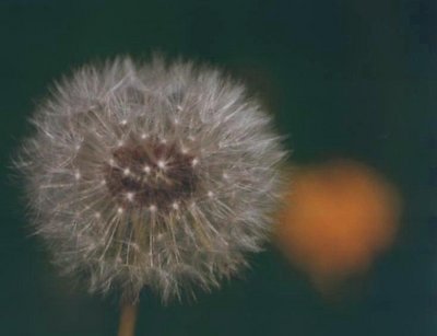
Hi Bjorn. This is total crap.
No, just kidding. I think you have something here, but it needs some work. I like the concept of the two stages of the flower together. (I assume that is what it is.)
What I don't like is how fuzzy and low contrast the picture looks. With closeups and macros, the bar is raised. Are you shooting on a tripod? If not, you might think of using one for this type of photograph. F:5.6 probably isn't going to do it for you here. It doesn't capture enough depth of field and the lens is not sharp enough at that aperture.
The composition is good with the blurred background and the yellow in the shape of a heart, but you need to arrange the space around your subject so it acts like a canvas. Attention to these details will raise your work from good to wonderful. This picture shows you have an eye, but your technique needs to be improved.
regards
John
|
|
|
|
 A. W. Osnafotos
{K:6373} 5/8/2003
A. W. Osnafotos
{K:6373} 5/8/2003
|
great....i like it !! regards andré
|
|