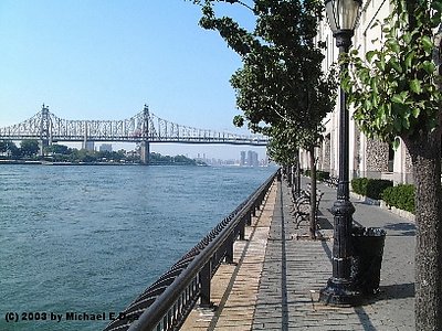
I, on the contrary, find myself quite fond of this image. And I feel the two-point kind of unfair. The lines in this picture form a very good subject as an abstract. I did some cropping and I hope the author doesn't mind. In the modified image, I located the crossing point at the 1/3 and 1/3 of the image to emphasize it. It's a tragedy of the cropped lamp head and the presence of the garbage can.
0
Marc Gougenheim{K:5398} 1/3/2003
Technically, this picture is fine, but it has no subject at all. The lamp is cropped, the bridge is too far to be the main subject, and the perspective effect is "empty" - meaning nothing else to see in it than just a perspective. Graphically, this image is very rigid with a kind of "T" composition, which doesn't strikes me as great graphically. Colors are boring too. What's left ? Nothing but a technically clean image of a piece of a place that I still know nothing substantial about after watching this image.
Sorry if it sounds harsh, but I thought I'd just speak my mind openly. No content here. Best regards.