|
|
|
Ian Crean
{K:14866} 11/30/2003
|
Tom, sorry I made a mess of the ratings and don't know how to put it right! Really sorry!
|
|
|
|
|
Ian Crean
{K:14866} 11/30/2003
|
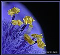
Whichever way you go with this (and it is worth the effort to find the best result) it is a superb macro. Quite apart from the stunning textures what I find most impressive is how you've made the four leaves which form the maijor part of the composition stand out from the crowd.
|
|
|
|
|
Neia Frank
{K:478} 1/18/2003
|
I think the crop now works much much better than the other one.The texture,light and tones are great!
|
|
|
|
|
Tom Vadnais
{K:973} 12/27/2002
|
Again, thanks to everyone for their inspiring comments. JB, I think you've got it best. Thanks, again.
|
|
|
|
|
John Black
{K:1047} 12/26/2002
|
I found that I didn't like this as much as the original and I couldn't figure out why. I thought it would be stronger with the corner to corner and looked, compared, and finally edited to figure out what I was originally thinking. I think it's too tightly cropped now. This is what I envisioned when I first commented... Hope this makes sense (and makes a good picture better).
JB
|

|
|
|
|
|
Thomas Paul
{K:111} 12/26/2002
|
My first reaction was that this is nice. After looking at it again, I like it even better. Light and texture are outstanding. It would be nice if the two small leaves at the bottom were not there.
|
|
|
|
|
Kristupa Saragih
{K:1031} 12/26/2002
|
Nice composition, nice colors
|
|
|
|
|
Alex Avilov
{K:634} 12/26/2002
|
When I saw the original picture I thought that it needed the cropping. So I tryed to crop it myself and got picture similar to yours, which i think is not better than original. These leaves at the bottom disturb now and don't add anything to the image, as opposed to the original where they do add some balance.
|
|


