Hi Liz, Merry Christmas and welcome to Usefilm. You've said in your bio that you would appreciate comments and help, so I will try to do this for each of your images so far. I myself love straightforward criticism with little "windowdressing", so I tend to comment in this way, I hope you'll find them helpful and not discouraging! I'm no expert so all my comments are my opinion only.
Righto... on with the show... :)
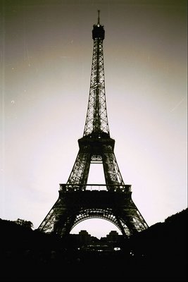
I like the idea behind this shot - the stark silhouette of the eiffel tower against the sky has a lot of potential, especially because it's such a well known shape. The impact of the shot could be improved however if the tower was a straight vertical, here it is leaning enough to distract. If you have access to image editing software, (assuming you have no objections), you could straighten this image quite easily. It's tough to see a tilt like that when you take the picture, especially probably stretching your neck to look upwards. The scan/print/negative is quite scratched/dirty - which is a distraction, and is again "fixable" with some digital editing work if you cared to do so. I'm not sure why the shot has the darkened arc across the top third - is that something you did deliberately? Finally I think you're to be commended for looking for a less common angle on the tower! The symetry of the buildings between the tower legs has potential to add additional "pattern" impact to the shot, but I think the best result would be gained by taking care to achieve a perfectly straight and central shot. The result would really sizzle if absolute perfect symmetry was achieved!