|
|
Critique By:
Robert Stokes (K:4509)
4/29/2004 2:28:55 AM
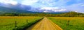
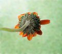
I've never seen a shot of Cades Cove quite like this before. The camera format looks great here, more so since you have some favorable light and those clouds over the mountains. I'm wondering, had it just rained? It looks that way to me because of the lack of haze in the air. People who haven't been here won't realize just how difficult it can be to get this shot with the lighting just right, a lack of haze in the air and what's that I see, or rather don't see, by golly there are no cars. Rare indeed. Nice shot.
|
| Photo By: John Barclay
(K:3650)
|
|
|
Critique By:
Mkm . (K:2458)
4/28/2004 9:55:38 AM
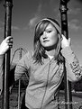
Well, Jeff. I liked the previous one better because of the clouds. It added a great sense to the image.However, I like this one too. I agree that there is a soft quality to it,but that adds a magical feel to it. I love the colored version more than the negative.Although, negatives are always interesting for a change! Keep it up =)! Well done
|
| Photo By: Jeff Cartwright
(K:52046)
|
|
|
Critique By:
JL E (K:9693)
4/26/2004 9:49:55 PM
Hi Bulent:
I've been looking your portfolio for about 20 minutes. And I like it so much. Sincerely I'm not a fan of digital, but your work is amazing.
I've spent the last 5 minutes on this one. And I don't know where starts.
Is a wonderful work. Is not less excellent than a medium format b/w photography, with all the details it gives you. I think is perfect the project election. I can see it has poetry. But I like mostly (apart from details and composition) the lighting you used. I can see you used PS (because you are telling it), and I like it, is very well balanced the light and tones. But Is amazing that one can't not realize about the moment of the day. It could be the sun of midday in a very fast exposure, but also It can be moon of the midnight.
And the square format goes really good on the composition.
so... overall:7/7, thanks for sharing it!
cheers (sorry about my English)
ps: you should try some b/w photography, is only my point of view of course 
|
| Photo By: Bulent Ahiskal
(K:1251)
|
|
|
Critique By:
Xena B (K:183)
4/24/2004 4:58:21 PM
Phil,
This is a great shot and I love the title. The shadow play in it inspires curiosity, from those being naturally cast along the ground to the dark, almost disproportionate figure on the upper right side. The shadows falling on the ground around the woman almost seem to hedge her in. The angle she's standing at is so strange in part, I suppose, a trick of they eye influenced by the curve of the tree. I spent some time looking over this image. Apart from the fact that its new work to me there is so much of interest in it. Just when you think you've seen it all something else creeps out of the shadows and attracts your interest. I like pictures that get me thinking. This, to me at least, is one of those. One for the favorites. Nice one boy! More like this please!
|
| Photo By: PhilCB 1973
(K:1894)
|
|
|
Critique By:
Hugh Hill (K:1618)
4/23/2004 10:40:46 PM
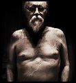
What are the marble effects on the body>?
I like them, it gives a statute type appearance and the darkness where the eye's should be indicate to me an uncertainty in the direction of life.
Another extraordinary image by an remarkably talented artist.
|
| Photo By: Bernt Carlzon
(K:554)
|
|
|
Critique By:
Larry J. Rhodes (K:2441)
4/23/2004 4:48:16 AM
This is a simple yet strong image. It grabs my attention and holds it, and I see so many different things when I look at it. Flood lights hanging on a wall outside a bar at night, the faucet of an old basin tub, even an old steel syringe. It sparks my imagination, and I love images that do this. The lighting and framing are impeccible. The only thing I can see that I can suggest would be a deeper depth of field to get everything in sharp focus. It would've really finished this picture off, I think. But, as everything else is in art, my opinions are purely subjective, and what appeals to me may not appeal to anyone else. That's why I hate making suggestions about things to do differently, but, at the same time, I feel that, by hearing others' ideas about my work, I get a better idea of how to approach it in the future...even ways I would never have imagined otherwise. Good job! 
|
| Photo By: Jim Greenfield
(K:5172)
|
|
|
Critique By:
Roberto Arcari Farinetti (K:209486)

4/22/2004 11:24:15 AM
hello Ivan...
they are firm on this photo from ten minuteren! The believe that it is a great piece of photo, it is like aesthetic that like composition and emotionality... the light overexposed of hats is fantastic, as the smoke that encircles the head, the field of grain (clearly) and the background of the trees (dark) makes from superb contrast with the subject, which it is in means to the photogram. (little "moved" second the good rule) is main presence, divided completely from the line grain forest!
the exposure of this backlighting is truly fantastic!
we have much to learn from this beautiful photo!
my congrats is a very wonderful mode.. and I hope that this photograph make road.. deserves it. my wish!
cheers
roby
|
| Photo By: Ivan Møllebjerg
(K:6079)
|
|
|
Critique By:
Sérgio Vieira (K:3384)
4/21/2004 3:16:34 AM
Amanda,
This is a very original self-portrait. Well seen and composed and I really liked it a lot.
But you really got yourself in a tricky light situation there in two aspects:
1. The dark tones of your clothes against the strong light from the window.
2. The white cast from the light from the direct reflection from the mirror.
The first one is good if you want to highlight the background until it has no detail. But then you have to do this:
1. Focus your camera to the subject (light measuring is afected by the focus distance).
2. Put your hand or a medium-grey card filling all your centerweight meter.
3. Adjust the camera to 0 (or level the needle).
The other one, the cast, is like having your camera pointing to the sun. The cast can be fixed after and is good if you want high key, it will give a difuse look to your photo.
What happened IMreallyHO, is that you measured your camera to the correct light situation. And I believe it has center-weightned metering, wich means it will evaluate the light more in the center and a litle percentage on the rest of the frame. So has your clothes where not only dark but with the light from behind, even if you compensated the meter, it would still be a tricky measure.
I don't know if you understand this (maybe you already do) but I drew this anyway (ops! yes over your photo ) so I could explain better.
I also made another version with the correct metering in you (and no cast). I will post it after.
If you have any doubts or reclamations please feel free to let me know.
Congratulations on a very original portfolio!
Best regards,
Sérgio
|
| Photo By: Amanda Hensley
(K:360)
|
|
|
Critique By:
Taras R. Hnatyshyn (K:4055)
4/19/2004 8:40:46 PM
Jose Luis,
Most people taking pictures of star trails tend to avoid the nights with the moon. This is original from that respect. In this image, there is little detail below the horizon. Maybe a flash, or better yet a flashlight (torch) could have been used to add some details there. If the horizon wasn't so flat, this wouldn't be needed. This type of image may work better on color film. It is good to see someone else pointing their Hasselblad to the heavens...
Taras
|
| Photo By: JL E
(K:9693)
|
|
|
Critique By:
Matej Maceas (K:24381)
4/19/2004 10:09:21 AM
"this is as close as I could go with the lens I was using"
Well, I'm not sure. I think it depends on what you were trying to get in focus. If it was the white mouse, you've gone too close, and the out-of-focusness is due to exceeding the minimal focusing distance rather than from unsteady handholding. If your target was the black mouse, then you got it almost right. Either way, the words "promise for" and "aqueous media" just to the right of the rear mouse seem to be most in focus.
"small movements are exaggerated when so close in with non-macro lenses"
I think they're exaggerated when close in with macro lenses as well. The magnification should play the key role here. The greater the magnification, the more impact will any shift in camera position have on focus.
By the way, have you tried setting the focal length on your zoom lens to 50mm, focusing to infinity and holding the lens reversed to the camera body? It should give you a macro lens.
"I was experimenting on how to force film to become grainy through processing"
It's great to see people still using film, and using it creatively. What did you develop it in?
|
| Photo By: Daithí O' Donoghue
(K:838)
|
|
|
Critique By:
Roger Williams (K:86139)
4/18/2004 5:42:34 AM
I like this photo very much. "Colourful" is an understatement! But there is quite a difference between the colours and textures in the foreground and those in the background (the wall carpets). Since the businessman is the main element, you could increase the impact he makes by trimming away most of that foreground, which I find a bit distracting. I mean, right up to the pillow/cushion. The he would be thrown up in relief against the darker colours of the background. Also it might have been nice if he had looked this way... but you can't have everything! What do you think?
|
| Photo By: Elahe S. Ahmadian
(K:8695)
|
|
|
Critique By:
Keith Naylor (K:13064)
4/17/2004 12:04:19 PM
An impressive image, and as everyone has commented the double entendre work very well indeed.
The lighting is almost perfect, just a tad darker towards the top as previously noted. However its the angle at which the fruit sits that adds most to this composition, the angle is just right. I can't think of any other way to enhance the image.
Congratulations
Keith
|
| Photo By: John Lamb
(K:9687)
|
|
|
Critique By:
Bradley Prue (K:30678)
4/15/2004 8:54:33 PM
Hi Mia!
Ahhhhhh, this is juicy. Where do I begin?? First of all the DOF is awesome. Not only does it provide a 3-D experience, the "stems" in the background actually have the appearance to be shaking. This is a very nice example of color "jumping out at you" without being juiced up, or too loud. It is the combination of colors, working together that is so appealing, as opposed to A color, standing out boldly. The overall composition has everything..eye catching color, depth, and balance. Great eye, Mia! ...Brad
|
| Photo By: Mia Hargreave
(K:790)
|
|
|
Critique By:
Petros Stamatakos (K:12101)
4/15/2004 9:46:54 AM
Sara, I've seen one too many flower shots lately, and I think I'm over them. You, however, have a slightly different approach going on here, and of course I'm referring to the angle. It's refreshing to see people try something different. Good for you.
Now, here are a couple of things that would potentially improve the image:
1/ Focus - Not everything has to be sharp in photography... Not even flower shots. I do think though, that in this case, your photo would improve if at least one part of the shot was in focus.
2/ Composition - Like I said, I loved the fact that you chose to shoot this from behind. Have you tried moving the flower away from the centre though and say, the stem coming into the frame from the corner of the photo? I think it would be better that way... What do you think?
By the way, I love your background. Nice Job!!!
Keep posting :-)
|
| Photo By: Sara M
(K:12411)
|
|
|
Critique By:
Mattias Eklund (K:2921)
4/5/2004 2:00:57 PM
Hi.
I also like to take macros of barb wire and think this is a good shot. I like the contrast between the green background and rust red wire.
I think you are slightly off with your focus, I would like to see real sharpness right where one of the wires meats the spiral.
I also think that the composition is a bit messy with the wires to the left. I suggest to crop it tighter, for example like this:
|
| Photo By: Marta Pereyra
(K:5029)
|
|
|
Critique By:
benjamin mati (K:598)
4/13/2004 4:44:45 AM
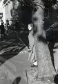
I like this photograph. I tried to read while walking in the city and it never worked. I think you capture the reason here. There is a lot going on, lots of angles and intersectiosn, and its a bit hard to focus on one aspect of the photo.Like trying to focus on a word or sentence while walking.
|
| Photo By: John Strazza
(K:11535)
|
|
|
Critique By:
Paul Fisher (K:641)
4/12/2004 5:09:47 AM
Nice and sharp, and well exposed. However I feel this shot does not make the greatest possible use of the subject.
Try framing (or cropping) to a vertical format to match the upright stance of the flower.
Although the background has been thrown out of focus, there is still too much detail, and the colour is too similar to the lower part of the subject flower. To make the main subject "pop" you may need to use lighting (eg flash exposure of the flower and let the background go dark) or perhaps drape some coloured cloth behind the flower. I always carry a square of black velvet for this purpose.
|
| Photo By: Robert Jones
(K:1692)
|
|
|
Critique By:
Paul Lara (K:88111)
4/10/2004 7:35:36 PM
Given the harsh nature of sunlight without any fill, this is a very good portrait, and you had her pose at just the right angle.
That said, you can use an inexpensive piece of white foamcore to bounce sunlight into the shadows, softening them up considerably.
So, you like your Kodak, Drew? I have the same model, and I'm having a blast with it!!
|
| Photo By: Drew Brashler
(K:750)
|
|
|
Critique By:
Betsy Hern (K:12872)
4/10/2004 7:22:41 AM
This is really clever. As a reflection, the clarity of your hand and camera is very crisp, you must have a steady hand. The tilt makes this a more dynamic composition, and even though this is a dreary day the colors are super - the muted reds and blues and cream/gray shades go well together. the rain drops appear as if they are mervury, not water, nice effect. I think the added frame, while appropriate to the subject is not needed. The photo speaks for itself and is very creative.
|
| Photo By: Jessica deem
(K:187)
|
|
|
Critique By:
Emgy Massidda (K:60358)
4/9/2004 6:03:24 AM
Hi Jeff
What an amazing shot!
Some photos are fascinating for their simplicity, others, like this one, is fascinating just because there is so much to see. I love this composition. It's lots of photo's in one and everything I see is interesting in its variety of details. The choice of B&W is perfect. In colour it would probably look messy and with distracting elements. Well balanced composition with a beautiful display of texture and shadows.
I'm adding this to my favourites
cause it's ispirational and absolutely superb
(Check my croppings coming next)
Best regards - Emgy
|
| Photo By: Jeff Cartwright
(K:52046)
|
|
|
Critique By:
Chris Hayward (K:1519)
4/5/2004 8:47:59 PM
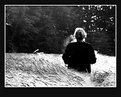
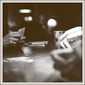
This one caught my eye in the thumbnail. I think one of the things that I liked in the thumbnail was how the two people were just a speck in the rest of the picture. When I look at this full size my attention swaps back and forth between the statute making and the couple - almost a commentary on the actions of the couple. I do wonder what the effect would be had you opened the lens up and fuzzed out the foreground - or even (assuming that it was possible w/o disturbing anyone) had a wide angle w/ the lamb (sheep) dominating the frame.
On this shot I'd also wonder about applying a minor crop to knock out that white sky.
Just thinking about alternatives -- As it is, it's a nicely done shot!
|
| Photo By: Raamses Ortiz
(K:4408)
|
|
|
Critique By:
Elangovan S (K:10675)
4/3/2004 9:24:28 PM
Asim...
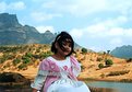
I just quickly looked at your portfolio. This is your daughter, right? You might have emotional attachment to this picture. However, as a viewer of this image this is what I feel, and is purly my personal opinion.
Couple of things to note -
- This is much like a bull'e eye composition. The subject's face (eyes) is at the very much center of the picture. Hmmm... This location where you shoot is the right opportunity to keep the subject in a one of the thirds. In this case, I would have setup the subject where the left and center 3rds are intersecting - if I wanted to shoot w/o fill flash, because the light is coming from the right side of the frame. Even though she is in the open shade still the light is directional. For an alternate composition, the subject could be positioned at the intersection of right and center 3rd and use fill flash to kick it up a bit.
- secondly, there is nice bit of room in the picture, I wouldnt have cropped her like that. But thats just individuals choice. But as a thumb rule, dont crop at the joints (such as knee, ankles and such) of the subject.
The film that you used an awesome film. I just love 'em.
Keep shooting. Have fun.
Elangs.
|
| Photo By: Asim Roy
(K:10051)
|
|
|
Critique By:
Roger Cotgreave (K:15892)
4/2/2004 5:26:07 PM
beautiful image Richard..thr BW looks good in this one.
I also bought Fred's plugin but I can do it much quicker that works for me.I think petteri actions are good but I do it this way. I tune up the colour version and then change it to BW via lab mode keeping the lightness channel, flip this to greyscale and then back to RGB.
Make a colour balance adjustment layer and slot a bit of red and yellow into the midtones and blue into the shadows or vica versa or whatever colour you want. Then give this a multiply filter which darkens the bottom copy.
Hold shift, ctrl, alt, E, while your pointer is on make new layer, bottom of layers palette. This will make a copy of all the layers without flattening them. So now you have three layers, original,adjustment layer and a layer combined of both.
Go back to the adjustment layer and lower the opacity and merge with background layer. Now I have two copies one darker and one lighter. I make a mask between the two of them and start rubbbing back into the lighter copy and playing with the opacity. I will do this until I have the play of light and darker the way I want it...It sounds a lot but it isn't. If I just want the BW shot skip out the colour adjustment layer just make a copy and give it a multiply filter ( overlay and soft light work well) and do as above....let me know how you go, rog
|
| Photo By: Richard Marriner
(K:6657)
|
|
|
Critique By:
E A (K:727)
3/31/2004 3:03:27 PM
First reaction: I'm assuming you made some levels adjustments here... I might suggest a little *less* blow-out, if that's the case. I think you can maintain a stark, modern, eye-catching look while still maintaining the look of a photograph as opposed to a graphics piece. Did you cut out and completely eliminate something to the left of the frame? If the wall surface was white or similarly light and had even a slight texture, it could be retained slightly to "ground" the image without losing the surreal nature. As is it's very eye catching, but needs more to hold focus as a photograph.
|
| Photo By: H.Keith Wills
(K:87)
|
|
|
Critique By:
Phillip Cohen (K:10561)
3/29/2004 6:37:14 PM
I like this image a lot. I can see why it is an editors choice. The image has a very painterly (is that a word) quality to it. The brush strokes have been replaced by a little grain and fuzziness. It is abstract enough but you can almost tell what it is. The colors are nice and soothing and the lighting is spot on. It all works very nicely. I would hang this on my wall.
Not all images have to be Weston sharp. This image is definitely a piece of fine art. The fact that it was totally made in the camera with no after the fact modifications via photoshop makes it even that much better in my mind.
Good job Erika, well seen and well captured. Keep working at it and post often. I look forward to viewing more of your images. Don't be affraid to experiment and go for that masterpiece.
Phil
|
| Photo By: Brian Veleker
(K:17)
|
|
|
Critique By:
Becky V (K:9699)
3/27/2004 9:23:32 AM
Having lived in similar climates to Calgary, this photo definitely captures a strong feeling of springtime for me!
I really like the composition of this photo and how it gives equal time to the ground, water and sky. I like the slope of the ground in the bottom of the photo, but at the same time I feel seeing a little less tree would be nice, particularly because it's obscuring some potentially strong lines along the shore. The rolling clouds are great and they create some nice depth, though they are a bit overexposed, along with the icy lake. That's always a tough one - I personally find it hard to render sun on ice or snow without things getting all supernova on me . . . that's why I was thankful to get a neutral density filter for Christmas!
|
| Photo By: Jeff Cartwright
(K:52046)
|
|
|
Critique By:
Hugo de Wolf (K:185110)
3/26/2004 10:38:35 AM
Hi Maria, I just read your comment (thanks....) I'll try to elaborate a bit more.
I think that if you would've used a smaller aperture, the shallow Depth of Field would have enhanced the distance; it would blur the foreground as well as the background. The effect depends on the used focal lenght, the more you zoom in, the wider your DOF gets.
Secondly, I think the photo is slightly overexposed, and it looks like you took this shot at midday, very bright, to say the least. Early moring or late afternoon would've softened the light and would've added some more "dramatic" shadows.
As far as the compostion goes, I think it is a bit static. Before the shot, ask yourself what you intend to display or tell by the photo. Then adjust your camera settings, and only then compose the shot.
As to the sharpness I had a feeling it was zoomed in quite alot, even digitally. Hard to tell why it seems slightly out of focus or how you could've prevented it, as I don't know what you did.... One possibility I can come up with is that you increased the size of the photo before uploading it.
Hope this helps....
Cheers,
Hugo
|
| Photo By: Maria Luisa Vial
(K:36017)
|
|
|
Critique By:
Emgy Massidda (K:60358)
3/25/2004 6:53:38 PM
Another night shot with superb lighting and colours, I like the details in this one.
Beautifully composed and superbely captured image.Great work!.
P.s. thanks for comment, Mike. You couldn't find the raincoat I photographed it in close-up and the only thing visible are some folds. The light source is natural. We had an exceptional sunny morning inbetween the many rainy days. The sunlight getting in from the window made the colour of the raincoat appear very nice, that day.It's the reason why I decided to take a shot of it. The folds made for some beautiful shadow work
Regards - Emgy
|
| Photo By: Mike Ombrello
(K:4878)
|
|
|
Critique By:
tom rumland (K:14874)
3/24/2004 7:43:20 PM
Interesting... just the hands this time. i was fascinated by the disembodied hands in the first one. this gives it a whole different feel. i also agree with Saeed regarding the "dizzy" lights. to me it looks as if a cylon centurion is sitting in the shadows watching the game. which brings me to the coolest part of the image: the contrast. not just color contrast but the contrast between moving objects and still ones. very cool effect. well done, hugo! btw, what is that i see right in front of me at the bottom of the frame?? is that the top of a bald head?? nice touch ;^)
|
| Photo By: Hugo de Wolf
(K:185110)
|
|
|
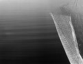
Critique By:
Becky V (K:9699)
1/5/2003 2:25:44 AM
I really like the contrast of the two textures here, and how it's almost impossible to judge the distance/depth between the water and the metal. I feel the vertical metal "strap" kind of detracts from simpleness of the abstraction, but I suppose without it, the fence would be *in* the water. :-)
I really enjoyed the California series you posted, and have been meaning to comment on it since it was posted. I like your unique interpretation of the California coast - very moody and almost pessimistic (that's my interpretation anyway).
My favourites of the series were 2, 3 & 5, though I think 5 is the best because it fits well into the series, yet stands out on its own as a great abstract.
|
| Photo By: al shaikh
(K:15790)
|
|