|
|
Critique By:
Neil Dolman (K:26883)
8/20/2005 8:57:44 AM
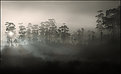
Hi Kim, thanks for your comment yesterday. I visited your Website, you really do have some great shots. Here on Usefilm it was hard to find a shot without a dog in it  Just joking (they are all very good) but eventually came across this one. As i'm a fan of your "magic light" landscapes i thought i would reply here. I'm sure by now you have printed this, i sincerely hope so! I like the combination, very colourful and ALL the images are excellent. I can see what you mean about the layout, but i think that is due to the emptiness and colour involved in the top horiz. one. It is just so strong and appears optically to be larger than the one underneath it. When i scroll the photo in IE then i crop just a tiny bit of the top of this photo and it gets a different weight in the overall picture. You lose a little cloud formation (which in the original would be really important) but for the sake of this collage, mabe it helps here. Just IMHO Just joking (they are all very good) but eventually came across this one. As i'm a fan of your "magic light" landscapes i thought i would reply here. I'm sure by now you have printed this, i sincerely hope so! I like the combination, very colourful and ALL the images are excellent. I can see what you mean about the layout, but i think that is due to the emptiness and colour involved in the top horiz. one. It is just so strong and appears optically to be larger than the one underneath it. When i scroll the photo in IE then i crop just a tiny bit of the top of this photo and it gets a different weight in the overall picture. You lose a little cloud formation (which in the original would be really important) but for the sake of this collage, mabe it helps here. Just IMHO
Best wishes from Switzerland, Neil
|
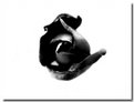
| Photo By: Kim Culbert
(K:37070)
|
|
|
Critique By:
Neil Dolman (K:26883)
8/20/2005 8:46:42 AM
Hi Petros, congrats on being on the front page for the critique you wrote for Peta, that was excellent. This photo is a real gem! i would have liked you to sahre the exposure info with us though  At first the white point/star/plane toward the left of the image annoyed me but then when i study it closely i can see other very faint ones so i assume they are stars and then it didn't worry me anymore At first the white point/star/plane toward the left of the image annoyed me but then when i study it closely i can see other very faint ones so i assume they are stars and then it didn't worry me anymore
Nice work.
Best wishes from Switzerland
Neil
|
| Photo By: Petros Stamatakos
(K:12101)
|
|
|
Critique By:
Neil Dolman (K:26883)
8/20/2005 8:40:30 AM
@ Petros: Great critique. Very well written... fair and to the point. I enjoyed reading it. I'm also pleased for Peta in getting some recognition.
Best wishes to you both
@ Peta: I feel Petros has a good point here, and am pleased you are on the front page. Take care Neil
|
| Photo By: p e t a .
(K:18700)
|
|
|
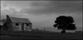
Critique By:
Neil Dolman (K:26883)
8/16/2005 11:38:31 AM
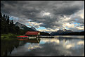
Hi Greg, excellent shot and beautiful landscape. I'm pleased you posted and shared it with us. I feel you could have gotten a little more out of it with a little more contrast, especially in the hut area. Hope you don't mind i tried it for you. It might not be your thing and it does take a little away from the eerie atmosphere. Still i enjoyed trying. Rememebr you are the artist!
Take care and best wishes Neil
|
| Photo By: greg collins
(K:12273)
|
|
|
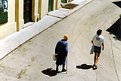
Critique By:
Neil Dolman (K:26883)
8/15/2005 1:37:01 PM
Hello Branimir, Great the way you are concentrating on your village/town, with some very nice street shots. This one here has a touch of Cartier-Bresson IMHO. Excellent and unusual capture. My compliments.
Best wishes from Switzerland
Neil
PS: Thanks for visiting my portfolio.
|
| Photo By: Branimir Fagarazzi
(K:38367)
|
|
|
Critique By:
Neil Dolman (K:26883)
8/15/2005 7:05:48 AM
Hi Peta, well it's a good first attempt BUT i can see the stitches (all four of them ) It seems to me you have not used the same exposure for all four images. This is really important. Measure the scene and then choose a middle exposure that will best cope with everything. Set the camera to manual and then take the series, of course using a tripod and concentrating on your horizon etc. I use a spirit level to make sure that it is all straight. When stitching try and use a layer mask so you can make the join gently blend into the other one. This is what makes it noticeable here as your second from left image is much better exposed than the other three and the line (if you look carefully is quite distinct, but i'm sure you knew that. Please don't get me wrong and i don't want to take any praise away from this excellent effort. Keep up your good work and most of all have fun. I too am a big fan of the panoramic format and have done several myself. We talked about Ken Duncan and Peter Lik, they are both masters of this You have some great advocates in your country to help you. Take care
Neil
|
| Photo By: p e t a .
(K:18700)
|
|
|
Critique By:
Neil Dolman (K:26883)
8/14/2005 3:46:04 PM
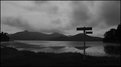
Hi Phil, nice photo! I've been up that way i think. Is that near "Stone", just across the other side of the loch if i remember correctly. Stayed in a B&B just about where you would have been
Best wishes, Neil
|
| Photo By: Phil M
(K:11526)
|
|
|
Critique By:
Neil Dolman (K:26883)
8/14/2005 3:43:32 PM
Hi Carsten, wow! Beim durchlesen dein "About" dachte ich, "Phew, das klingt ja kompliziert". Aber das Resultat lässt sich durchhaus sehen. IMHO ist den Himmel etwas zu dunkel geworden, (Dodge und Burn?) aber mir gefällt sehr diese Breite und Leere im Bild. Schöne und gelungene Arbeit - Congrats
Herzlichen Grüsse aus der Schweiz
Neil
|
| Photo By: Carsten Ranke
(K:14476)
|
|
|
Critique By:
Neil Dolman (K:26883)
8/14/2005 8:44:11 AM
Hi Alexandre, EXCELLENT shot. I'm sorry it isn't getting the attention it deserves. Sometimes the name at the bottom of the photo is worth more than the photo itself. That is the way it works on UF I'm sure you know what i mean.
I think this is brilliant. Well done.
Best wishes from Switzerland
|
| Photo By: Alexandre Hoffmann
(K:374)
|
|
|
Critique By:
Neil Dolman (K:26883)
8/14/2005 8:27:58 AM
Hi Cessy, now if i only could say the name of that place correctly
Love the toning you have achieved here, almost monchrome but not quite. And what i really like is the depth of the photo. It is really quite sharp and still has great depth to it.
Very nice shot you can be proud of.
Best wishes Neil
|
| Photo By: cessy karina
(K:14205)
|
|
|
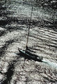
Critique By:
Neil Dolman (K:26883)
8/14/2005 8:11:10 AM
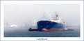
Hi Antonia, very nice image and it really enhances the size of this ship by using the wide format. I like the treatment of the haze, it too works well. Did you get some good sunset shots?
Many thanks for your comment & best wishes Neil
|
Photo By: Antonia BauerleinSehnert
(K:30599)

|
|
|
Critique By:
Neil Dolman (K:26883)
8/14/2005 8:05:48 AM
Hi Mark, i have a couple of questions. Any chance of writing me at neild@bluewin.ch. I would very much appreciate it, i was told by a mutual friend you could help. Cheers Neil
|
| Photo By: Mark Julian
(K:36866)
|
|
|
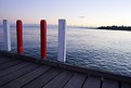
Critique By:
Neil Dolman (K:26883)
8/13/2005 2:32:29 PM
Hi Peta, Very nice shot here and not an easy one! I guess if you had made the horizon level then you might have had a problem with the verticals from the post? (not sure). Anway if you get the chance to go back again and do this in the evening, so you can do a long exposure with the glassy effect of the water and maybe just a touch of colour on the posts this would look fantastic. I have a desktop photo from a photgrapher whom you would love (Judging from your Portfolio) He's also from Australia. Unfortunately i'm not on my compi at home at the moment so i'll have to send you the name later. He specialises in exactly this sort of photo.
By the way thanks for your comment on my work. and i love your Portfolio.
Best wishes from Switzerland
Neil
|
| Photo By: p e t a .
(K:18700)
|
|
|
Critique By:
Neil Dolman (K:26883)
8/12/2005 2:57:41 PM
Ciao Antonio, very nice Portrait, with good lighting. Now if only you could have had a different background or less detail in it Still as this guy has an axe in his hand i guess it's not a good idea asking him to move Still you can't have everything. Wish you a nice weekend.
Neil
|
| Photo By: Antonio Trincone
(K:23167)
|
|
|
Critique By:
Neil Dolman (K:26883)
8/12/2005 9:50:19 AM
Hi Aimee, nice to see a photo from you again. Funny just the other night i was looking at your portfolio again! I like this, it has a really solidness to it, which you don't expect from a flower. Nice work
Neil
|
| Photo By: Aimee' Desire'
(K:744)
|
|
|
Critique By:
Neil Dolman (K:26883)
8/12/2005 9:46:24 AM
Hi Lori, nice work of art. Love the texture created by the composing of tweo images. Looks like a painting.
Best wishes Neil
|
| Photo By: Lori Stitt
(K:75282)
|
|
|
Critique By:
Neil Dolman (K:26883)
8/12/2005 9:44:43 AM
Great shot Tim. I would like to see this blown up to around 2 metres and hung on a wall.
Very nice.
Best wishes Neil
|
| Photo By: Tim Schumm
(K:29196)
|
|
|
Critique By:
Neil Dolman (K:26883)
8/12/2005 9:43:13 AM
Hi Mindy, this is a great shot and i hope for you it gets some attention. It is one of those that you really need to open up to appreciate. On the thumbnail you don't get this at all. I like the effect of two photos in one!
Very nice, congrats
Neil
|
| Photo By: Mindy Frankel
(K:157)
|
|
|
Critique By:
Neil Dolman (K:26883)
8/12/2005 9:37:16 AM
Hi Ursula, i find it hard to find any fault with this at all, not that i need to I don't agree with Thilo about the schwarzpunkt, for me the contrast is just fine. The only point i would mention is the asymettry of the fine black border. It has more on the right than on the left. I find this happens to me if i choose an uneven amount of pixels for the border. So i always choose 4 pixels eg and never three. I think it is a photoshop bug!
Best wishes Neil
|
| Photo By: Ursula Luschnig
(K:21723)
|
|
|
Critique By:
Neil Dolman (K:26883)
8/12/2005 9:33:10 AM
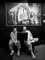
Hi Ursula, did you take the picture on the wall as well? Just joking. I really like this one from you. It is interesting, and as Bradley said the relationship between the two people comes across as well. It looks great in B&W and you have done an excellent job here. Congrats
|
| Photo By: Ursula Luschnig
(K:21723)
|
|
|
Critique By:
Neil Dolman (K:26883)
8/11/2005 11:24:18 AM
Hi Greg, nice and moody! I would have prefered a little more difference between the Black and white, maybe not quite so dustre! But thats just IMHO. Is this between the islands towards (the other side of) port chalmers? Anyway thanks for sharing photos of this great peninsula.
Cheers to all in Godzone
Neil
|
| Photo By: greg collins
(K:12273)
|
|
|
Critique By:
Neil Dolman (K:26883)
8/10/2005 9:02:02 AM
Hi Kai, i really like the solitary person in this photo. Of course the lens is dirty, but that added to the effect for me. I thought it might look good in B&W so i did one for you. I removed the noise in NeatImage and used the healing brush to get rid of most of it, but then i found the image so sterile so i added some back again , converted it to B&W. Hope you don't mind. I like your image.
Best wishes Neil
|
| Photo By: Kai Yiu, Chan
(K:431)
|
|
|
Critique By:
Neil Dolman (K:26883)
8/10/2005 8:39:57 AM
Cool effect Fabio, for me it works better on the thumbnail for some reason? But i could well imagine this as a poster or even a bronze sculpture/statue. Interesting and greta texture. Makes you think.
Nice work
Neil
|
| Photo By: Fabio Keiner
(K:81109)
|
|
|
Critique By:
Neil Dolman (K:26883)
8/9/2005 8:17:28 AM
Hi Chris, nice idea and very good PS work. Good composition with the line if water coming towards you. That is sometimes the hardest part doing that in the dark
Best wishes Neil
|
| Photo By: Chris Hunter
(K:25634)
|
|
|
Critique By:
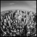
Neil Dolman (K:26883)
8/8/2005 1:16:10 PM
Hi Hugo, i always knew the world was round, and now thanks to Huge de Wolf i finally have proof. Nice shot and deserving of the recognition.
Thanks also for the comment on "Henry Moore", next time your in Zürich give me a call, OK?
Best wishes Neil
|
| Photo By: Hugo de Wolf
(K:185110)
|
|
|
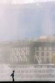
Critique By:
Neil Dolman (K:26883)
8/8/2005 9:08:49 AM
Hi Cessy, i didn't see this one before. I prefer it because you not only have the attraction of the water, but also the togetherness of the couple, and a littel if the city in the background. Nice shot.
Neil
|
| Photo By: cessy karina
(K:14205)
|
|
|
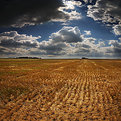
Critique By:
Neil Dolman (K:26883)
8/8/2005 9:05:47 AM
Ciao Paolo,
Tuscany at its best, beautiful landscape and i love those clouds.
Best wishes from across the alps,
Neil
|
| Photo By: Paolo Pagnini
(K:828)
|
|
|
Critique By:
Neil Dolman (K:26883)
8/8/2005 8:43:45 AM
Hi Cessy, if it's from Switzerland... i have to comment . Nice effect looking through the water. All you need is a rainbow and it would be perfect.
Best wishes Neil
|
| Photo By: cessy karina
(K:14205)
|
|
|
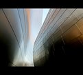
Critique By:
Neil Dolman (K:26883)
8/5/2005 7:34:12 AM
Hey Paul, this is REALLY cool! Love the perspective and the texture, warp etc. But the touch of the different colours make it really special. The exposure looks like it might have been a bit tricky so i think all in all you've done a great job.
My compliments and best wishes,
This is a +7 from me.
Neil
BTW: i too thought of the bug of 2 ships at first
|
| Photo By: Paul's Photos
(K:35235)
|
|
|
Critique By:
Neil Dolman (K:26883)
8/4/2005 7:13:58 PM
Hi Mary, no problem! Basically there are several ways to do this (and no/yes you are not really on the right track by looking in your control monitor settings!) The idea is that you set up your monitor so it accurately reproduces the colour and brightness etc that will be seen/accepted by most monitors at home, or will agree with your printer settings.
As i said there are several ways/programs that will help you do this. If you use photoshop, one program that is delivered with Photoshop is Adobe Gamma. You will find this on your computer somewhere (if you need help just ask). This when correctly set up "lets you calibrate the contrast and brightness, gamma (midtones), color balance, and white point of monitors. This helps you eliminate any color cast in your monitor display, make your monitor greys as neutral as possible, and standardize your display of images on different monitors (whatever the combinations of monitor and video card). The utility then saves these settings as an ICC profile for your monitor" (btw: i copied this from an internet site, makes it easier to explain).
Before i did this myself i would have photos that looked wonderful at home but when i posted them they were always to dark. OK, i can check them at work (television) so it's easy for me. But now i have a pretty good idea just how far i can go and i see everything/lots of things that others don't. Like your rock for example, or where someone has used the USM on a particluar part of the image and thinks no one will notice
It is not easy to get a good calibration, but worth the effort... after all you spend a lot of time trying to get a good composition/photograph and it would be a shame when it doesn't come across quite as you would have liked it.
If i can help in any way just let me know, otherwise take a look in google and you'll find lots of information.
Best wishes Neil
|
| Photo By: Mary Brown
(K:71879)
|
|