|
|
Critique By:
Marco Vredegoor (K:7301)
9/20/2007 5:15:23 PM
yeah i was in the neighbourhood :P
|
| Photo By: Annemette Rosenborg Eriksen
(K:55244)
|
|
|
Critique By:
Marco Vredegoor (K:7301)
9/20/2007 5:14:05 PM
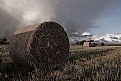
simplistic but good composition! the different shades in grey work really nicely and help creat a feeling with the picture. the square shape is a good chosen shape, it brings out the vertical lines more. Otherwise i think it would be too horizontal.
All the best, Marco.
|
| Photo By: Pawel Rubaj
(K:801)
|
|
|
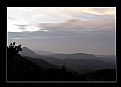
Critique By:
Marco Vredegoor (K:7301)
9/20/2007 5:11:28 PM
wow excellent picture. Great colors and great sky. Really dramatic clouds indeed. The perspective works really great here.
|
| Photo By: Annemette Rosenborg Eriksen
(K:55244)
|
|
|
Critique By:
Marco Vredegoor (K:7301)
9/20/2007 5:01:23 PM
hey michele, how ru? i like this picture very much. It looks at first like a simple object, but when i took a sharper look i saw that you posted the primary colors each in one corner (or accidently??) Red left upper corner, blue right upper corner and below left the flowers are yellow. The only problem is that the empty right corner below pulls ur eye into the middle and to the back. But you can also say that when u clicked the pirate was in the middle and swinged towards the left of your frame 
Anyway: always nice to see this kind of allday american life. It brings to perspective how small the world really is. There is so much to see on this, and it is very sharp. I like it! a 7+
|
| Photo By: Michele Carlsen
(K:146013)
|
|
|
Critique By:
Marco Vredegoor (K:7301)
9/15/2007 10:42:02 AM
ah coffee my favourite drink, nice shot too.
|
Photo By: Pablo Dylan
(K:63918)

|
|
|
Critique By:
Marco Vredegoor (K:7301)
8/28/2007 12:42:31 PM
hi michele, even the summer is very busy, but i always take time to see the pictures here. I also took som time to take some pictures myself, maybe i will post them soon if any's good enough.
all the best, marco.
|
| Photo By: Michele Carlsen
(K:146013)
|
|
|
Critique By:
Marco Vredegoor (K:7301)
8/25/2007 12:58:55 PM
hi michele, interesting picture and it does make u wonder how people could have made this kind of sarcofugus in the ancient times. I can't see how you have taken this shot... is it lying down or is it standing above your head. I do see that you had a flash on your camera, which makes the colors lack a certain mysteriousness. (if that is a word in english :)) I think it would add more to the character if you had uses a tripod and no flash, also the sharpness on both ends is not equal. But that may be a problem of how you faced this mummy. I like the subject though, it is really beautiful. Take care, Marco.
|
| Photo By: Michele Carlsen
(K:146013)
|
|
|
Critique By:
Marco Vredegoor (K:7301)
7/28/2007 2:00:29 PM
hey michele, i'm not going to travel like last year through Spain, though i wanted too, but maybe travel a bit in Holland. Or do R+R as you say (whatever that is??)
The job is really keeping me busy, i have to design and draw buildings myself, since we are just a starting buro. I want to pick up photography as a serious hobby, in order to photograph the buildings once they are built. Have a good weekend!
Marco
|
| Photo By: Michele Carlsen
(K:146013)
|
|
|
Critique By:
Marco Vredegoor (K:7301)
7/28/2007 10:38:40 AM
hey nicole, a very good picture! A real good example of your really colorful and joyous portfolio! I don't know how you do it, but throught the composition the colors seem always to lift out of the picture. I really like the way you use colors. Very nice. All the best, Marco.
|
| Photo By: Nicole Besch
(K:72664)
|
|
|
Critique By:
Marco Vredegoor (K:7301)
7/28/2007 10:26:04 AM
lovely picture. Simple joyous and very nice. Very ad campaign like indeed
all the best, Marco.
|
| Photo By: Erwyn's Image
(K:422)
|
|
|
Critique By:
Marco Vredegoor (K:7301)
7/28/2007 10:23:02 AM
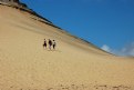
wow, this one is great! it looks so desolate. The people look lost in their surroundings. What a good capture and the composition is also very good. The diagonal line, the sharpness and the position of the group not exactly in the middle. Very nice. What is most evident here is the contrast between the colors of the dune and the blue sky. It is so bright and colorful it hurts your eye. Hurt in a good way. It is beautiful. I hope i can grab some time to pick up photographing now during my vacation. But i still like watching your pictures, as they become increasingly better. All the best, Marco.
|
| Photo By: Michele Carlsen
(K:146013)
|
|
|
Critique By:
Marco Vredegoor (K:7301)
5/28/2007 10:37:47 AM
great capture. Good composition and layers of colors. Nicely done!
All the best, Marco.
|
| Photo By: Mohammad Aslefallah
(K:1725)
|
|
|
Critique By:
Marco Vredegoor (K:7301)
5/28/2007 10:26:39 AM
simply great! nice perspective and good use of black and white here. Well done! All the best ,Marco.
|
| Photo By: Nuno Milheiro
(K:453)
|
|
|
Critique By:
Marco Vredegoor (K:7301)
5/28/2007 10:25:20 AM
hi michele! very nice picture. great mood thanks to the color. The composition here i think is great. The position of the rock is excellent and the horizon is really straight. I think you are still improving on these shots. Especially how you finish the picture with a subtle border is very great. Excellent work! All the best, Marco.
|
| Photo By: Michele Carlsen
(K:146013)
|
|
|
Critique By:
Marco Vredegoor (K:7301)
5/12/2007 10:16:29 AM
hi michele. Thank you for your comment. the camouflage look is maybe due to the light spots of the sun through the leaves of the trees. It is one reason i chose to shoot it in black and white, otherwise it would be to distracting. Now it is a nice change in tones.
|
| Photo By: Marco Vredegoor
(K:7301)
|
|
|
Critique By:
Marco Vredegoor (K:7301)
5/12/2007 10:15:02 AM
hi annemette, thank you for your comment. Indeed the look on their faces was one thing that appealed to me immediately.
|
| Photo By: Marco Vredegoor
(K:7301)
|
|
|
Critique By:
Marco Vredegoor (K:7301)
5/11/2007 3:04:42 PM
een paard heeft benen trouwens en geen poten (want je mag een paardenliefhebber niet voor de kop stoten :))) (herman finkers zei dat ooit)
verder: riny, je hoeft echt niet 10x te posten hoor als je op wilt vallen
groetjes!
|
| Photo By: Nick Mekkelholt
(K:142)
|
|
|
Critique By:
Marco Vredegoor (K:7301)
5/11/2007 2:52:22 PM
wow! breath taking beautiful landscape. composition is excellent. so did you take it early in the morning or late in the evening. The way the light enters the frame is beautiful and also the clouds make it feel special. Well done! All the best, Marco.
|
| Photo By: Subhashis Ghosh
(K:1647)
|
|
|
Critique By:
Marco Vredegoor (K:7301)
5/11/2007 2:49:19 PM
what a nice image! so very rich on colors, it almost hurt your eyes. So joyful and pretty, it looks like an impressionistic painting. Shame there isn't one really large golden frame arround it... if you look at it a long time, i can see a heart shape in the middle. Or is that just me??
so did you correct the levels, or contrast somewhat? It really makes this picture stand out and make it so powerful.
Well done! All the best, Marco.
|
| Photo By: Claudio Bonaccorsi
(K:2146)
|
|
|
Critique By:
Marco Vredegoor (K:7301)
5/11/2007 2:44:50 PM
such a nice composition and funny picture! Good bright and thick colors. Well captured.
All the best, marco.
|
| Photo By: Siddharth Siva
(K:3327)
|
|
|
Critique By:
Marco Vredegoor (K:7301)
5/11/2007 11:40:11 AM
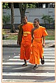
very nice and powerful picture. Great to see a photograph from this camera. Color and tones are excellent. Well done. All the best, Marco.
|
| Photo By: Branimir Fagarazzi
(K:38367)
|
|
|
Critique By:
Marco Vredegoor (K:7301)
5/11/2007 11:37:51 AM
Erg mooie foto. Een frame is hier niet eens nodig denk ik omdat de banden boven (van de lucht) en onder (van het zand) op zich al een 'breedbeeld' effect geven. De kleuren zijn ook heel helder, en zelfs opvallend kil in relatie tot het onderwerp (strandvakantie). De symmetrie stoort me helemaal niet in tegenstelling tot de bovenstaande commentaren. Maar dat heeft te maken met de rechtlijnigheid die al in de foto opgesloten zit. Erg mooi. Groetjes, Marco.
|
| Photo By: Nick Mekkelholt
(K:142)
|
|
|
Critique By:
Marco Vredegoor (K:7301)
5/11/2007 11:33:52 AM
hoi Nick, iemand uit de buurt , leuke foto. Toch jammer dat de benen van het linker paard er niet helemaal op staan, voor de compositie niet zo mooi. Daardoor komt de achtergrond meer tot uiting. Maar dat kan ook komen doordat de levels niet helemaal kloppen. Het groen overheerst erg, terwijl de focus juist moet liggen op de paarden, neem ik aan. En jammer van die plakbandjes, of is dat een (overbodig) digitaal trucje?
Ik zie trouwens dat je meer mooiere foto's in je portfolio hebt. Groet, Marco.
|
| Photo By: Nick Mekkelholt
(K:142)
|
|
|
Critique By:
Marco Vredegoor (K:7301)
5/11/2007 11:11:26 AM
this is a subject that we can discuss forever. The difference in prosperity between the western world and countries like in africa is so huge, that every help is too little. But it is nice to see that you really have helped individuals. It is always better then doing nothing.
All the best, Marco.
|
| Photo By: Annemette Rosenborg Eriksen
(K:55244)
|
|
|
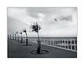
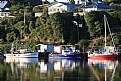
Critique By:
Marco Vredegoor (K:7301)
5/11/2007 11:04:58 AM
excellent shot, really good use of the reflection, though its a shame that the right reflection is cut off at the bottom. Nonetheless, good picture and very nice and bright colors! I can see that you must have had problems by letting the houses on the picture, or cropping them off. I think I would have cropped it. All the best, Marco.
|
| Photo By: Nicole Besch
(K:72664)
|
|
|
Critique By:
Marco Vredegoor (K:7301)
5/11/2007 11:00:58 AM
hi michele, interesting picture. America seems to have so much different landscapes, and you seem to go everywhere! It is nice to see your pictures and this way getting to know the little places of america. you are a master in seeing this little beauty and everyday american life. I do not always agree with the composition you use, but it is lovely to see what objects you photograph and what point of view You take. Take care. All the best, Marco
|
| Photo By: Michele Carlsen
(K:146013)
|
|
|
Critique By:
Marco Vredegoor (K:7301)
5/4/2007 4:04:57 PM
wow, that is a great idea. I think we (in the rich countries) are often much too indifferent from what happens elsewhere in the world. Though it is not always good to help the countries as a whole, it is much better to help the individuals. I think the idea of 'microcredit', giving people small amounts of money, to open their own shop or business, is to be embraced in stead of the usual aid in development western countries are giving to the third world countries. Still it is a shame that money to those countries is still needed, when we do everything to prevent those countries to trade with europe or usa, and thus make their own income. But luckily that is changing slowly, now for instance the borders to former east-european countries are opened for trade openly... and campagnes like the one you are participating in of course help too.
All the best, Marco.
|
| Photo By: Annemette Rosenborg Eriksen
(K:55244)
|
|
|
Critique By:
Marco Vredegoor (K:7301)
5/4/2007 3:52:45 PM
wow, very nice tones and shadows. I like this building very much, it is so sacred and ancient. and amazing how this huge dome was built. this pattern in the ceiling make a nice abstract picture this way. Excellent work. good crop! All the best, Marco.
|
| Photo By: Paolo Corradini
(K:59552)
|
|
|
Critique By:
Marco Vredegoor (K:7301)
5/4/2007 3:50:39 PM
very nice portrait, good use of the d.o.f. here, it makes a nice composition with her hanging towards the right of the frame and the depth off focus on the right. she is beautifully serious and not as a pose. it looks like a every day shot. good use of tones and lighting. excellent picture. All the best, Marco.
|
| Photo By: Pablo Dylan
(K:63918)
|
|
|
Critique By:
Marco Vredegoor (K:7301)
5/3/2007 3:10:01 PM
very beautiful picture. the composition is excellent and i like the minimalistic colors and tones. Erg mooi, groetjes, Marco.
|
| Photo By: Petal Wijnen
(K:50989)
|
|