|
|
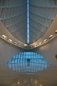
Critique By:
Paul Eggerling-Boeck (K:503)
1/7/2005 9:53:46 PM
Another good shot Ranjan. You're developing quite the eye for abstracts.
|
| Photo By: Ranjan Pruthee
(K:35)
|
|
|
Critique By:
Paul Eggerling-Boeck (K:503)
1/7/2005 9:52:11 PM
Awesome shot Ranjan! How did you arrange for there to be only two people in that space?
Great work my friend!
|
| Photo By: Ranjan Pruthee
(K:35)
|
|
|
Critique By:
Paul Eggerling-Boeck (K:503)
6/8/2004 4:42:54 PM
At first glance, the blown out top of the photo bothered me too, but then as I thought about it some more, it kinda hints at what one might imagine heaven to be like (i.e. very bright white) so I think it's not so bad as it might be in a different type of shot.
Nice work Ranjan.
|
| Photo By: Ranjan Pruthee
(K:35)
|
|
|
Critique By:
Paul Eggerling-Boeck (K:503)
5/19/2004 4:44:49 PM
Great composition! I love the abstract nature of the photo. I think the DOF works well. Good range of tones too.
|
| Photo By: Pim de Ruijter
(K:2170)
|
|
|
Critique By:
Paul Eggerling-Boeck (K:503)
1/14/2004 10:57:33 AM
Congrats on the POD Barry!
Your work is truely inspirational to me. Not that I've done much with that inspiration lately, but it's there.
Thanks for sharing.
|
| Photo By: Barry Walthall
(K:5312)
|
|
|
Critique By:
Paul Eggerling-Boeck (K:503)
1/13/2004 2:15:21 PM
This photo had an interesting effect on my eye when I first saw the large version. For whatever reason I keep thinking it looks like a miniature movie set. Maybe it's because there is nothing for me to guage the scale of the trees. I really like that this photo is making me see it like that.
Nice job.
|
| Photo By: Trussov Dima
(K:176)
|
|
|
Critique By:
Paul Eggerling-Boeck (K:503)
12/17/2003 11:14:53 AM
This is a really good shot. The tonal range is great and I love the contrast between human-made and the natural. I might crop a bit off the top, maybe to just above the most dense part of the large cloud. I think that would draw more attention to the rest of the scene, especially the logs/poles.
|
| Photo By: Paolo Grusovin
(K:3344)
|
|
|
Critique By:
Paul Eggerling-Boeck (K:503)
9/22/2003 4:35:01 PM
Very good composition and exposure. Maybe it's the scan, but to me it lacks sharpness. Otherwise a great shot.
|
| Photo By: San
(K:34)
|
|
|
Critique By:
Paul Eggerling-Boeck (K:503)
7/25/2003 2:45:16 PM
Wow! Great exposure and use of backlight!
|
| Photo By: Todd Miller
(K:16464)
|
|
|
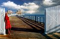
Critique By:
Paul Eggerling-Boeck (K:503)
7/17/2003 12:40:44 PM
Spectacular! I don't often go for color photos lately, but this one is Great! The red dress against the white fence really stands out. Well done.
|
| Photo By: Snehendu Kar
(K:2427)
|
|
|
Critique By:
Paul Eggerling-Boeck (K:503)
7/17/2003 12:33:27 PM
Great shot! Perfect lighting!
|
| Photo By: jon
(K:869)
|
|
|
Critique By:
Paul Eggerling-Boeck (K:503)
7/14/2003 2:25:13 PM
Another great shot Barry. You've got a great eye for abstractions!
|
| Photo By: Barry Walthall
(K:5312)
|
|
|
Critique By:
Paul Eggerling-Boeck (K:503)
7/14/2003 1:22:12 PM
Wow, that IS dreamy! Great color! I might crop a bit off the top to get rid of the branch in the upper left.
|
| Photo By: Fatih KILIC
(K:137)
|
|
|
Critique By:
Paul Eggerling-Boeck (K:503)
7/14/2003 1:17:41 PM
Excellent composition. I get the feeling I know who's in charge at this wedding. She's all business.
Great shot!
|
| Photo By: jon
(K:869)
|
|
|
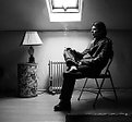
Critique By:
Paul Eggerling-Boeck (K:503)
7/14/2003 1:15:34 PM
This get's a 7 for Emotional Appeal from me. I'd also move the horizon a bit. I'd move it up in the frame. Great exposure. Thanks for sharing it.
|
| Photo By: David Rozenblyum
(K:3)
|
|
|
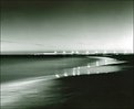
Critique By:
Paul Eggerling-Boeck (K:503)
7/11/2003 11:37:33 AM
Great Shot. I love the feel of the mist in the background. Very dramatic!
|
Photo By: Robert Gaither
(K:34128)

|
|
|
Critique By:
Paul Eggerling-Boeck (K:503)
7/11/2003 11:19:09 AM
Great abstract! Love the colors and texture.
|
| Photo By: Barry Walthall
(K:5312)
|
|
|
Critique By:
Paul Eggerling-Boeck (K:503)
7/9/2003 7:49:55 AM
Reflections and abstract architecture. Two of my favorites. Excellent shot. Great lighting
|
| Photo By: John Barclay
(K:3650)
|
|
|
Critique By:
Paul Eggerling-Boeck (K:503)
7/7/2003 11:40:52 AM
Wonderful feel to this one. Love the composition too. Nice that the sky isn't completely washed out.
|
| Photo By: Andrea Parker
(K:187)
|
|
|
Critique By:
Paul Eggerling-Boeck (K:503)
7/7/2003 10:17:43 AM
On one hand I agree with the earlier comment about sharpness, but on the other hand, the shot has a nice softness to it. Overall, a pretty great shot. Nice and simple.
|
| Photo By: Ria Swart
(K:283)
|
|
|
Critique By:
Paul Eggerling-Boeck (K:503)
7/7/2003 10:11:34 AM
Excellent! I love the composition. Great abstract.
|
| Photo By: Jim Johnson
(K:1025)
|
|
|
Critique By:
Paul Eggerling-Boeck (K:503)
7/3/2003 2:43:45 PM
Great shot. I can imagine that the print is quite beautiful. It makes me wish I could see it in person. Only thing I might change is to see how it looked with either more of the people at the bottom, or completely crop them out. Just seeing the heads is a bit distracting.
|
| Photo By: Marc Robin
(K:3385)
|
|
|
Critique By:
Paul Eggerling-Boeck (K:503)
7/2/2003 10:06:01 AM
Very cool! Definately an eye catcher. You could crop the left side more for even greater dramatic effect. I wonder what it would look like with just the eye and lips colored leaving the strap as monochrome.
|
| Photo By: Toini Blom
(K:2039)
|
|
|
Critique By:
Paul Eggerling-Boeck (K:503)
7/2/2003 9:54:41 AM
Very nice abstract. I love the contrast of the foreground with the yellow background. How did you create the background? It seems there is both vertical and horizontal motion going on there? Do tell.
|
| Photo By: Sofia Z.
(K:166)
|
|
|
Critique By:
Paul Eggerling-Boeck (K:503)
7/2/2003 9:50:36 AM
Wow, that's creepy! I feel like that eye must be peering into my soul when I look at it. Great shot. You must be a very patient person (or have a catatonic cat) to get this shot. Well done.
|
| Photo By: Juan Sánchez
(K:5441)
|
|
|
Critique By:
Paul Eggerling-Boeck (K:503)
7/2/2003 9:47:18 AM
Great composition Gerhard. For me the upper left corner would look better if it were a bit darker. Otherwise perfect.
|
| Photo By: Gerhard BuschEFIAP/AFIAP
(K:18382)
|
|
|
Critique By:
Paul Eggerling-Boeck (K:503)
7/2/2003 8:54:57 AM
Great Shot. I didn't even notice your son the until I read your description and looked for him. I like the feeling of a deserted street better though so nothing against you and your son, but I'll ingore him 
|
| Photo By: Robert Fox
(K:208)
|
|
|
Critique By:
Paul Eggerling-Boeck (K:503)
6/30/2003 2:56:34 PM
I like the originality of your idea and the composition of the photo. I'm not sure what I think of the lens flare. On one hand it's interesting because it make a line from the tip of the toes to the assumed light source. However, it's a bit distracting and I find that my eyes are drawn to the top right of the photo and away from the feet.
|
| Photo By: Liz Chaffin
(K:546)
|
|
|
Critique By:
Paul Eggerling-Boeck (K:503)
6/24/2003 8:41:31 PM
Yeah, I wish the guy would have cleaned his wheels a bit more carefully
|
| Photo By: Paul Eggerling-Boeck
(K:503)
|
|
|
Critique By:
Paul Eggerling-Boeck (K:503)
6/17/2003 10:26:08 AM
For me the composition is great for illustrating the setting, but not for highlighting the person. It took me a few seconds to even find the person once I saw the title and assumed that there must be a person in there somewhere.
Nice exposure though, and I really do like the composition, just not to emphasize the person.
|
| Photo By: Dante Tang
(K:14)
|
|

![Photograph By Nelson Moore [Kes] -](http://thumbs.imageopolis.com/images/6/0/0/5/6005/1537290-tn.jpg "Photograph By Nelson Moore [Kes] -")