|
|
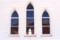
Critique By:
Rob M (K:222)
5/20/2004 1:01:17 AM
Good contrast and tonal range. Good eye also!
|
| Photo By: Sean D.
(K:2361)
|
|
|
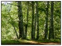
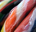
Critique By:
Rob M (K:222)
3/8/2004 7:27:34 PM
Great use of textures and light - I like it a great deal!
|
| Photo By: Jorg Reif
(K:16020)
|
|
|
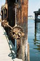
Critique By:
Rob M (K:222)
1/31/2004 9:18:01 PM
Great use of colors and textures. I suppose you could say that the gear (machine) vs. the wood (nature) provides an interesting contrast.
|
| Photo By: Zach Golden
(K:381)
|
|
|
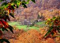
Critique By:
Rob M (K:222)
1/28/2004 7:30:50 PM
Very nice shot - well composed, great light - I like it a lot!
|
| Photo By: Tom Smith
(K:108)
|
|
|
Critique By:
Rob M (K:222)
1/25/2004 4:44:14 PM
Nice image, and wonderful composition on what could be a tricky image (DOF, shadows, etc).
|
| Photo By: David Dias
(K:1347)
|
|
|
Critique By:
Rob M (K:222)
1/24/2004 12:52:39 PM
Nice compostion and good eye!
|
| Photo By: - simos -
(K:9354)
|
|
|
Critique By:
Rob M (K:222)
12/25/2003 3:47:12 PM
Very nice!
|
| Photo By: Claudia De Benedetto
(K:2220)
|
|
|
Critique By:
Rob M (K:222)
12/24/2003 8:26:46 AM
Nice composition, lighting is excellent. Not sure what the eye is supposed to focus on.
|
| Photo By: Edward Oest
(K:192)
|
|
|
Critique By:
Rob M (K:222)
12/23/2003 2:33:22 PM
A nice picture. It looks like the water is a bit overexposed - the final pool looks washed out. People better in Photoshop could probably offer some ideas on pulling in some more detail.
|
| Photo By: Albert Gacsádi
(K:244)
|
|
|
Critique By:
Rob M (K:222)
12/15/2003 6:59:40 PM
Actually, the cropping is OK. The masts of the boats fall to the bottom of the image. The sky is about the top 1/3 of the image, so I think that is OK also. The challenge is to find something to focus the eye on. (My problem too). One suggestion - crop more and focus on fewer boats.
DO NOT crop to reduce size! Crop the image to what YOU like, then use an Image Resize tool to get to the 640 pixel limit. If the size is still over 300kb, I sometimes go up a tiny bit in .jpg compression, and that always gets me under 300k. (PS El 2 - Image>Resize>Image Size / Save As>Image Options)
|
| Photo By: Paul Ragone
(K:1331)
|
|
|
Critique By:
Rob M (K:222)
12/15/2003 6:52:11 PM
Good composition!
|
| Photo By: lowell whipple girbes
(K:13151)
|
|
|
Critique By:
Rob M (K:222)
11/24/2003 1:36:11 PM
Perfect composition, wonderful colors. The building in the center is nice - it provide something for the eye to focus one.
|
Photo By: Francesco Martini
(K:12249)

|
|
|
Critique By:
Rob M (K:222)
11/8/2003 1:07:26 PM
Nice - good use of whatever effect you used to blur / soften the photo. That's a tough image to capture!
|
| Photo By: Mari Mar
(K:11469)
|
|
|
Critique By:
Rob M (K:222)
11/8/2003 1:05:10 PM
No - the cropping is great. The focus is on everyone's similar expression and direction they are looking - not WHAT they are looking at. Fun!
|
| Photo By: Katharine E. Wright
(K:533)
|
|
|
Critique By:
Rob M (K:222)
10/24/2003 11:49:20 AM
Wonderfully composed, excellent colors - impressive!
|
| Photo By: Dan Samoila
(K:715)
|
|
|
Critique By:
Rob M (K:222)
10/24/2003 11:41:29 AM
Actually, this is a stack of Lollipops!
|
| Photo By: Rob M
(K:222)
|
|
|
Critique By:
Rob M (K:222)
10/6/2003 7:53:52 AM
Good composition. Great colors and textures - unique viewpoint. Nicely done.
|
| Photo By: Christian Wettergren
(K:1333)
|
|
|
Critique By:
Rob M (K:222)
10/6/2003 7:51:11 AM
Great composition - very unique. It works. I'm not sure if there's anything you could have done, but the tiger poster is a bit fuzzy - it may have been the original image itself. Nonetheless, good eye!
|
| Photo By: Kim Taylor
(K:2816)
|
|
|
Critique By:
Rob M (K:222)
10/2/2003 6:15:30 AM
Excellent composition, color, lighting. I hope to capture something like this one day.
|
| Photo By: John Lamb
(K:9687)
|
|
|
Critique By:
Rob M (K:222)
10/1/2003 6:10:42 PM
Great composition, but the shallow DOF takes the eye off the flowers. Maybe crop out the top and the bottom a bit to pull the eye in?
|
| Photo By: Kennett Mohrman
(K:2)
|
|
|
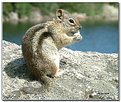
Critique By:
Rob M (K:222)
8/18/2003 11:21:55 AM
Great DOF, detail. Did you lure the chipper with the food?
|
| Photo By: Jim F
(K:8859)
|
|
|
Critique By:
Rob M (K:222)
8/15/2003 11:41:54 AM
Thanks for the idea!
|
| Photo By: Rob M
(K:222)
|
|
|
Critique By:
Rob M (K:222)
8/13/2003 7:02:11 PM
Pops right off the screen - great lines, vibrant color - excellent!
|
| Photo By: Jim F
(K:8859)
|
|
|
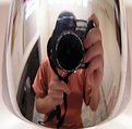
Critique By:
Rob M (K:222)
8/10/2003 10:50:48 AM
Well composed, great light. I like how the relections are bent.
|
| Photo By: John Bohannon
(K:154)
|
|
|
Critique By:
Rob M (K:222)
8/8/2003 5:47:01 AM
Thanks, uh, I guess!
|
| Photo By: Rob M
(K:222)
|
|
|
Critique By:
Rob M (K:222)
8/8/2003 5:46:28 AM
Great lighting and composition. The shadows on the brick wall are excellent.
|
| Photo By: Jamie Ferguson
(K:6284)
|
|
|
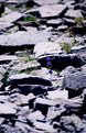
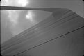
Critique By:
Rob M (K:222)
8/7/2003 6:59:10 PM
I think the conversion to B&W helps this out greatly. It draws you to the textures, which make this image. You may want to crop out the sun at the top to focus attention. Just my 2 cents.
|
| Photo By: Rodney Steele
(K:1841)
|
|
|
Critique By:
Rob M (K:222)
8/7/2003 6:28:06 AM
This is a yellow garden spider. Why do I know - I took a picture of the same spider last night! Mine did not come out nearly as well. Nice shot.
|
| Photo By: Who Kares
(K:224)
|
|
|
Critique By:
Rob M (K:222)
8/7/2003 6:26:17 AM
This is a tough shot - variations in light and shadows, DOF, etc. Well done!
|
| Photo By: Megan Forbes
(K:4617)
|
|
|
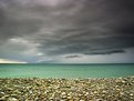
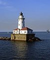
Critique By:
Rob M (K:222)
8/7/2003 6:21:30 AM
I like the boat on the right - it's an old schooner, which fits in well with the lighthouse. Yes - what Deb Mayes said - move the lighthouse out of center, to the left a bit and leave the boat in. It's still great.
|
| Photo By: SarahM none
(K:7836)
|
|