|
|
Critique By:
Christian Barrette (K:21125)
9/3/2004 2:38:38 AM
Thank you Matej for this suggestion. I have spend some time working on it, but I'm not through with it. Maybe I'll post it here as a comment.
|
| Photo By: Christian Barrette
(K:21125)
|
|
|
Critique By:
Matej Maceas (K:24381)

9/1/2004 9:32:41 AM
Christian, it was nice to see your work on the front page.
I've been comparing the two versions of this photo. I prefer the shadow details in the colour version, but on the other hand, I agree with Hugo that this one has a much stronger mood. Difficult choice; maybe this version but with more open shadows would be best?
|
| Photo By: Christian Barrette
(K:21125)
|
|
|
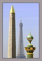
Critique By:
Sam Andre (K:12484)
8/31/2004 10:33:45 PM
Good idea to put them together and technically very good too, although the tower looks a bit out of place. It needed abit more sharpness/contrast.
|
| Photo By: Christian Barrette
(K:21125)
|
|
|
Critique By:
Patrick Jacobson (K:29151)
8/31/2004 1:16:23 PM
Good scene and light. Good details and tones! Love it =)
|
| Photo By: Christian Barrette
(K:21125)
|
|
|
Critique By:
Ian McIntosh (K:42997)
8/31/2004 12:10:18 PM
Lots of work here Christian and I appreciate the care shown in exposure of the brick work up top.
|
| Photo By: Christian Barrette
(K:21125)
|
|
|
Critique By:
Sudhir K. Reddy (K:7583)
8/31/2004 11:58:30 AM
Mes felicitations Christian pour "POD"! Tres bien pris! J'aime la symmetrie d'architecture, la composition et le choix de presentation en sepia. Excellent.
|
| Photo By: Christian Barrette
(K:21125)
|
|
|
Critique By:
NN (K:26787)
8/31/2004 4:19:54 AM
Congratulations, Photographer of the Day and my dear friend ... 
|
| Photo By: Christian Barrette
(K:21125)
|
|
|
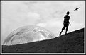
Critique By:
Stefan Engström (K:24473)
8/30/2004 6:07:08 PM
Truly perfect placement of the elements in this photo. At first I was a little dissapointed that the boy's face is so dark, but I have changed my mind and think that this near silhouette is just what you want here. The sky-reflection in the globe is truly amazing. I was convinced this was going to be a composite before I saw the full-size image. The slope adds a good deal of dynamics to the image.
|
| Photo By: Christian Barrette
(K:21125)
|
|
|
Critique By:
Hugo de Wolf (K:185110)
8/30/2004 1:29:29 PM
Hi Christian, Again an interesting diptych, and a very good display of what changing the tones can do to an image. I think the atmosphere in this version is much more defind, and much stronger. More gloomy, and ominous. Nice capture. I feel a bit ambiguous about the centered composition, but I don't know what other options could've vorked. Anyway, I find the centered composition in the colour version more distracting than in this version, as the bold and confronting perspective fits well with the atmosphere. Interesting, and my compliments of keeping such a high standard of intriguing work. You know how much I appreciate that!
Cheers,
Hugo
|
| Photo By: Christian Barrette
(K:21125)
|
|
|
Critique By:
NN (K:26787)
8/30/2004 5:40:02 AM
Excellent title ... a perfect image to demonstrate the power of the sun!
|
| Photo By: Christian Barrette
(K:21125)
|
|
|
Critique By:
Don Loseke (K:32503)
8/30/2004 2:12:39 AM
Very nice angle of view. I bet it was impressive to be there.. Very nice. Don.
|
| Photo By: Christian Barrette
(K:21125)
|
|
|
Critique By:
Don Loseke (K:32503)
8/29/2004 11:40:16 PM
Christian, this is outstanding. So well photographed. The monochrome background works so well with this bloom. A very nice presentation. Don.
|
| Photo By: Christian Barrette
(K:21125)
|
|
|
Critique By:
charles zhao (K:988)
8/29/2004 10:13:06 PM
wonderful toning...
|
| Photo By: Christian Barrette
(K:21125)
|
|
|
Critique By:
Ameed El-Ghoul (K:42215)
8/29/2004 5:12:39 PM
Very ncie capture and great composition, i like using the sepia in here, the angle is great, and the framing is peace of art, cheers,
|
| Photo By: Christian Barrette
(K:21125)
|
|
|
Critique By:
G G (K:61359)
8/29/2004 4:08:12 PM
Je crois que je prefere celle en Sépia.. meme si on perd la teinte colorée des vitraux..L'avantage du sépia (comme du B&W) est qu'il permet (à mon avis) de mieux faire ressortir les pierres de l'edifice. J'aime beaucoup l'angle de prise. Très belle photo. Fabrice
|
| Photo By: Christian Barrette
(K:21125)
|
|
|
Critique By:
Matej Maceas (K:24381)
8/28/2004 11:11:04 AM
Three eras, one symbol - quite amusing :-)
I can see the slight lack of focus on the rightmost element, and it acts as something of a visual riddle, the reason being that with the given composition, the side elements appear to be at roughly the same distance from the camera (no haze effect as with the Eifel tower).
Nice work.
|
| Photo By: Christian Barrette
(K:21125)
|
|
|
Critique By:
Christian Barrette (K:21125)
8/27/2004 8:34:28 PM
Thanks again Hugo.
It was a very hot and humid day in mid-afetrnoon. The air was almost greyish at a distance, as the original shows. I did have to lighten and boost the colours. I selectively retouched the blue curve.
The rightmost element is a tad out of focus as a matter of fact. F 8 was not enough to cover that distance, but I wanted to have a very fast speed as this was handlheld and I was shacking a bit from heat exhaustion. I have another one similar but only with the obelisk and the tower. Both are in focus, but I liked this one better for it's triadic composition.
|
| Photo By: Christian Barrette
(K:21125)
|
|
|
Critique By:
Don Loseke (K:32503)
8/27/2004 8:19:25 PM
Christian this is very impressive. So well done. I really think this is great. Don.
|
| Photo By: Christian Barrette
(K:21125)
|
|
|
Critique By:
NN (K:26787)
8/27/2004 12:02:52 PM
Hi Christian! This is my favourite of the three. To me all of them are too much dominated by the darkness - as a consequence, T. is the one I prefer the least ...
|
| Photo By: Christian Barrette
(K:21125)
|
|
|
Critique By:
Christian Barrette (K:21125)
8/27/2004 11:45:43 AM
Trying to share subjectivity is what this is all about.
You understood the reasons for the three propositions. You know how it is : you are caught by a moment, a place - call it a scenerey - and wonder "What is it, where is it ? ". There are two, three maybe more composition proposals taking shape. And the "rules" come out and make their noise : don't split it in two, avoid burning out highlights, mask the street lamp.
I have more taken out of that moment. One is solely based on the reflection. A slow shot to catch the water movements made by the fishes sucking insects on the surface : dark and abstract. What was it ? Did I catch it ?
|
| Photo By: Christian Barrette
(K:21125)
|
|
|
Critique By:
Hugo de Wolf (K:185110)
8/27/2004 11:17:06 AM
Hi Christian, Very creative shot, and a well balanced composition. The distance cue creates a very strong sence of depth between the three landmarks, but does also make the photo appear a bit soft (not soft focus, though, just in the saturation and tones). I played around a bit in PS, but it clearly shows that distance cue is essential to the shot. "reviving" the colours only flattens the photo, so it's not an option.
The slight overlap between the eifel tower and the obilisk is a bit distracting.
Nonetheless a very strong image, showing the grandeur of Paris by only capturing three elements. Very strong image.
Cheers,
Hugo
|
| Photo By: Christian Barrette
(K:21125)
|
|
|
Critique By:
Hugo de Wolf (K:185110)
8/27/2004 10:55:09 AM
Hi Christian, For me, this composition is much more balanced. As you say, the emphasis is more focused on the clouds, and the tree line is "reduced" to a secondary subject.
RE: your reply to my comment on Turner's version:
"About the horizon... I have this idea that in a composition working on reflection and symmetry, a central line of division is acceptable."
I think that you are right in suggesting that the composition based on the symmetry and central dividing line, created by the trees is acceptable, but in both previous versions, that line becomes the utmost important aspect, rendering the tones and hues of the clouds to a secondary and less prominent subject.
It's only a minor effect, but I think the change in appearance is quite substantial.
With this composition and change of format, the tonal differences between sky and reflection are also more prominent in their perception, and I think the division between sky and reflection, still horizontally based is better balanced, probably because the proximity between the horizontal axis of the pane and mirror line is smaller. (there's more distance between the two of them).
It goes without reason, that this is purely a subjective matter, and solely based on my personal preferences. That also accounts to both of the previous versions to be completely "acceptable" ("Sound in composition" is a better phrasing, I think)
I appreciate your thourough elaboration on a single shot, trying to excell by applying small changes. Very meaningful, and it helps me learn alot about composition and the subtleties thereof. Thanks!
Cheers,
Hugo
|
| Photo By: Christian Barrette
(K:21125)
|
|
|
Critique By:
Lukasz Kuczkowski (K:14687)
8/27/2004 7:59:03 AM
lovely spotted, I like it
|
| Photo By: Christian Barrette
(K:21125)
|
|
|
Critique By:
Roberto Arcari Farinetti (K:209486)
8/27/2004 7:52:55 AM
excellent my friend..
just BIP!
woow
roby
|
| Photo By: Christian Barrette
(K:21125)
|
|
|
Critique By:
Roberto Arcari Farinetti (K:209486)
8/27/2004 7:47:37 AM
wonderful .. you have created a great composition!!!
perfect title..
ciao roby
|
| Photo By: Christian Barrette
(K:21125)
|
|
|
Critique By:
Roberto Arcari Farinetti (K:209486)
8/27/2004 7:44:08 AM
nice mode and atmsphere.. roby
|
| Photo By: Christian Barrette
(K:21125)
|
|
|
Critique By:
Roberto Arcari Farinetti (K:209486)
8/27/2004 7:37:48 AM
Hallo Christian Mon ami..
dans cette photo il y a une magnifique et belle emotion...!
mon cngratulation..
roby
|
| Photo By: Christian Barrette
(K:21125)
|
|
|
Critique By:
ventrix drogo (K:65398)
8/27/2004 7:32:51 AM
Very original shot. I like i. Good idea! Bye.
|
| Photo By: Christian Barrette
(K:21125)
|
|
|
Critique By:
NN (K:26787)
8/27/2004 5:54:16 AM
Very interesting & elegant work!
|
| Photo By: Christian Barrette
(K:21125)
|
|
|
Critique By:
cessy karina (K:14205)
8/27/2004 5:05:23 AM
wow well seen, very well composed, excellent !
|
| Photo By: Christian Barrette
(K:21125)
|
|