|
|
Critique By:
Chris Wenzel (K:1165)
2/9/2004 9:56:17 PM
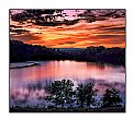
Gregory-
Since you didn't specify, not sure if the darkness at the top is due to a polarizer or PS. Either way, I like it. I think it adds balance to the shot. In my opinion, without the darkness the sky would be dull. The only thing I'm not sure about is the relatively central position of the horizon. Not saying it's bad, just not sure.
Regards,
Chris
|
Photo By: Gregory McLemore
(K:35129)

|
|
|
Critique By:
Chris Wenzel (K:1165)
2/9/2004 9:43:12 PM
Tim-
I like the contrast of the rusty birdhouse/feeder with the seemingly black and white trees, but it seems overwhelmed. Maybe the detail/color just didn't show up enough in the scan? Composition is excellent. Maybe a bit overexposed though?
|
| Photo By: Tim Long
(K:9228)
|
|
|
Critique By:
Chris Wenzel (K:1165)
2/9/2004 9:27:01 PM
Cedric -
Much improved crop over the previous version. Again, very cool shot. I'm a sucker for night shots with rich brown and gold tones.
Best Regards,
Chris
|
| Photo By: Cedric Sims
(K:3259)
|
|
|
Critique By:
Chris Wenzel (K:1165)
2/9/2004 9:19:49 PM
Raja,
I like what you were attempting here, but it doesn't quite work for me. Shooting directly into the sun can be very challenging. Usually it results in the photo being underexposed, but in this case, most of the shot is well exposed while the sun is overexposed. Also, the lens flare is a bit distracting. Still. I like that you are trying something different. Keep at it!
Regards,
Chris
|
| Photo By: Raja Oloan Tumanggor
(K:631)
|
|
|
Critique By:
Chris Wenzel (K:1165)
2/9/2004 9:04:30 PM
Farva,
Strange that this photo has so many views without a comment. A very different shot of a pet. not focusing on the face...I like it. The paws remind me of an old (cat) friend of mine, whose paws would clench in his sleep, as if he was chasing down mice. Looks like it might be a bit over-sharpened (especially in the light hair in the top center), but otherwise I think it's great.
Regards,
Chris
|
| Photo By: Imatolf Aggot
(K:34)
|
|
|
Critique By:
Chris Wenzel (K:1165)
2/9/2004 8:57:33 PM
Wow, completely different that the "weird rats" photo. I definitely like the other version better. I know, intellectually, that this should be a very tender photo/moment, but it seems very harsh. I like that you decided to experiment with this shot.
Regards,
Chris
|
| Photo By: Imatolf Aggot
(K:34)
|
|
|
Critique By:
Chris Wenzel (K:1165)
2/9/2004 8:18:29 PM
Paul -
Very cool shot. Sunset/sunrise aside, it's not often that people try to shoot directly into the sun. I've tried it myself with mixed results (thus only one into-sun shot posted on UF), but I think this shot works well. I really like the contrast between the light opening and the dark clouds. Probably not at all how it looked in person, but it's great on film (or digital in this case). Is the sun about to be swallowed by darkness...is it forcing it's way through? There seems to be a struggle between light and dark in the image, which makes it very dynamic, even without an explicit sense of movement. I guess it would be even better it there was more detail in the dark clouds, but that is a limitation of the camera and digital media in general - not much you could have done about that. Nice work!
Regards,
Chris
|
| Photo By: Paul Ragone
(K:1331)
|
|
|
Critique By:
Chris Wenzel (K:1165)
1/22/2004 6:40:51 PM
Outstanding shot, David. Perfectly sharp and wonderful saturation. You also did a nice job with the background, I don't see any side effects on the edges of the petals. Nice work!
Chris
|
| Photo By: David Yates
(K:4698)
|
|
|
Critique By:
Chris Wenzel (K:1165)
1/22/2004 6:07:32 PM
Wow, fantastic colors. Nice management of DOF. Maybe it could use a crop? The top seems a little empty to me. Well maybe not, I don't know. I like the trees in the background as well and wouldn't want to lose those.
|
| Photo By: Helder Santos
(K:3505)
|
|
|
Critique By:
Chris Wenzel (K:1165)
1/22/2004 6:02:37 PM
Maria,
Make sure that you set the longest side of the photo (in this case the width) to 640 pixels before uploading, and also save at a quality level that keeps the file size under 300K. Otherwise I think the site will resize the photo automatically. Look here if you haven't already: http://www.usefilm.com/showpage.php?page=faq#8
I hope this helps.
Chris
|
| Photo By: maria elisa duque
(K:1503)
|
|
|
Critique By:
Chris Wenzel (K:1165)
1/22/2004 5:35:37 PM
Great panoramic shot (or crop). The clouds are wonderful...nice and white without being blown out. I would like just a tiny bit more space between the boat and the bottom of the photo, especially if this was to be framed. Also wish I could see more detail, but that is probably due to the 640 pixel width limit on UF, not your photo. Nicely done.
Chris
|
| Photo By: Indra Yoto
(K:377)
|
|
|
Critique By:
Chris Wenzel (K:1165)
1/22/2004 5:26:46 PM
Maria -
Looks like an interesting shot, but I can't see it well enough to give any real feedback...needs to be bigger.
Chris
|
| Photo By: maria elisa duque
(K:1503)
|
|
|
Critique By:
Chris Wenzel (K:1165)
1/21/2004 7:23:41 PM
Davide -
Nice timing on the 981st try...thank god for digital!
Regards,
Chris
|
| Photo By: davide lupo-pasini
(K:8079)
|
|
|
Critique By:
Chris Wenzel (K:1165)
1/21/2004 7:07:39 PM
Jorge -
I like the diagonal line created by the boats, but personally I'm not a big fan of the grain. Also, I would suggest cropping or using photoshop to get rid of the masts that enter the photo from the bottom right corner.
Regards,
Chris
|
| Photo By: Jorge Vasconcelos
(K:33746)
|
|
|
Critique By:
Chris Wenzel (K:1165)
1/21/2004 6:49:55 PM
Steven -
Very nice portrait. Razor-sharp detail with a well-blurred background, can't manage DOF any better than that. I wish I had a suggestion for you, but I really wouldn't change a thing.
Regards,
Chris
|
| Photo By: steven carter
(K:2140)
|
|
|
Critique By:
Chris Wenzel (K:1165)
1/21/2004 6:31:02 PM
Sandy -
Great series (or at least the beginning of one!). I keep going back and forth between this one and "dust". I think I prefer the warmer tones in this one, and I definitely like the addition of the second character, but the silhouette from the other photo just can't be beat! Anyway, both are excellent and very creative.
Regards,
Chris
|
| Photo By: sandy c. hopkins
(K:17107)
|
|
|
Critique By:
Chris Wenzel (K:1165)
1/20/2004 6:39:39 PM
Perfect, Rachel! Wonderful soft focus and general sense of purity and innocence. I wouldn't change a thing. Your best shot yet!
|
| Photo By: Rachel Leah
(K:26110)
|
|
|
Critique By:
Chris Wenzel (K:1165)
1/20/2004 6:20:02 PM
Donna -
Wonderful shot. Great warm light and reflection. The tall narrow crop is perfect, and the mangroves provide an excellent background...visible enough to be interesting, subtle enough not to distract. Nicely done!
Chris
|
| Photo By: Donna Albers
(K:330)
|
|
|
Critique By:
Chris Wenzel (K:1165)
1/20/2004 4:03:24 PM
Nancy,
Nice job spotting this opportunity. I've never been any good at photographing people, for some reason I just don't usually feel comfortable, even if they are. The scene here is great and you did a nice job using a relatively shallow depth of field, but there are two things that don't quite work for me: First, I wish there was a little more on the left so I could see the rest of the donkey and the end of the boy's stick. Second is the person in the background, he/she is a bit distracting to me. Still, not bad for just jumping out of the car!
Regards,
Chris
|
| Photo By: Nancy B Brannaman
(K:445)
|
|
|
Critique By:
Chris Wenzel (K:1165)
1/20/2004 3:39:49 PM
David,
Nice work. I love the warm light on the trees and on the mist coming off the pond on the left side. It just feels like a late fall morning, waiting for the sun to warm it up.
A few thoughts though...It would have been nice if the geese were a little off-centered (probably not much you could do about that). Also, to me, the photo feels cut in half by the "horizon line" of the far side of the pond. Finally, not sure what the bank looked like, but it would be nice to have an interesting foreground to balance the shot...My eye is drawn mostly to the top of the shot, not the whole thing.
Still, I like it a lot since it almost feels like I am there.
Regards,
Chris
|
| Photo By: David Yates
(K:4698)
|
|
|
Critique By:
Chris Wenzel (K:1165)
1/19/2004 5:19:42 PM
Clayton -
Interesting shot. I like the distortion provided by the perspective, and I love the framing, it really works well here. The background is a little distracting to me though, especially the people who walked into your shot, but I guess that's the nature of street photography.
Regards,
Chris
|
| Photo By: Clayton Cole
(K:23)
|
|
|
Critique By:
Chris Wenzel (K:1165)
1/19/2004 3:40:26 PM
Tim,
Cool perspective shot. Nice job keeping it all in focus, and the infrared film was a great choice. As Ray said, it adds a real mood to the photo. My only minor nit is that I wish there was a little more detail in the foreground.
Regards,
Chris
|
| Photo By: Tim Long
(K:9228)
|
|
|
Critique By:
Chris Wenzel (K:1165)
1/9/2004 8:29:36 PM
Tim,
Again, great work. That being said, I'm a much bigger fan of the first "Buds" photo. I like how the "main" bud cuts across the image at a right angle to the rest here, but still, the simpler composition of the first photo is more appealing to me.
Regards,
Chris
|
| Photo By: Tim Long
(K:9228)
|
|
|
Critique By:
Chris Wenzel (K:1165)
1/9/2004 7:46:47 PM
Ryan -
Welcome to Usefilm. I hope that you find this site helps your photography. While we all like praise for our work, it often comes at the expense of an honest critique, especially here. So...my opinion: I like what you were after here (I've tried it myself at the Grand Canyon, perhaps the same tree), but it doesn't quite grab me. You handled the depth of field challenge very well, keeping the background relatively sharp while focusing on the tree. What doesn't work for me is the general harshness of the mid-day light. It just makes the whole scene look somewhat washed out. If your camera could accept filters, I would suggest a polarizing filter to add some pop to the sky, but I don't believe the S300 has that capability. Unfortunately the best light often requires an early start or a late dinner, as in your "Mexican Sunset" shot. Also, the horizon is a bit off, but that is an easy fix with photo editing software.
Keep shooting...you are off to a good start. I always enjoy the "Nice shot!" comments, but I learn much more from the balanced critiques. I have learned that if you watch the comments, you can find helpful members...give them a worthwhile critique and they almost always return the favor.
Best regards,
Chris
|
| Photo By: Ryan Melzer
(K:6)
|
|
|
Critique By:
Chris Wenzel (K:1165)
1/8/2004 8:03:32 PM
Natalie -
Great night shot, it does feel still. I love the crop, and I like that it is in B&W...makes it more striking. Nice job seeing this. It's probably not all that impressive by day, but it is very interesting at night.
Thanks for your comments on my El Morro and Havana Staircase photos. To answer your question: exposure was roughly 1 to 1.5 seconds, if I remember correctly.
|
| Photo By: Natalie Papadopoulos
(K:5247)
|
|
|
Critique By:
Chris Wenzel (K:1165)
1/8/2004 7:40:01 PM
Tim -
Another great photo. I love the work you do with flowers...very original. It seems that 95% of the flower photos here are the same, but yours stand out. That is in itself an accomplishment, but your shots are beautiful as well (not just different). I particularly like how the sense of movement here takes my eye all the way around the photo.
Thanks for your comment on my El Morro shot. I agree, there is some loss in contrast in the second version, but there is more detail in the rocks as well. It's always a struggle to get all of the detail from a slide onto a computer, or a print for that matter...one of the reasons I am shooting mostly digital now.
Regards,
Chris
|
| Photo By: Tim Long
(K:9228)
|
|
|
Critique By:
Chris Wenzel (K:1165)
1/8/2004 7:26:20 PM
Paul -
It has already been commented on by many, but I'll add my voice anyway. This is beautiful. I think the silhouette of the dock makes the photo. The use of the trees to frame the sunset is well-done also. Nice work!
|
| Photo By: Paul Ragone
(K:1331)
|
|
|
Critique By:
Chris Wenzel (K:1165)
1/8/2004 7:15:53 PM
Paul ,
Nice shot. I especially like the door, the stones above it, and how the tree hangs over it. The story that goes with the photo is great as well, but without it (and the title) I'm not sure if I'd find it creepy. Maybe it's the brightness in the left half of the photo, I don't know. Maybe next time you'll work up the nerve to approach closer or better yet, how about a long exposure night shot? Don't get me wrong, I think this is great, I just think you might be able to do even more with it.
Regards,
Chris
|
| Photo By: Paul Ragone
(K:1331)
|
|
|
Critique By:
Chris Wenzel (K:1165)
1/7/2004 6:53:13 PM
Bill -
Nice sharp image. I might have underexposed just slightly to get more detail in the white areas, in fact, I shoot most of my photos on the 10D -1/2 stop to keep the whites from being blown out. Also would have been better without the bright orange leg of the duck in the background, but you can't always get nature to cooperate!
|
| Photo By: Bill Ciavarra
(K:10216)
|
|
|
Critique By:
Chris Wenzel (K:1165)
1/7/2004 6:41:39 PM
Wow, great shot! Almost looks like a painting. The color of the buds great, and the blue in the background is perfect.
|
| Photo By: Tim Long
(K:9228)
|
|


