|
|
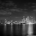
Critique By:
sean slavin (K:3488)
12/18/2002 6:22:23 PM
nice panning shot. makes me wish i was still racing. 8)
|
| Photo By: Elizabeth van Hulst
(K:283)
|
|
|
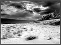
Critique By:
sean slavin (K:3488)
12/18/2002 6:20:59 PM
i like all of these al. great tone and simplicity. as i told you earlier, reminds a lot of the stuff that michael kenna does. 8)
|
Photo By: al shaikh
(K:15790)

|
|
|
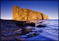
Critique By:
sean slavin (K:3488)
12/18/2002 12:09:38 PM
totally jealous. this place is on my wish list of places that need to be seen. good detail in the buildings and cliff face. do you have a color version? 8)
|
| Photo By: Robert L Major
(K:33)
|
|
|
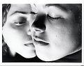
Critique By:
sean slavin (K:3488)
12/17/2002 1:47:44 PM
nice skin tones and dof but the foreground chin. the background cheek seem just a tad hot but it gives a good separation of their faces from the black along the bottom. 8)
|
| Photo By: Beth Lasoff
(K:539)
|
|
|
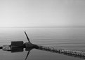
Critique By:
sean slavin (K:3488)
12/16/2002 9:14:48 PM
beautiful reflection. too bad for the bits of sand in the foreground. 8)
|
| Photo By: Don Martel
(K:551)
|
|
|
Critique By:
sean slavin (K:3488)
12/15/2002 8:45:10 PM
hmm... that looks awfully familiar. i like your framing of the hub. nice detail in the wood. 8)
|
| Photo By: Eric Goldwasser
(K:4294)
|
|
|
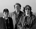
Critique By:
sean slavin (K:3488)
12/14/2002 6:50:48 AM
this must have been right before you guys ditched me... 8)
|
| Photo By: Larry Edwards
(K:843)
|
|
|
Critique By:
sean slavin (K:3488)
11/30/2002 5:36:12 PM
pretty interesting. i'm with phillip about the houses in the foreground. did the light from the lighthouse do that because of fog? 8)
|
| Photo By: Morsi Hussein
(K:1128)
|
|
|
Critique By:
sean slavin (K:3488)
11/29/2002 5:19:22 PM
i like this a bit better than the b&w version. there's a bit too much grain and it feels a little soft. if you want to keep using print film, try reala 100. i think you'll much more pleased with the results than the superia. 8)
|
| Photo By: Greg Smereczynski
(K:2278)
|
|
|
Critique By:
sean slavin (K:3488)
11/29/2002 5:13:59 PM
nice one dave. i like the square format. good to see some stuff from you again. 8)
|
| Photo By: David Chang-Sang
(K:680)
|
|
|
Critique By:
sean slavin (K:3488)
11/29/2002 7:27:29 AM
that light and shadows on this are wonderful. great shot. 8)
|
| Photo By: Don Martel
(K:551)
|
|
|
Critique By:
sean slavin (K:3488)
11/28/2002 7:42:01 AM
nice. quiet and serene. i'd like to see the color version. 8)
|
| Photo By: Greg Smereczynski
(K:2278)
|
|
|
Critique By:
sean slavin (K:3488)
11/28/2002 7:40:50 AM
love the lines and color. i need to get up that way. it looks like a great spot. 8)
|
| Photo By: Ken Alexander
(K:3905)
|
|
|
Critique By:
sean slavin (K:3488)
11/28/2002 7:17:28 AM
these are kinda cool. is the sand different colors to start with? 8)
|
| Photo By: April Atchley
(K:103)
|
|
|
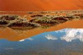
Critique By:
sean slavin (K:3488)
11/28/2002 7:05:56 AM
simple but effective. i like the way the ridge line intersects the ripples. it's a great color. 8)
|
| Photo By: Don Martel
(K:551)
|
|
|
Critique By:
sean slavin (K:3488)
11/27/2002 6:57:09 PM
wow... that's pretty wild. power plant of some kind? looks like a bit of a breeze blowing. 8)
|
| Photo By: Jason Ness
(K:88)
|
|
|
Critique By:
sean slavin (K:3488)
11/26/2002 7:06:17 PM
speechless. excellent. 8)
|
| Photo By: Andrew Polushkin
(K:311)
|
|
|
Critique By:
sean slavin (K:3488)
11/21/2002 8:56:59 PM
very nice in it's simplicity. looks like something from michael kenna except in color. 8)
|
| Photo By: Chelsea Burke
(K:5750)
|
|
|
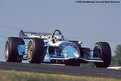
Critique By:
sean slavin (K:3488)
11/21/2002 4:31:15 PM
very nice. that's such a fun track. making me jealous. 8)
|
| Photo By: Mark Scheuern
(K:1428)
|
|
|
Critique By:
sean slavin (K:3488)
11/20/2002 4:23:38 PM
very nice sarah. this one is definitely better. great contrast and i love the sky. 8)
|
| Photo By: Sarah Needham
(K:2482)
|
|
|
Critique By:
sean slavin (K:3488)
11/19/2002 8:45:23 PM
very nice. very dramatic. the perspective and footprints draw me in and up to the sky. 8)
|
| Photo By: tess campbell
(K:515)
|
|
|
Critique By:
sean slavin (K:3488)
11/19/2002 8:40:28 PM
cool colors. not too sure about the ps work. what were the m&m's sitting on? can you post the unaltered version? 8)
|
| Photo By: Jon Rank
(K:683)
|
|
|
Critique By:
sean slavin (K:3488)
11/19/2002 8:39:00 PM
very nice. great detail in the foreground and the background. wonderful light on the rock. looks like you're almost standing in the water. 8)
|
| Photo By: Kenneth Kwan
(K:3084)
|
|
|
Critique By:
sean slavin (K:3488)
11/19/2002 8:36:36 PM
good one. love the mood. i too wish for a bigger version. be nice to see more detail. 8)
|
| Photo By: Mitchell Miller
(K:3009)
|
|
|
Critique By:
sean slavin (K:3488)
11/15/2002 5:32:22 PM
clever idea, cool reflections and good job keeping the camera from being seen. 8)
|
| Photo By: Jon Rank
(K:683)
|
|
|
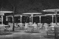
Critique By:
sean slavin (K:3488)
11/15/2002 12:00:47 PM
this is pretty cool. i like how the tables and poles glow and that there's enough reflected light to give detail on the underneath of the umbrellas. any way you can get up high and look down on this? that could be interesting as well. 8)
|
| Photo By: John Myers
(K:4308)
|
|
|
Critique By:
sean slavin (K:3488)
11/15/2002 11:56:48 AM
that's pretty incredible. how far do the caribou go? is that the ocean out at the top edge? 8)
|
| Photo By: Steve Kaufman
(K:2748)
|
|
|
Critique By:
sean slavin (K:3488)
11/15/2002 11:55:15 AM
ditto on the coolness factor. 8)
|
| Photo By: Steve Kaufman
(K:2748)
|
|
|
Critique By:
sean slavin (K:3488)
11/14/2002 7:57:23 PM
haha... that's funny. i thought your other one was a hot air balloon as well. 8)
|
| Photo By: Howard M. Parsons
(K:3496)
|
|
|
Critique By:
sean slavin (K:3488)
11/14/2002 6:51:25 PM
it's just a tad soft and the foreground is a bit underexposed. the palm fronds kinda dominant the picture a bit. maybe try it without cropping so much from the left. welcome to usefilm and keep posting. 8)
|
| Photo By: Jenny
(K:1)
|
|