|
|
 marco "dheim" orciuoli
{K:4467} 10/12/2007
marco "dheim" orciuoli
{K:4467} 10/12/2007
|
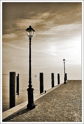
i agree with your view, and i think you used the right words... i think that cold and bleak sepia tones give a strong "hopeless" feeling... that's why i love and often use them!
kiitos!
|
|
|
|
 N M
{K:4879} 10/11/2007
N M
{K:4879} 10/11/2007
|
Beautiful in both color and sepia. They both convey a different mood. This sepia version brings thoughts of tranquillity and something on the lines of lost hope to the surface, whilst the cool blue version looks like a beginning to something new, just like we experience every morning. Both are beautiful and unique.
Regards,
Niclas
|
|
|
|
 Jeanette Hägglund
{K:59855} 11/24/2005
Jeanette Hägglund
{K:59855} 11/24/2005
|
Nice perspective and lines!
Jeanette
|
|
|
|
 AlZahraa Sulie
{K:7255} 11/23/2005
AlZahraa Sulie
{K:7255} 11/23/2005
|
am a sepia fan, so for sure i love this one!
simple and beautiful shot.
Well captured!
Z.S
|
|
|
|
patrizio napolitano
 {K:13119} 11/23/2005
|
un viraggio perfetto, la gista grana e un'eccellente composizione fanno di questo scatto un'ottima ed elegante foto
patrizio
|
|
|
|
|
marco "dheim" orciuoli
{K:4467} 11/22/2005
|
uhuh, petal, i fear that my lens is dirty... :(
|
|
|
|
|
Gennaro Guarino
{K:12372} 11/22/2005
|
Preferisco indubbiamente questa, ha più atmosfera rispetto all'altra versione. Questa coppia di foto è un pò l'emblema se sia meglio rappresentare la realtà così com'è, o meglio come la si riprende ,oppure è meglio, quando è possibile, migliorarla.
saluti gennaro
|
|
|
|
|
Sergio M. Cameno
{K:7856} 11/22/2005
|
I totally prefer this one. Nice crop, composition and sepia tone. Good work!
Best regards!
|
|
|
|
 Piero Somma
{K:13399} 11/22/2005
Piero Somma
{K:13399} 11/22/2005
|
non cambia il giudizio!...anche se amo il BW.... la preferisco a colori...
ciao
|
|
|
|
 Paolo Corradini
{K:59552} 11/21/2005
Paolo Corradini
{K:59552} 11/21/2005
|
l'atmosfera ci guadagna molto con questo bel sepiato..veramente suggestiva e anche un po' triste.
ciao
|
|
|
|
 Simone Tagliaferri
{K:28180} 11/21/2005
Simone Tagliaferri
{K:28180} 11/21/2005
|
Mi piace più questa versione. Bella.
|
|
|
|
 Mahmoud Baha Sadri
{K:19634} 11/21/2005
Mahmoud Baha Sadri
{K:19634} 11/21/2005
|
I guess i like this one better,
baha
|
|
|
|
 metoni .
{K:24727} 11/21/2005
metoni .
{K:24727} 11/21/2005
|
Great
|
|
|
|
|
Pawel Niewierowicz
{K:81} 11/21/2005
|
Very nice, good work.
Congratulations!
Pawel
|
|
|
|
|
Carlos
{K:12969} 11/21/2005
|
A beautiful shot Marco - in both incarnations. I lean towards sepia as, for whatever reasons, is always a preferred ?look?. What doesn?t belong here (and this because the picture is very well composed and so should merit more scrutiny) is the over sharpening artefacts clearly seen along the edges of the poles, etc? I often go a bit over the ?edge? myself and always live to regret it. But no matter ? the important is that the original remains. Again a fine composition. An invitation for reflection. Classical.
C
|
|
|
|
|
A.H.M. A.H.M.
{K:283} 11/21/2005
|
Excellent,it really works well in sepia.Congrats!
|
|
|
|
 Roberto Arcari Farinetti
{K:209486} 11/21/2005
Roberto Arcari Farinetti
{K:209486} 11/21/2005
|
ottima.. anche l'idea impeccabile della linea del lago che culmina sopra i pali.. ossia in linea con i pali, un ottimo taglio dove , mancando la presenza umana, incentra e crea solitudine..disarmante.. mi piacciono anche i lampioni "fatti a mano"..
roby
7
|
|
|
|
 Petal Wijnen
{K:50989} 11/21/2005
Petal Wijnen
{K:50989} 11/21/2005
|
Like this one the best.... ;-D!! Great tones, view and composition.... well done!!! I don't know if the grain was deliberate, but it works here... BTW the dark spot still sits in the upper right corner... LOL!!!
|
|
|
|
 Endre Novak
{K:12666} 11/21/2005
Endre Novak
{K:12666} 11/21/2005
|
Not sure what I have rated the previous version of this.
But this is a full #7
Endre
|
|
|
|
 Bubamara
{K:11030} 11/21/2005
Bubamara
{K:11030} 11/21/2005
|
Divina nella composizione e, nei toni, nel gran senso di profondità.
Complimenti Marco, è una foto davvero fantastica.
A presto.
Simona ;)
|
|
|
|
 Mohsen Bayramnejad
{K:21377} 11/21/2005
Mohsen Bayramnejad
{K:21377} 11/21/2005
|
very nice angle with great composition...Love it in Sepia with this sweet tones!!
7/7!
Cheers,
Mohsen
|
|
|
|
|
antonio nullus
{K:8540} 11/21/2005
|
bELLISSIMI TONI E COLORI, MOLTO ACCATTIVANTE.
ANTONIO.
|
|
|
|
 vanessa shakesheff
{K:68840} 11/21/2005
vanessa shakesheff
{K:68840} 11/21/2005
|
It is lovely ,the sepia tones really make this picture,best wishes vanessa
|
|