|
|
 Tim Long
{K:9228} 2/12/2006
Tim Long
{K:9228} 2/12/2006
|
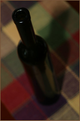
Thanks for your comment, Moe. I agree that greater DOF would have helped here, pulling the focus down from the bottle lip. A bit more contrast would make a difference, too, though I like the feel of it this way. Regards,
Tim
|
|
|
|
 Moe Rabie
{K:4390} 2/12/2006
Moe Rabie
{K:4390} 2/12/2006
|
i think you had here wonderful back ground, but it is not clear though, i dont know maybe because of the lack of light, or because of the focus, for me i will make the focus till the middle of the bottel, my best regadrs..
Moe
|
|
|
|
|
Tim Long
{K:9228} 12/18/2005
|
Thanks for your comment, Kim. I think I can blame the lack of tack-sharpitude on the upload. I certainly agree on the need for a clear anchor. The original is absolutely sharp at the top and that is one reason I liked it enough to post. Maybe the new usefilm has addressed this sort of upload issue. -Tim
|
|
|
|
|
Kim Culbert
{K:37070} 12/18/2005
|
I like the perspective as well, and the graphic quality of this image. I wish that the top of the bottle was super sharp though... it wouldn't matter then if the focus fell of completely at the bottom , but my eye is searching for something tack sharp to anchor on. (love the shadow!)
|
|
|
|
Warren Simons
 {K:741} 11/4/2005
|
Hi Tim, I like this a lot: the perspective, the colors, and shadow. But my eye keeps asking for more of the bottle to be in focus, especially the portion with the light reflecting on it.
|
|
|
|
 Gayle's Eclectic Photos
{K:91109} 10/28/2005
Gayle's Eclectic Photos
{K:91109} 10/28/2005
|
hi again, cool perspective and good contrasting BG with the colorful plaid...like the shadow,highlight on lip and the selective focus...
could pass for a painted still life,Tim
how have you been?.....regards,gayle
|
|


 talukder")