|
|
 pan g.
{K:16899} 10/22/2005
pan g.
{K:16899} 10/22/2005
|
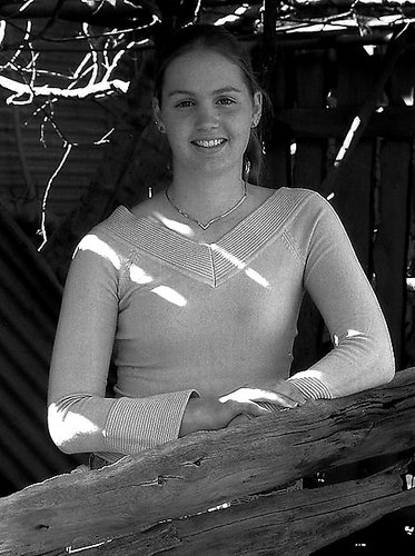
Wonderfull portrait shot. I like the girl's relaxed pose.Keep the one posted (colour version), or at least i prefer it!
|
|
|
|
 Tracey Main
{K:7290} 10/22/2005
Tracey Main
{K:7290} 10/22/2005
|
Thanks for commenting Len I do appreciate it..Tracey
|
|
|
|
|
Tracey Main
{K:7290} 10/22/2005
|
Hello Slava, there was grape vines above her head where the roof used to be thats what let the light in I thank you for your kind words..Tracey
|
|
|
|
|
Tracey Main
{K:7290} 10/22/2005
|
Hello Kay and thankyou, I wasn't sure about the sunlight coming through I was going to fix it but decided to leave it..Tracey
|
|
|
|
|
Tracey Main
{K:7290} 10/22/2005
|
Thanks so much Ina..Tracey
|
|
|
|
|
Tracey Main
{K:7290} 10/22/2005
|
Thanks heaps Kathy, Giulio did a b/w for me his copy is good..Tracey
|
|
|
|
|
Tracey Main
{K:7290} 10/22/2005
|
Thanks Susie..
|
|
|
|
|
Tracey Main
{K:7290} 10/22/2005
|
Thanks Giulio I appreciate your words and thankyou your b/w looks really good I should have played with it a little but ran out of patience, I guess we all have those days..Regards Tracey
|
|
|
|
 Giulio Rotelli
{K:28441} 10/22/2005
Giulio Rotelli
{K:28441} 10/22/2005
|
è un ritratto ben composto ed illuminato, e sinceramente lo preferisco a colori. il bianco e nero non è incisivo e si perde molto nei contrasti, appiattendo un pò tutto lo scatto: la figura è chiara e si staglia bene dallo sfondo, ma perde proprio di volume sulla ragazza. Forse avresti dovuto provare a lavorare su due toni di bianco e nero, quello dello sfondo e quello della ragazza in modo separato. Ma rimango della convinzione che a colori rimane un gradino sopra. Per me hai fatto la scelta giusta
|

|
|
|
|
 Susie OConnor
{K:34798} 10/22/2005
Susie OConnor
{K:34798} 10/22/2005
|
I definitely like the color version best. Looks like everyone is evenly split! I like the tones in the color and the dappled sunlight across her. I think it's a very nice portrait. Well done!
|
|
|
|
 Kathy Hillard
{K:25721} 10/22/2005
Kathy Hillard
{K:25721} 10/22/2005
|
I like the b&w Trace. The focus is a little soft in this image, but it's a good shot of a cute gal.
Kathy
|
|
|
|
 Ina Nicolae
{K:44481} 10/22/2005
Ina Nicolae
{K:44481} 10/22/2005
|
Hi Tracey, I agree entirely with Len, so I won't repeat his observations. I think the color version is the best, better crop, and the B & W loses the golden colors, and the beautiful color of her eyes, hair, and lovely skin tone. Very nice portrait!
|
|
|
|
|
Kay McIntire
{K:11787} 10/22/2005
|
Beautiful portrait. I like the sunshine on her, too- the golden touches make it real world and not studio- stiff. She looks relaxed and has a sweet smile. I think she will love this shot, Tracey.
|
|
|
|
 Slava Z
{K:1124} 10/22/2005
Slava Z
{K:1124} 10/22/2005
|
i love the colour version. i think it's a pity to lose this golden light reflected off... whatever it's reflected off. it gives the portrait a beatiful glow and makes the girl stand out against the background, and it's a good thing, because the tree makes the background a bit crowded. also, i prefer the colour original's crop - it gives enough breathing space without being too tight. Nice portrait altogether. Cheers, Slava.
|
|
|
|
 Len Webster
{K:25714} 10/21/2005
Len Webster
{K:25714} 10/21/2005
|
It's a good shot, Tracey. My only reservation is the brightness of the sunlight reflecting on the branches, top left, in the colour version. That's moderated in the b & w version, but in both the sunlight across the body adds something extra. (All very subjective, of course.)
|
|
|
|
|
Tracey Main
{K:7290} 10/21/2005
|
b/w version and more of a crop to the bottom
|

|
|