|
|
|
Cheryl Ogle
{K:24494} 8/3/2005
|
Such an artsy feel on this Gayle. I really love the attitude of the shot - not "squared" and straight but doing it your own way. Great filter on it - love the color but I love the contrast play here too. Well done.
|
|
|
|
|
Ann Texter
{K:10064} 8/2/2005
|
great shot Gayle.. love the sunset glow. :)
|
|
|
|
|
Ciprian Ilie
{K:13571} 8/2/2005
|
Very good, surreal, I like the tones a lot. Very eerie, interesting composition.
Regards,
Ciprian
|
|
|
|
 Linda Imagefree
{K:72276} 8/2/2005
Linda Imagefree
{K:72276} 8/2/2005
|
I think that's just what we need in the forums and I'm sure there would be interest...I know that I would be interested...and you are most welcome Gayle, thank you for sharing your technique with me....:):)Linda
|
|
|
|
 Gayle's Eclectic Photos
{K:91109} 8/2/2005
Gayle's Eclectic Photos
{K:91109} 8/2/2005
|
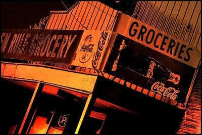
hi and thanks for your in-depth comment,Linda...in this instance,i toned over the original colors since was a sunset image to begin with...i noticed it looked like coke as Angelo mentioned,and brought down the saturation level a bit...yes, i am fascinated by tone and contrast levels all of which are influenced by the existing light....might make a good article for forum is there is interest?
|
|
|
|
 Thilo Bayer
{K:50358} 8/1/2005
Thilo Bayer
{K:50358} 8/1/2005
|
Hi Gayle,
very very weird stuff =) The tilt (deliberate!) the burning, the color... all works great together, a fine concept composing. nice work my dear.
hugs, Thilo
|
|
|
|
 Peggy Christine Skinner
{K:26936} 8/1/2005
Peggy Christine Skinner
{K:26936} 8/1/2005
|
Love the 'sunset glow' tones and the angle is inspired, Gayle. Very rare to see signs like this anymore especially the vintage Coke ones. It has that dusty road corner store in the middle of nowhere feel to it.
|
|
|
|
|
Linda Imagefree
{K:72276} 8/1/2005
|
This really has a vintage look Gayle. Brings back memories for sure, the warm tones work well here, and I agree with you about tones/colors having an impact, they definitely do...I was reading something just this last weekend about color and mood, interesting and challenging information, so it was neat to read what you said about that, and nice to see the effect it had on your image..when you toned this one did you desaturate first or tone over the colors as they were...someone said it has a western kind of look to it, and yes I agree it does..just don't see these kinds of signs anymore...it's kind of a shame too don't you think? Losing so much history..anyway I like your vision, and your thinking outside the lines...interesting and a very nice image...:):)Linda
|
|
|
|
Nando Mondino
 {K:14261} 8/1/2005
|
Excellent image and tones.
|
|
|
|
 Marcus Armani
{K:36599} 8/1/2005
Marcus Armani
{K:36599} 8/1/2005
|
beautiful shot gayle, the glowing colors and nice perspective give a real nice look, very original work....
|
|
|
|
|
Gayle's Eclectic Photos
{K:91109} 8/1/2005
|
Mark,i'm confused..LOL..did i send the above longer comment to you by mistake? It was meant for Angelo......let me know when you get this,please...gayle
|
|
|
|
 Mark Julian
{K:36866} 8/1/2005
Mark Julian
{K:36866} 8/1/2005
|
......Well said !!......... (I'll totally stand by that)........
|
|
|
|
|
Gayle's Eclectic Photos
{K:91109} 8/1/2005
|
hi and thanks for critique...For the toning,i used a light effect in paintshop pro8 called "Fire watcher",then i reduced saturation a bit,and then i tweaked contrast level...
To me,toning is an art in itself...choosing a tone that fits the image can make a significant favorable difference.
re: FList comment- pleased to know of your decision for whatever your reasons...i have managed to attract very few in-depth critiquers during my 1yr.7mos. here and value your honest and instructive feedback.
I was amused by the latter part of your comment, "but that does not necessarily mean what you think it does"...so i say in reply,"never presume to know what a woman thinks!"..LOL..
And yes,i agree that the process brings back memories of being 12 and having my gum-wrapper friendship bracelet stripped away!...best regards,gayle
|
|
|
|
|
Gayle's Eclectic Photos
{K:91109} 8/1/2005
|
hi and thanks for comment!...i like your take on this ...body parts in the freezer chest out back..LOL..
|
|
|
|
|
joan elliot
{K:53} 8/1/2005
|
Cool shot! Okay, forget the soda pop for a minute; I think this looks like it could be something out of a Stephen King thriller! This has an erie feel to it, a "sitting on the edge of your seat, waiting for something horrendous to happen" feeling, imo.
joan
|
|
|
|
 Angelo Villaschi
{K:49617} 7/31/2005
Angelo Villaschi
{K:49617} 7/31/2005
|
Yeah, root beer would do it, too...
Except it isn't root beer being advertised in that sign, is it? Coke has bought this little corner of the coutry out, too. Boo hoo!
:)
|
|
|
|
|
Mark Julian
{K:36866} 7/31/2005
|
What is Angelo going on about NOW ? ....LOL. Sorry about my absence - I've been grieving for mankind (Hear that Angelo?!) i like what you did here. I'll ditto Angelo's comments - haha - but I say Root Beer, Not Coke. Nice shot, Yes it is, Mark
|
|
|
|
|
Angelo Villaschi
{K:49617} 7/31/2005
|
Different-looking scene, Gayle. The toning has worked nicely. I'm sure that's what you meant to do: it actually looks like Coke. I mean, if you had printed this in straight b&w fixed the printo the bottom of a container and poured a layer of Coke over it, I feel that this is how the results would look like.
I'd love to know what technique you used for this toning!
As for the "friend list" thing... you won't be taken out... but that does not necessarily mean what you think it does...
BTW, I wish they'd call it something else. Taking someone out of my friend list... just sounds so pre-teen! :))
|
|
|
|
 Kamran Bakhtiari
{K:24054} 7/31/2005
Kamran Bakhtiari
{K:24054} 7/31/2005
|
western shot,against lines and letters.
|
|
|
|
|
Neal Nye
{K:15827} 7/31/2005
|
I love all those tilted rectangles and the bright orange. It's like the little store is lying back to catch the rays.
|
|