|
|
|
Kessia & Morgan UVA
{K:7265} 8/9/2005
|
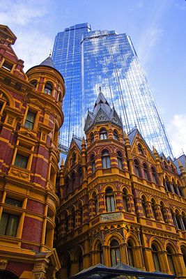
this is really beautiful of well! what a difference between the old and new! i really love how the new skyscraper almost blends into the sky almost allowing you to chose whether you see the image with it or not! great capture! Kessia
|
|
|
|
 Shane Finnigan
 {K:1990} 8/1/2005
|
Excellent image! Great composition! Stunning!!
|
|
|
|
|
Cheryl Ogle
{K:24494} 7/31/2005
|
LOVE this shot Rob. WOnderful contrast with the old and new! Great work here.
Thanks for your comment elsewhere.
|
|
|
|
|
Sean Schwoerer
{K:268} 7/28/2005
|
Great color, great shot, great comp, just what can I say, just awesome!....
|
|
|
|
 Rob Graziano
{K:6678} 7/27/2005
Rob Graziano
{K:6678} 7/27/2005
|
Thanks Naylor! I liked you writeup and appreciate the compliment..."Professional" THANKS!
|
|
|
|
|
Rob Graziano
{K:6678} 7/27/2005
|
THANKS A LOT Mary! I like the contrasting of the old to the new as well...wasn't sure what people would think after uploading the other one; glad I did now. :)
|
|
|
|
|
Rob Graziano
{K:6678} 7/27/2005
|
Thanks Dina! I love the Vertical lines in this one. I would loved to have gotten this shot at night when it is all lit up. :)
|
|
|
|
|
Rob Graziano
{K:6678} 7/27/2005
|
Isn't that sign thing a trip? And you were even there...see...I took what you taught me and applied it... LOL Woooo Hoooo!
|
|
|
|
|
Rob Graziano
{K:6678} 7/27/2005
|
Thanks John! Your comments are always very encouraging and I appreciate that!
|
|
|
|
|
Rob Graziano
{K:6678} 7/27/2005
|
Thanks Alastair! I agree with you about the sense of height...I tend to like this one much better to..especially the more I compare the two after everyone's feedback.
|
|
|
|
|
Rob Graziano
{K:6678} 7/27/2005
|
thanks a lot Ciprian! Wow...into your favorites...THANKS!
|
|
|
|
|
Rob Graziano
{K:6678} 7/27/2005
|
Thank for the feedback Jason! Can't wait to get shots of the Opera House some day!
|
|
|
|
|
naylor .
{K:746} 7/27/2005
|
I like this one better . I think the colours and contrast make the difference more marked, it has a more professional quality about it. It makes me think of a Spiderman movie trailer!!
|
|
|
|
|
Mary Brown
{K:71879} 7/26/2005
|
This is marvelous. The beautiful older architechture with the more modern behind makes a wonderful composition.
Mary
|
|
|
|
 Dina Marie
{K:-1410} 7/25/2005
Dina Marie
{K:-1410} 7/25/2005
|
i like the vertical one better... it's all about the lines here rob -- great!
|
|
|
|
 Krzysztof Miroslawski
{K:969} 7/25/2005
Krzysztof Miroslawski
{K:969} 7/25/2005
|
nice shot! it`s absurd! (talking here about the buildings)
|
|
|
|
 Ran Brosh
{K:1498} 7/25/2005
Ran Brosh
{K:1498} 7/25/2005
|
This one is better
|
|
|
|
 p e t a .
{K:18700} 7/25/2005
p e t a .
{K:18700} 7/25/2005
|
Wow I never actually noticed the old Rialto sign on Le Merdian before! I cant choose, they both impress me...and I wasnt even there when you took it! You did it all on your own, hahaha whoo hoo!
|
|
|
|
 John Loreaux
{K:86210} 7/25/2005
John Loreaux
{K:86210} 7/25/2005
|
Great shot Rob!!! I really like this series! I like the vertical format very much!The reflections of the sky in the tall building are great! I love the colors of the older building! Well seen Rob! My best...........John
|
|
|
|
|
Alastair Bell
{K:29571} 7/25/2005
|
Verticals always work better on tall buildings as they emphasise the height. I like how the new building apppears almost ghostly behind the older foreground buildings. Beautiful colours in the foreground too....
Alastair
|
|
|
|
|
Ciprian Ilie
{K:13571} 7/25/2005
|
this is a fabulous capture, and in my favourites; I like everything about it, the lines, the tones, the old and the new etc...
Regards,
Ciprian
|
|
|
|
 Jason Mckeown
{K:22200} 7/25/2005
Jason Mckeown
{K:22200} 7/25/2005
|
the vertical gives it a better sense of its height
|
|