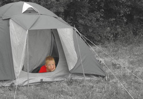
As you can see, I played a little bit with the colors. I'm happy with the bright red kid, but I'm not sure about the composition. Is the kid too much in the middle? Any suggestions?
Hi Marc, thanks for your comment! About the rain you'd like to see: in fact it wasn't really raining, but the wheather wasn't very nice either. I don't know why the boy was looking so sad. I think this is just one of those views you see in a glance, you think "waw, what a picture, I wish I had my camera with me" And for once, I had my camera at hand. ad to take the picture in a hurry before it was gone, maybe that's why the original composition isn't right..
Hi, cool idea, good work with the colours. I think the composition is a bit off...I don't think you need the whole tent, and your crop is a definite improvement. I like 'the rules', they make my photos more consistent (and from a quick glance at your portfolio, your photos seem generally pretty well composed too). I think your crop is better because of two things: the boy (who is the subject) is placed approximately on a strong point of the image, and you have now left a larger space where he is looking than where he isn't looking, indicating that is where he would prefer to be if it were nice out. So the interaction between the boy and his surroundings is better. Now if only some rain were visible :-)
Very funny profile picture of yourself with the icicle! well done. Also, your mountain photos are great! Good exposure on the snow. But maybe some levels work in photoshop could make them 'pop' a bit more.
Imo there's nothing wrong with the alignment (just drawing the attention to the kid, don't always follow the so-called rules...), but the kid is too red.