|
|
|
Mladen Borisov
{K:518} 4/10/2007
|
:) :) :) :) :) :)
|
|
|
|
 Hugo de Wolf
{K:185110} 8/16/2005
Hugo de Wolf
{K:185110} 8/16/2005
|
Hi Pat, I definitely agree, and I think it's always a good thing to point attention to the work of others. Thanks!
Cheers,
Hugo
|
|
|
|
 Patrick Ziegler
{K:21797} 8/13/2005
Patrick Ziegler
{K:21797} 8/13/2005
|
Hugo, Have a peek at this. It's a very powerful image and I would really like to see this guy get some attention. I hope you agree. I don't normally loby on behalf of other's photos but I think one is outstanding. I hope you agree...
http://www.usefilm.com/image/889381.html
|
|
|
|
|
ken krishnan
{K:19102} 6/19/2005
|
Hello Hugo,
Havent' seen any of your comments recently anywhere !!!. Thats most unusual.
You haven't posted any image for more than a month !!
I wonder if all is well.
Hope so.
regards,
ken.
|
|
|
|
 Roger Williams
 {K:86139} 5/15/2005
|
You promised a third one of these, with some more details of what it IS. I resolved to comment then, but I guess you are still too busy... That lovely night photo of Hong Kong on the front page reminded me to look again in case I'd missed it. Wow! I've just noticed your Karma score...
|
|
|
|
|
Antonella Nistri
{K:21867} 5/10/2005
|
Excellent still, Hugo, cheers!
Antonella
|
|
|
|
|
Karadag Metin
{K:2939} 5/10/2005
|
Excellent......
|
|
|
|
 karen clarke
{K:18893} 5/8/2005
karen clarke
{K:18893} 5/8/2005
|
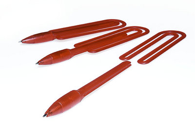
I think to go with the idea a bit more, I would have the second pen pushed out even more, and maybe angle the third one just slightly more to the right. Overall a very interesting abstract product shot~
|
|
|
|
|
Tiro Leander
{K:19060} 5/7/2005
|
I think you've managed to keep the details so clear even with the use of levels in PS. this is great.
|
|
|
|
|
Antonia BauerleinSehnert
{K:30599} 5/7/2005
|
Pure and to the "point." The pen is shouting "look at me." Which is the point. Not to overdo it. Just right. Now I'm hanging on to the edge of my seat for the third...where'd you go!? Antonia
|
|
|
|
|
Kevin Christensen
{K:3891} 5/6/2005
|
Very nice. Great positioning and geometry in this photo. Great job, and good luck with it!
-Kevin
|
|
|
|
 Rashed Abdulla
{K:163889} 5/4/2005
Rashed Abdulla
{K:163889} 5/4/2005
|
simple and beautiful.very well created and presented,great lighting Tecnic's ,well done my friend and very best regards.
|
|
|
|
 Randy Lorance
{K:24769} 5/3/2005
Randy Lorance
{K:24769} 5/3/2005
|
Hi Hugo, I have looked at your first of this series but haven't commenting until seeing this second shot. First I'd like to say that this is a nice opportunity to see and read your approach to presenting and isolating an object. This does not look like the easiest object to render in a photo,what with it's translucent and matte finish qualities, which I think must tend to give an appearance towards softness and lack of deffinition.
In the first shot if that was an obstacle you did a good job despite. It has good detail and depth, and the color looks full. While the shadow I feel adds a lot to that capture, in this picture they do not stand out enough to add impact and to me,it would almost be more desirable if totally eliminated if not as strong as in first. This image, comparing it to the first, has a bit of flatness to it, and I would tend to agree with what was said by James and Antonio, but again this does good job of showing functionality. I will be quite interested to see the third.
Randy
|
|
|
|
 Bobby Mun
{K:3709} 5/3/2005
Bobby Mun
{K:3709} 5/3/2005
|
Hi Hugo,
Creative shot! I like the beafutiful lighting and composition.
Cheers! Bobby
|
|
|
|
 Walter Scarella
{K:19671} 5/2/2005
Walter Scarella
{K:19671} 5/2/2005
|
Excellent creative work Hugo ! Great compo and effect. Congrats...Regards...Walter
|
|
|
|
|
L B.
{K:13965} 5/2/2005
|
Hey Hugo,
Dit zijn niet echt mijn 'type' fotos, ik vind ze meestal een beetje leeg. Maar deze daarin tegen hebben redelijk wat te bieden. Het scherpte diepte effect is prachtig, en dat het steeds verder 'in elkaar schuift' wordt ook prachtig weer gegeven en ziet er mooi uit. Ook het 'draaiende' effect wat in de foto zit is erg erg mooi! Ik denk dat ik daarom mijn mening over dit soort type foto's moet bijstellen, want ze hebben wel degelijk heel wat te bieden!
Groet,
Lex.
|
|
|
|
|
Omar Rifaat
{K:10141} 5/1/2005
|
Hugo,
I Like the 'rocket launcher' effect of the three pens in various stages of deployment!
On the technical side I think the rear pen is a little out of focus which is a minor detail but a little distracting.
But I definitely want to buy one of these!
I like the blue version (as on the company site) too.
Omar
|
|
|
|
 Massimo Di Maggio
{K:-53658} 4/29/2005
Massimo Di Maggio
{K:-53658} 4/29/2005
|
I moved you to my associates list, I hope you don?t mind, I use Fl for Italian members and AL for members from other countries, don?t worry, a list is only a list, but friends are friends ;) The shot? good as usual, I would have positioned differently the second pen, just to create a geometrical perspective, but these are little and personal details. Bye, Max :)
|
|
|
|
|
Andrej V
{K:6693} 4/29/2005
|
hola Hugo!
you sure can surpise, can you?
interesting shoot.
greets Andrej
|
|
|
|
 Roberto Arcari Farinetti
{K:209486} 4/29/2005
Roberto Arcari Farinetti
{K:209486} 4/29/2005
|
wooww so perfect still life my friend,,.. anothe great field of apllication.. very well done!
cheers
roby
|
|
|
|
|
Laurie Gould
{K:11942} 4/29/2005
|
Very nice! The clarity is really great.
Definitely looks like an interesting product. Truth be told, I've always had an affinity for office supplies.
|
|
|
|
|
Antonio Trincone
{K:23167} 4/29/2005
|
If I remember well the red color of the previous one I commented was different, may be some strong influence of PS processing
|
|
|
|
 Thilo Bayer
{K:50358} 4/29/2005
Thilo Bayer
{K:50358} 4/29/2005
|
Hi Hugo,
again, a nice DOF composing. great clarity and detail. this time, the diagonal goes a bit more "natural" to the right ;-)
nice development of the pencil. get kind of stripped ;-)
best wishes,
thilo
|
|
|
|
 NN
{K:26787} 4/29/2005
NN
{K:26787} 4/29/2005
|
Somehow I like the previous shot, just as a picture, better. This one has another function, and is very good as such.
|
|
|
|
 Jeanette Hägglund
{K:59855} 4/29/2005
Jeanette Hägglund
{K:59855} 4/29/2005
|
Very good idea of a product photo, how you have placed the pen and the paper clip together ad how you show how the paper clip shall remove from the pen. That one of the importat aspects of product photography. Beside that, another aspect is to make the product even more interesting then in "real". You have done a very good work here, with the light, the arranging and "explaining" through image.... Excellent!
Jeanette
|
|
|
|
|
Paolo De Maio
{K:34932} 4/29/2005
|
Really impressive for high contrast between white and red and overall for the composition which follow the diagonal in a 3 D Layer
Superb work as usual Hugo
Paolo
|
|
|
|
|
James Hager
{K:6285} 4/29/2005
|
Not as immediately interesting as the other shot, but it shows how the object works. Good to see the tip of the pen in focus here. :)
|
|
|
|
|
Maria Luisa Vial
{K:36017} 4/29/2005
|
A simple and compelling composition Hugo... You show the product very nicely...
The only thing I miss here is emotion... Definetly a lifeless picture... but love it's simplicity...
The high key background give the feeling as if they were suspended... The only thing showing that they are in a table or something is the shadow...
Like it... and a change of your usual work...
Cheers,
MaLuisa
|
|
|
|
 Paul's Photos
{K:35235} 4/29/2005
Paul's Photos
{K:35235} 4/29/2005
|
I like the photo.. but after seeing your previous post I think I am biased towards the other one... but both are good.. have you thought about working for an advertising or marketing company :) nice work
|
|
|
|
|
Carmem A. Busko
{K:48785} 4/28/2005
|
Wow... I?m late.... A week away and you finished a series, completed another and started a new....Sorry, Hugo!
This new is very plesant: simple, clean, elegant.
Just loved the two shots. Hope someday I learn something about artificial lighting..Meanwhile, I?ll keep following the sun...
Cheers!
Carmem
|
|
|
|
|
Chris Spracklen
{K:32552} 4/28/2005
|
Fine shot, once again, Hugo!
I'm sure the company concerned will be very pleased!
Best regards, Chris
|
|
|
|
|
Chris Spracklen
{K:32552} 4/28/2005
|
Fine shot, once again, Hugo!
I'm sure the company concerned will be very pleased!
Best regards, Chris
|
|
|
|
|
Hugo de Wolf
{K:185110} 4/28/2005
|
Tsja, Teunis... Goede vraag.... 't is volledig emotie en sfeerloos...:) Volledig anders dan wat ik zelf het liefst fotografeer, maar 't verdient goed....:) Voor mij is "Mooi en goed" precies waar ik op gehoopt had!
Groeten,
Hugo
|
|
|
|
 Erik Neldner
{K:10846} 4/28/2005
Erik Neldner
{K:10846} 4/28/2005
|
Beautiful Hugo! Even more powerful than the last one.
cheers,
Erik
|
|
|
|
|
Hugo de Wolf
{K:185110} 4/28/2005
|
If you cannot control the curiosity or patience, you could also see www.bridea.nl/index2.html....:) But rest assured, it won't show you the third one...;)
Cheers,
Hugo
|
|
|
|
|
Patrick Ziegler
{K:21797} 4/28/2005
|
Ahhh, yes. I do love a mystery....
|
|
|
|
|
Hugo de Wolf
{K:185110} 4/28/2005
|
Hi Pat, Thanks for your comment. As usual, it's another triptych. The functionality (and concept) will (hopefully) become more clear with the third image....
Cheers,
Hugo
|
|
|
|
 Teunis Haveman
{K:53426} 4/28/2005
Teunis Haveman
{K:53426} 4/28/2005
|
Hallo Hugo
Ja wat moet je hier van zeggen
Mooi en goed
Teunis
|
|
|
|
|
Patrick Ziegler
{K:21797} 4/28/2005
|
Hugo, the photography is excellent. However, I still am not understanding the functionality. What is the concept here?
|
|
|
|
|
Hugo de Wolf
{K:185110} 4/28/2005
|
Hi Michele, thanks for your comment. I can see why it's not your style of photography, as it's emotionless and purely a representation of the item, without feel or atmosphere. And those two things do characterise your photos. I generally like those kind of photos more too. That's why I appreciate your comment on the technicalities of this shot...:)
Cheers,
Hugo
|
|
|
|
|
Michele Berti
{K:14921} 4/28/2005
|
Very creative Hugo. To be honest I do not like to much such kind of photographs.... i can only say that it seems technically very well done with a great staging and light control.
|
|