|
|
|
Jim Goldstein
{K:21230} 9/9/2004
|
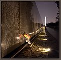
I really like the exposure for the reflection. I do find the sky in the upper left corner a bit distracting though. It is so bright that it actually pulls my eye away from the reflection. The same goes for the well lit pillars at the top of the frame. I can't help but think that an incomplete structure at the top adds greater impact and forces the viewers eye to reside primarily on the reflection where you can catch a view of what is cut off at the top of the frame. See my attached version of your image. This crop isn't perfect, but I do think that it helps shift the weight and emphasis of your image in a way that adds more impact to your photo.
|

|
|
|
|
|
Luis
{K:1445} 9/2/2004
|
Como acostumbras, una imagen que presenta una cuidada composición y un alto atractivo visual. Siéndo crítico creo que hubiera sacrificado un poco el reflejo en la parte inferior más oscurecida, ganando algo en la parte superior, acercándote a una posible simetría vertical. Un abrazo Felipón.
PS - Por cierto, tampoco habeís empezado mal, eh?
|
|
|
|
 Don Loseke
{K:32503} 8/30/2004
|
A great reflection. Interesting picture. Don.
|
|
|
|
|
Stephen Bowden
{K:64141} 8/29/2004
|
Excellent reflection Felipe, very well seen
|
|
|
|
|
Erik Silva Sobral
{K:318} 8/29/2004
|
Great Pic... it's cool the reflection... congratulations! :)
|
|
|
|
 Alison DuFlon
{K:36566} 8/29/2004
|
Great perspective, color,lighting and reflection in this picture. Not your usual view of Venezia. Alison
|
|
|
|
 Ned Ali
{K:11928} 8/29/2004
|
fabulous reflection with great composition!
very well done Felipe :)
|
|
|
|
 Teunis Haveman
{K:53426} 8/29/2004
|
Felipe, I like the reflection
Teunis
|
|


