|
|
 Sam Andre
{K:12484} 1/15/2005
|
original composition
|
|
|
|
 Roger Skinner
 {K:81846} 8/18/2004
|
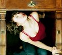
I actually like the odd angle..it echoes the odd approach that you employ in your work ..in odd I mean outside the square ..so it's a good thing...keep em coming
Cheers Roj
|
|
|
|
|
John Strazza
{K:11535} 7/30/2004
|
fantastic image .. wonderful ...
|
|
|
|
|
Aurore Lynch
{K:1687} 7/29/2004
|
You don't think maybe like this?
|

|
|
|
|
 david cunningham
{K:8255} 7/29/2004
|
raquel...
I love the crop. If it were totally symmetrical it would becaome just a bit static and maybe a bit boring.
|
|
|
|
|
Radmila Gorjanovic
{K:3113} 7/28/2004
|
I have croped this pictures, because I don,t like symmetry, and I want a model in focus.
|

|
|
|
|
|
Radmila Gorjanovic
{K:3113} 7/28/2004
|
Thanks, but I have croped this pictures, because I dont like symmetry, and I like to focused a model.
|

|
|
|
|
 david cunningham
{K:8255} 7/28/2004
|
raquel..
Yet another really cool shot. I love your composition and you are quite a wonderful model as well. Colors and textures are terrific. Keep the shots coming. You're my newest "friend".
David
|
|
|
|
|
Aurore Lynch
{K:1687} 7/28/2004
|
Interesting. I like the colors here, and you make a good model for yourself (isn't that nice?) ; ) I like the blur here as well... I think...
I believe a big improvement you could make here is completion of framing. The desk makes a nice frame at top and right (though it badly needs to be straightened), but you've cut yourself off at the bottom and it's cropped too close at the left. Include the rest of you at the bottom, with some floor under to serve as a 'frame', include more desk at the left, and I think you'd find that the picture looks much more put together.
LOL... I was going to say (based on the picture in my mind) that this would be great in square format... but it already is! Nice choice ; )
|
|


