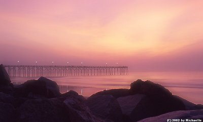
This is a shot that the thumbnail does not do justice to! A shot where "soft" is a compliment. Amazing color, so soft and dreamy - and yet the pier is so clear and sharp - in a soft way - including the lights. Lovely image! Regarding your comments on my b&w, Standing Watch, I really like your first suggestion: the first is to just dodge in selective areas to make them a little lighter (this would retain the full black silouettes of the boats). I do prefer this to my original. But it doesn't seem like it would be so easy to "just dodge selective areas". Can you be more specific? Thanks! Donna
this image has a very peaceful, serene mood to it, soft colors, and fog really adding to that. I think the composition is excellent, love the fg rocks, maybe just a tad more detail in the rocks would have been nice, but great anyhow.