|
|
 Nick Karagiaouroglou
 {K:127263} 4/23/2009
|
About the color, first of all thanks a lot, Marcio!
I wish I could get that in acontrolled way right out of the camera.
Cheers!
Nick
|
|
|
|
|
Nick Karagiaouroglou
{K:127263} 4/23/2009
|
The pixelation in the sence of that "stair-stepping" look is not necessary, Marcio. in many other omages it doesn't appear on lines that deviate from horizontal or vertical direction. Such things are visible on such lines only when the scanning was not as good or the focus was not as good and there has been sharpening afterwards. But they can be avoided.
So, as I don't use afterward enhancements, I guess that my scanning was not really good.
Cheers!
Nick
|
|
|
|
|
Nick Karagiaouroglou
{K:127263} 4/23/2009
|
Many thanks for the nice comment, Malulez!
Cheers!
Nick
|
|
|
|
 Marcio Janousek
{K:32538} 4/14/2009
Marcio Janousek
{K:32538} 4/14/2009
|
Good color added..
|
|
|
|
|
Marcio Janousek
{K:32538} 4/14/2009
|
This imperfection of the line is because of the position of the lens...do you know what is it?
It seems to be something very common.
|
|
|
|
|
Nick Karagiaouroglou
{K:127263} 4/13/2009
|
Thank you very much, Dave!
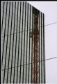
For convenience I attach the same part of the image alsong with some markups, as I already did for Marcio. It is at the same magnification degree as the whole image too. Look closely at the lines and you will see the stair-steppings.
Cheers!
Nick
|

Marked up imperfections |
|
|
|
 Malules Fernandez
{K:54810} 4/13/2009
Malules Fernandez
{K:54810} 4/13/2009
|
Excellent composition, Nick!
great work indeed.
regards,
malules
|
|
|
|
|
Nick Karagiaouroglou
{K:127263} 4/13/2009
|
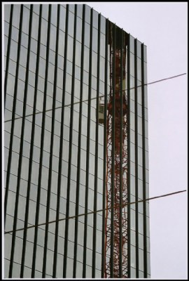
So, here it is Marcio! Is that in the direction that you mean? If so, then in order to keep the darker appearance of the building, I guess I needed some fim with the appropriate hie sensitivity at those orange hues.
Cheers!
Nick
|
Replaced the colors of the crane by more saturated ones |
|
|
|
|
Nick Karagiaouroglou
{K:127263} 4/13/2009
|
Thanks a lot for the nice comment, Marcio!
The lines are not perfect however. I attach a small part of it at the same magification. Do you see the stair-stepping?
About the reflection, even if it should be more saturated it would be a fake this way. And as it was possible to do that ba a better usage of my camera/lens I prefer to have comments like yours that tell me what to do better with camera/lens, in order to better my own skills.
Having said that, I wonder if the rather cloudy and dark atmosphere of that day would be as well visible then. In order to do that I assume that only the color of the crane should be saturated. So I attach also the retouched image on the next message.
Cheers!
Nick
|
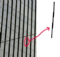
Marked up line imperfections |
|
|
|
 Dave Stacey
{K:150877} 4/12/2009
Dave Stacey
{K:150877} 4/12/2009
|
Excellent reflective work, Nick, and I don't see any pixelation on my monitor.
Dave.
|
|
|
|
|
Marcio Janousek
{K:32538} 4/11/2009
|
The definition of the lines are perfect Nick, great diagonal too..
I think the reflection of the crane could be more saturated with color but I know you want to as it was done without editing..
|
|