|
|
|
Nuno Borges
{K:1570} 8/30/2008
|
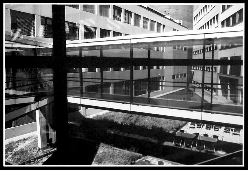
It does.
|
|
|
|
 Nick Karagiaouroglou
 {K:127263} 8/29/2008
|
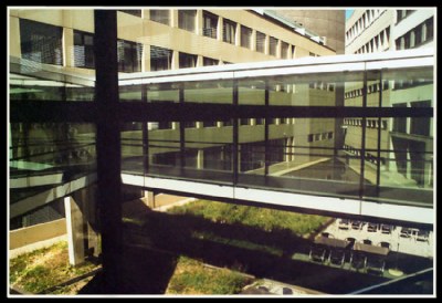
Indeed, Nuno! The color fidelity here is only given up to the level of a view though the glass of the window, which of course shifted hues. The main problem for me is the overexposure, though. I also consider the B&W better.
Still sometimes such a color shift can help enhancing some latent atmosphere.
Cheers!
Nick
|
|
|
|
|
Nuno Borges
{K:1570} 8/28/2008
|
Colour is nice when it's faithful, not so much so when not. Black and white is the best solution here where what matters are structures.
|
|
|
|
|
Nick Karagiaouroglou
{K:127263} 7/27/2008
|
Did the conversion to B&W starting from the color tuned image this time. It's much much better now, indeed, since the white balance was also much better on the tuned one.
Thanks a lot for the very very useful input, Harry! Now I must translate these actions to camera settings, and I have a good place to start from!
Cheers!
Nick
|
Turned it to B&W from the color tuned version after Harry's suggestion. |
|
|
|
 Wolf Zorrito
{K:78768} 7/26/2008
Wolf Zorrito
{K:78768} 7/26/2008
|
Agree but now seeing this i thing the white balance is not ok. Tuning with channel mixer may clear that.
|
|
|
|
|
Nick Karagiaouroglou
{K:127263} 7/25/2008
|
Well, as Harry pointed out the colors are a bit off, but I am glad if you like it, Claudia!
Nick
|
|
|
|
|
Nick Karagiaouroglou
{K:127263} 7/25/2008
|
B&W. Many many problems are revealed here! But good thing to know about them!
Thanks once again, and tot ziens!
Nick
|

Turned it to B&W after Harry's idea |
|
|
|
|
Nick Karagiaouroglou
{K:127263} 7/25/2008
|
Color tune up.
|

RGB "tune" after Harry's idea |
|
|
|
|
Nick Karagiaouroglou
{K:127263} 7/25/2008
|
Thanks a lot for the nice comment and even more for the ideas, Harry! The place was already "colorless" but not as colorless as on the image. I guess the glass through which I was shooting added its "filtering" look. :-(
But it would be interesting indeed to tune it a bit. Only that I don't know much about working with that and so I just try things out without any systematical approach. I assume that the attachment is not really the best possible tune, but somehow it added a bit more intensity on the colors.
I also turned it to B&W (next attachment) and then the many problems became even more visible. I guess this is a case for a real pro. And of course I must read a bit more about these things.
Thanks a lot and cheers!
Nick
|
|
|
|
 Claudia Perilli
{K:31090} 7/24/2008
Claudia Perilli
{K:31090} 7/24/2008
|
Una bella serie. Ottima la composizione.
Claudia
|
|
|
|
|
Wolf Zorrito
{K:78768} 7/24/2008
|
I like the whole thing. Colors are a bit off, RGB tuning may work or b/w. I like the tables and chairs on the ground too. Jassou Nick !
Harry
|
|