Of course I wouldn't give it away... for free, that is! I think that some $8723648237 would be OK, and of course also my name written with fat letters on the stage when they perform! ;-)
OK, OK, considering the orthography problems with my name, I accept the $8723648237 only ;-)
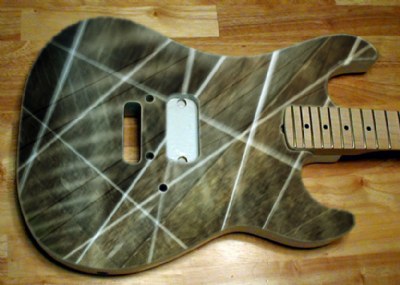
I undersdtand exactly what you mean now, and I burned the middletones on that part a little bit. (Attachment) It really gained consistency of look. It is more "real" now, and it has a better definition of its color palette. I think that the more dominating part is the result of the reflections on the window of the train, from which I took the image - if I remember well. So, in a backwards engineering mode, I should have chosen a better position behind the window to avoid the reflections as good as possible.
Thanks a lot for the sharp look again!
Nick
0
Burned the parts at the lower right of the guitar body
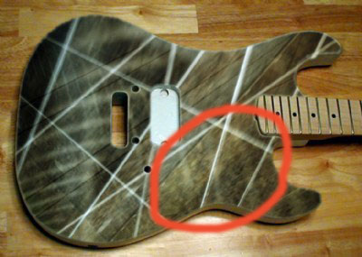
ah Nick, I'd be glad to see your design of guitar on him, but then I am not sure you would give it away!! however, to be exact on what i mean of that yellow- the part you marked seems more dominant with 'my yellow point-outing' and the rest is less intense.
So I must write them if they'd have any interest for a new look and image of guitars, ey? ;-)
Thanks a lot for the nice and inspiring comment again, Visar! I don't quite see any yellow - do you perhaps mean that region as marked on the attachment?
Cheers,
Nick
0
Marked-up region that I think Visar means speaking about yellow color
I find this design fit for Kenny Hickey of Type O Negative!- black and silver design- i think fits so much to this band and the nature of their philosophy/ what they sing about. here, perhaps i would modify that yellow to silver- thus have a duochromatic design, pretty typical for gothic and black metal.